| Image |
Comment |
| 04/13/2005 04:34:08 PM |
|
 Photographer found comment helpful. Photographer found comment helpful. |
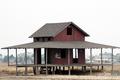
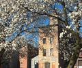
| 04/13/2005 04:00:34 PM |
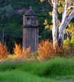
Silent Sentryby datcatComment: Hmm. First, it's a landscape shot with a building in it. Next, it's titled 'silent sentry' which suggests habitation.... Well, never mind. I like the strong lighting. I like the composition. I like the building and its placement in the photo. |
| Photographer found comment helpful. |
| 04/13/2005 03:54:06 PM |
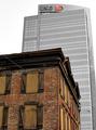
Not Insured by INGby StrikeslipComment: I absolutely love the contrast between buildings. When you offer it as a print after winning the challenge, I hope you choose to clone out the pesky wire. Otherwise this strikes me as being about as good as it gets in this challenge, and there are a lot of very good entries. Excellent.
|
| Photographer found comment helpful. |
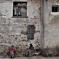
| 04/13/2005 03:48:32 PM |
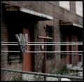
The Forgottenby instepsComment: The problem is that the shiny white clotheslines suggest that these particular clothespins might belong to an inhabited building. If so, then we might call the abandoned building in the background a minor element. ... But we're not going to do any of that. I like the tension between the clothespins and the background. |
| Photographer found comment helpful. |
| 04/13/2005 03:43:24 PM |
|
| Photographer found comment helpful. |
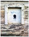
| 04/13/2005 03:32:21 PM |
Home with ghostsby proglotComment: I find the organic shape of the building interesting. I like the almost total lack of color. I like the textures and the lighting. The cat is a powerful image, waiting patiently for an owner who will never again show, perhaps.
I believe the photo would be much better with the bottom cropped to just abouve the lintel (structure above the door.) I'm trying to imagine crops that would place the cat horizontally on the rule of thirds, but cannot do it. Regardless of how it is cropped i like this photo. |
| Photographer found comment helpful. |
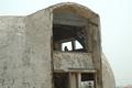
| 04/13/2005 03:22:47 PM |
Boarded Upby rookComment: The strength of the photo would have been the beautiful texture of the peeling paint, IMO; but it all seems a little out of focus. It's hard to argue that the composition is strong. Or that the lighting is unusually good, although I notice some pleasing soft shadows. I'm afraid the blued-out face sort of ruins what little attraction the peeling paint had - might have been interesting before it was 'defaced.' |
| Photographer found comment helpful. |
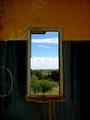
| 04/13/2005 03:17:41 PM |
Forgotten Viewby LynnSComment: I like this photo for its colors and for the idea. I wonder whether the photo might be better with just a touch more view, and with the window not dead center. I'm impressed that you got detail in the sky and detail in a black, interior, unlit wall. |
| Photographer found comment helpful. |
| 04/13/2005 03:12:55 PM |
Philcoby wheeleddComment: Of abandonment, decay, regeneration. The circle of life. It's among the most hopeful shots in the competition. Its strengths may be more symbolic than graphical, but that's still worth points in my book. |
| Photographer found comment helpful. |
| 04/13/2005 03:09:12 PM |
|
| Photographer found comment helpful. |
Home -
Challenges -
Community -
League -
Photos -
Cameras -
Lenses -
Learn -
Help -
Terms of Use -
Privacy -
Top ^
DPChallenge, and website content and design, Copyright © 2001-2025 Challenging Technologies, LLC.
All digital photo copyrights belong to the photographers and may not be used without permission.
Current Server Time: 06/09/2025 06:32:18 AM EDT.