| Image |
Comment |
| 11/15/2008 09:58:44 PM |
|
 Photographer found comment helpful. Photographer found comment helpful. |
| 11/15/2008 09:55:09 PM |
an element of funby krnodilComment: Pastels, soft-focus, extremely tilted perspective... I missed the 60's but that's about how I picture them. OTOH, it could be an innocent childhood memory of baloons at a birthday party, a bit fuzzy with a touch of gender ambiguity. Ok, I know I try to read too much into a photo, but why else would I be here? Can I just suggest slightly dodging the left side to prevent the background from drawing too much attention. |
| Photographer found comment helpful. |
| 11/15/2008 09:48:56 PM |
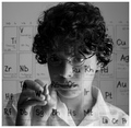
W - 183.85 Tungsten 74by faeryComment: This is very well executed, it's awful hard to write backwards;) Other than the point of the pencil, however, there is little that screams Tungsten, so, while I question the choice of title, that has little (if any) effect on scoring. Nice shot! |
| Photographer found comment helpful. |
| 11/15/2008 09:45:11 PM |
|
| Photographer found comment helpful. |
| 11/15/2008 09:38:18 PM |
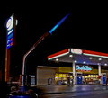
Phlogistonby raishComment: Ok, this made me cringe. As a former overnight "On the Run" employee, my biggest fear wasn't a robbery, it was a fire at the pumps, having witnessed, as a child, first-hand, the explosive "dephlogistication" of another fuel product, en masse. Anyway, I guess it's well composed and technically well done. I certainly can't claim that it failed to elicit an emotional response. Well done ... I guess. |
| Photographer found comment helpful. |
| 11/15/2008 09:30:21 PM |
Strontiumby phloverComment: Explosive photo! I like pyro! Come on, who doesn't? Well done ... what else can I say?
Oh, I had to come back to add that I am a huge sucker for wide format images. |
| Photographer found comment helpful. |
| 11/15/2008 09:23:37 PM |
[Au] for [Hu]by FocusPointComment: Nice concept, comp, and expression, but overprocessed, IMO. Seems like too much noise reduction, producing stepped gradients around the cheeks and chin, and artifacting around the eyes. |
| Photographer found comment helpful. |
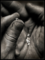
| 11/15/2008 09:19:48 PM |
Currency of Love and War by scalvertComment: Nice title. It suits this gritty depiction of an often glorified gem. Well composed, well executed and thought provoking. |
| Photographer found comment helpful. |
| 11/15/2008 09:18:09 PM |
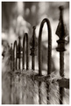
Titaniumby bspurgeonComment: Nice, I'm not sure what it is, but it gives an impression of strength. It's reminiscent of a safe or something solid and impenetrable, yet intricate and obviously man-made. |
| Photographer found comment helpful. |
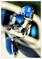
| 11/15/2008 09:16:10 PM |
Chrome ladyby Yo_SpiffComment: Good concept, but the perspective and framing hurt this shot. I feel like she just knocked me over, and now she's walking away without a second glance! IMO, A horizontal comp with her entering the frame would have been stronger. |
| Photographer found comment helpful. |
Home -
Challenges -
Community -
League -
Photos -
Cameras -
Lenses -
Learn -
Help -
Terms of Use -
Privacy -
Top ^
DPChallenge, and website content and design, Copyright © 2001-2025 Challenging Technologies, LLC.
All digital photo copyrights belong to the photographers and may not be used without permission.
Current Server Time: 08/05/2025 08:38:23 PM EDT.


![[Au] for [Hu]](https://images.dpchallenge.com/images_challenge/0-999/946/120/Copyrighted_Image_Reuse_Prohibited_738238.jpg)