| Image |
Comment |
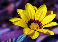
| 04/11/2006 10:08:22 PM |
Complementary Flowerby jorrComment: I really like the soft but colorful background. The flower could stand to be a little sharper on the top edge, but that's really hard for me to get so I can't, unfortunately, say how to do it better. Still this is a very pleasing image and meets the challenge very well without being only yellow |
 Photographer found comment helpful. Photographer found comment helpful. |
| 04/11/2006 10:05:12 PM |
Jammy Timeby timfythetooComment: I like kid shots. Don't worry about always pleasing the DPC crowd - they're a fickle lot. This is a nice shot and a great model. Your background is actually pretty good for being just a wall - good light. He's a little off-focus below the middle, but his smile is really the point of the shot. Nice job. |
| Photographer found comment helpful. |
| 04/11/2006 08:29:05 PM |
Clicheby nards656Comment: Well I like it. There's a reason for cliche's. People like certain things and this type of shot is one of them.
There's a little junk in the glass at the top on the right, and a few curvy areas in the stem and at the very top that probably distracted the voters. The one thing I've noticed about these types of images is that the really good ones are near perfect symmetry. The lines are straight, the sides balance each other perfectly etc. I couldn't do it. But then take a look at my yellow entry, then take this comment with a grain of salt :)
Nice job. |
| Photographer found comment helpful. |
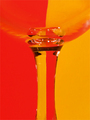
| 04/11/2006 08:23:17 PM |
Yellow IIIby ChinabunComment: Very cool.
I want one of those.
The composition here is great. So are there three lava things? or are you very tricky with mirrors? Honestly the only thing I think you could have improved is the focus on the left.
I'm becoming a big fan of Neat Image and am wondering if it might have helped clean up some of the noise in the yellow areas -not really bad stuff, but it's the only thing along with the focus that I can see to keep this from a really high score. Good job. |
| Photographer found comment helpful. |
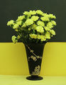
| 04/11/2006 08:14:34 PM |
Still Life In Black and Yellowby olddjComment: I really like the composition and layout here. The only thing I think you could have done better, post process, would be to apply neat image or something like it to the top background. The two color split, with contrasting top and bottom of the flowers and vase is excellent, but I'm distracted by the texture on top.
You also have a little wrinkle on the yellow bottom near the left side of the vase, and the color on bottom could have been brightened a little with more direct lighting.
I know, I know. You've seen my yellow entry, and who am I to say these things?! But I really do like your shot and only want to offer what I see and have tried to learn myself. |
| Photographer found comment helpful. |
| 04/10/2006 02:41:41 PM |
Jack Be Nimbleby dw_photoComment: Great grundge. The background could have been less noticeable, but not a problem. |
| Photographer found comment helpful. |
| 04/10/2006 02:33:03 PM |
|
| Photographer found comment helpful. |
| 04/10/2006 02:22:15 PM |
|
| Photographer found comment helpful. |
| 04/10/2006 02:19:14 PM |
|
| Photographer found comment helpful. |
| 04/10/2006 02:15:55 PM |
|
| Photographer found comment helpful. |
Home -
Challenges -
Community -
League -
Photos -
Cameras -
Lenses -
Learn -
Help -
Terms of Use -
Privacy -
Top ^
DPChallenge, and website content and design, Copyright © 2001-2025 Challenging Technologies, LLC.
All digital photo copyrights belong to the photographers and may not be used without permission.
Current Server Time: 08/29/2025 10:06:41 PM EDT.