| Image |
Comment |
| 05/02/2005 10:33:44 AM |
Ranch Land Oakby clearlakemikeComment: Critique Club:
The composition is just great and what an lovely oak and beautiful sky. Someone walking in the field in a pretty dress or some colorful clothing would made this shot so much better. If you are on your own take a tripod with you. Timer 10 second and run to the field :)
I would like to see this picture in black and white and lots of contrast. Maby darkening the sky to almost black.
Good job on this one and good luck in the future. |
 Photographer found comment helpful. Photographer found comment helpful. |
| 05/02/2005 10:23:45 AM |
Rising Sunby WawaaComment: Critique Club:
Because this is taken late at night the house in the foreground is a bit too dark. And the sky burns out over the house.
I think the foreground is a bit to crowded.
Maby you could have gone closer to the building and have it in the foreground and alot of sky in the rest of the picture.
I see potential in you. |
| Photographer found comment helpful. |
| 05/02/2005 10:19:30 AM |
Ponce Inlet Lighthouseby wmprkgComment: Critique Club:
I like the composition in your picture. The light house is placed just perfectly.
There is white in the picture, there is black in the picture, there is grey in the picture. That is what every black/white picture should have.
The only thing I would like to have changed is to maby have someone walking on the beach. Or you could have walked and made the footsteps more visable. One other thing. At the top of the picture there is a white circle. Lens flair or something. You almost can't see it. Just minor details :)
Overall a good picture. |
| Photographer found comment helpful. |
| 05/02/2005 10:15:08 AM |
|
| Photographer found comment helpful. |
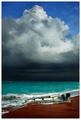
| 05/02/2005 10:13:32 AM |
In the Path of Havocby CutterComment: Amazing colors. Like it how the dark clouds split the image in half. Putting this in my favorites. |
| Photographer found comment helpful. |
| 05/01/2005 10:18:32 AM |
|
| Photographer found comment helpful. |
| 04/30/2005 04:54:43 PM |
Care Free by JeanComment: This one should have grabbed the blue. Clearly by far the best shot in this challenge. Thumbs up for you. I think it couldn't have been done better. |
| Photographer found comment helpful. |
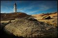
| 04/30/2005 04:35:10 PM |
Ragged IIIby TychoComment: Good contrast between the harsh rock and the soft sand. The light house makes this shot very interesting. The darkening of the sky works well. |
| Photographer found comment helpful. |
| 04/26/2005 12:02:02 PM |
Seductionby DufusComment: Like the pose. Like the contrast. Great work! You should have place much much much higher. |
| Photographer found comment helpful. |
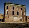
| 04/25/2005 09:53:39 AM |
Abandondedby theSajComment: Like how you placed a person in the picture. I found most of the pictures uninteresting because they didn't have people in it. Good job. |
| Photographer found comment helpful. |
Home -
Challenges -
Community -
League -
Photos -
Cameras -
Lenses -
Learn -
Help -
Terms of Use -
Privacy -
Top ^
DPChallenge, and website content and design, Copyright © 2001-2025 Challenging Technologies, LLC.
All digital photo copyrights belong to the photographers and may not be used without permission.
Current Server Time: 07/18/2025 01:40:56 AM EDT.