| Image |
Comment |
| 08/27/2005 11:51:36 PM |
It Comes In A Rainbow Of Colorsby sanxComment: This would make a good advertisement picture, but, I think the picture would have fit the title better if you would have made the rainbow with more colors of yogurt instead of just a rainbow behind it. The border between the yogurt and the background makes it look blue-screened in place. Also, the date in the bottom right pulls you out of the picture completely. |
 Photographer found comment helpful. Photographer found comment helpful. |
| 08/27/2005 11:44:10 PM |
Milk Splashby smartypantsComment: I like how the dark glass/bowl makes really shows how the milk thins near the top of teh splash.
The only thing that I would have changed would be the dark corner in the very top right. |
| Photographer found comment helpful. |
| 08/27/2005 11:37:32 PM |
don't cry...by mesmerajComment: I love how you have enough DOF to capture the person, but still throw them out of focus. Better maybe if the girl in the background was turned around to balance out the glass, and if the front of the milk was in focus. |
| Photographer found comment helpful. |
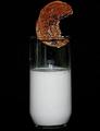
| 08/27/2005 11:23:27 PM |
"The Dunk Tank"by NstiG8trComment: I like the idea, however I think it could have been better if the top/lighter side of the cookie had been facing us, that's the side that everyone identifies with. But I do like that the cookie has a bite gone, making it look like the letter "C", which is for cookie. |
| Photographer found comment helpful. |
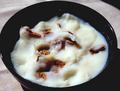
| 08/27/2005 11:13:39 PM |
Bran Flakes Go for a Swimby chaliceComment: Good capture, I like the contrast of the white milk on the dark bowl. However I find the background to be distracting from the image.
Maybe just a plain white background or blue to match the bowl? |
| Photographer found comment helpful. |
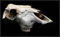
| 08/27/2005 11:11:27 PM |
Dairy Deathby CalliopeKelComment: I reallly like the idea behind this picture it is well composed and I really like the black background with the starkness of the bones. However the skull is tough to identify as a cow, it's too bad you couldn't get more of the skull to make it easier to see, maybe some horns on it or the lower jaw. |
| Photographer found comment helpful. |
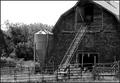
| 08/27/2005 11:09:12 PM |
Dairy in declineby U622Comment: I really like the use of black and white in this photo. The contrast of the steel fence, conveyer and storage tank with the wooden barn is nice. However, the birds in the background are a little distracting. |
| Photographer found comment helpful. |
| 08/27/2005 10:47:06 PM |
Beatriceby maxjComment: I love how you blended the title with the picture, a great way to help the person focus on the image and answer the question the viewer might have of what the word on the tombstone is.
Only two minor things detract from this picture. The tombstone right behind Beatrice is too bright (but the text is not as clear as Beatrice's) and the tombstones end before going out of frame behind the tree.
Otherwise a very nice picture and a good addition to a portfolio. |
| Photographer found comment helpful. |
Home -
Challenges -
Community -
League -
Photos -
Cameras -
Lenses -
Learn -
Help -
Terms of Use -
Privacy -
Top ^
DPChallenge, and website content and design, Copyright © 2001-2025 Challenging Technologies, LLC.
All digital photo copyrights belong to the photographers and may not be used without permission.
Current Server Time: 08/15/2025 08:33:55 PM EDT.