| Image |
Comment |
| 09/19/2008 09:38:34 AM |
My light!by oldEyeComment: Nice idea, though, the "safety" of this might be a little too subtle. I'd like to have seen more detail in the hair, and perhaps a little more light (perhaps a second source) to give some substance to the body attached to the face. |
 Photographer found comment helpful. Photographer found comment helpful. |
| 09/19/2008 09:35:52 AM |
Dead Boltby GryphxComment: Nice and sharp. The details in the image are excellent. The sepia effect works well with this image. Can't help but feel that there's the slightest of tilts to the image though... which is somewhat unnerving... make me want to tilt my head. |
| Photographer found comment helpful. |
| 09/19/2008 09:32:49 AM |
Maritime Channel Beaconby BrianRComment: Nice colours in the photo. Especially the sky. The foreground is way to distracting though... would have been better with them cropped out (perhaps not entirely)... IMO. |
| Photographer found comment helpful. |
| 09/19/2008 09:30:14 AM |
Family by MelethiaComment: Nice message... nice photo. I like the black and white. It's a little too blurry for my liking though. |
| Photographer found comment helpful. |
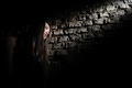
| 09/19/2008 09:28:27 AM |
A Brother, A Guardianby Dr_TotoComment: Beautiful photo... shoehorned a little perhaps, but I think it's a reasonable fit ;)
The shadow on the back is a bit of a shame, and the black at the top/back is a little bit too much... causes the image to be a little unbalance (in my eye). The shallow DOF works well to take the foreground out of the picture (in terms of distractions that is). |
| Photographer found comment helpful. |
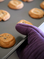
| 09/19/2008 09:24:52 AM |
Just Like Mama Taught Meby beckydiComment: I struggled to see the safety aspect of this at first... then I realised that it was the oven mit... I must be tired. So... extra points for originality. The shallow DOF works for this image, though, I think the colour of the glove doesn't contrast enough with the tray. |
| Photographer found comment helpful. |
| 09/19/2008 09:20:41 AM |
You've Got What???by GolferDDSComment: Nice expression, clear even through the face mask. Unfortunately, the image is OOF, the shadow from the flash is extremely harsh, and the blouse is extremely loud. |
| Photographer found comment helpful. |
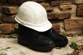
| 09/19/2008 09:18:40 AM |
Hi Ho! Hi Ho!by finman76Comment: Made me chuckle... saw this and thought of a dwarf, and then noticed the title. So, you get bonus marks for that. Where you lose marks is...Boots are too dark... they have no detail. There's too much clutter on the ground around the subject, and the background is also distracting. Might have been worthwhile getting a darker helmet and darker surface on which to rest the boots, which would have allowed you to get more details in the boots without risking over exposing the helmet. |
| Photographer found comment helpful. |
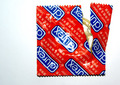
| 09/19/2008 09:13:23 AM |
Packaged Safety Unleashed !by deemunComment: The lighting used here is very harsh, and that combined with the arrangement of the subject make this image very 2 dimensional... might have tried taking it with a light other than the on camera flash, and perhaps from an angle other than from directly above. Also, from a product POV, it would have been better to have the brand name around the right way, or somewhat close to it. |
| Photographer found comment helpful. |
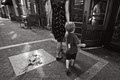
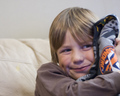
| 09/19/2008 09:09:35 AM |
Saftey Blanketby jdenniqueComment: Cute kid. Shame it's OOF. The composition too is a bit off... the space on the left doesn't add anything to the image, and the stain on the sofa (is it a sofa?) is rather distracting. |
| Photographer found comment helpful. |
Home -
Challenges -
Community -
League -
Photos -
Cameras -
Lenses -
Learn -
Help -
Terms of Use -
Privacy -
Top ^
DPChallenge, and website content and design, Copyright © 2001-2025 Challenging Technologies, LLC.
All digital photo copyrights belong to the photographers and may not be used without permission.
Current Server Time: 08/04/2025 10:05:16 PM EDT.