|
|
|
Showing 641 - 650 of ~1064 |
| Image |
Comment |
| 10/09/2009 02:06:31 AM | vertigoby krnodilComment: Commenting as part of my Team Suck duties...
I had a soft spot for this shot given it shared it's title with that of my first, and only (so far) ribbon photo. It is a beautiful image, but I feel Free Studies are all that kind on abstracts such as this... harsh, but true. As I look at this, trying to find the words for my comment, I feel I was too hard on this... I only gave it a 5 in voting, but as I sit and stare at it, I quite like the simply complexity of it.. sounds odd, but I don't know how else to describe it. Anyway...
How could have you scored better? I don't know that you could have, not at DPC in a FS... this is too different for this crowd. What would I have changed? Nothing really... it's great as it is, it's just under appreciated... even by me when I voted. To answer my own question I asked earlier then, I guess it might have done better if EVERYONE had to sit and contemplate the image to write a half decent comment... unfortunately, I can't see that becoming a requirement at DPC.
So... in conclusion, a beautiful image... just to complex to the average DPC voter to appreciate in the 5-15 seconds most give each photo when voting. Well done... |  Photographer found comment helpful. Photographer found comment helpful. |
| 10/09/2009 01:49:46 AM | Sammy Hagar in Chickenfoot by seeComment: Commenting as part of my Team Suck duties...
I thought this was yours, given your HDR challenge entry and all. This was a better photo, or at least, a better job of processing. Sharp, colours good... composition okay. I might have gone with just Sammy and the drummer, personally, cropping out the guitarist... would have brought more focus on the primary subject and allowed more detail in the image (i.e. get most out of the 720px limit), and would have eliminated the empty space in the middle there. | | Photographer found comment helpful. |
| 10/09/2009 01:43:53 AM | Boyby kashiComment: Commenting as part of my Team Suck duties...
Nice photo... colours are great and it's nice and sharp... handsome young man you have there. How do I (IMHO) think this image could have been better?
The horizon is a distraction... too little to be a feature really. Better to not have had it in the image, or to have had more of it to compliment the composition... perhaps up to the third line. That would have worked well with him on the third line... automatic improvement. So perhaps taking it from a slightly different angle, and or an adjustment of the crop to get that.
Another issue... lighting. Yes, it's harsh natural lighting and not much you can control, and you've done a great job considering... but just a slight rotation to avoid that touch of sun on his right cheek which I'm constantly focusing on.
Last issue... eye contact. For the composition you have here, I think some eye contact may have let the viewer connect with the subject better.
Now... all this is said purely from a technical aspect, and this little boy is a little boy, and having 3 of them myself, I know that getting all these technical ducks in a row would be a minor miracle, and I think what you've managed here given the subject matter is already enough of a minor miracle in itself.
But... hopefully, some of this is useful and helps you score better with the voters. In reality, there's more to life than what the voters think, and you have here a beautiful photo of a beautiful little boy. | | Photographer found comment helpful. |
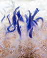
| 10/09/2009 01:28:24 AM | Delicate Poisonby Blue MoonComment: Commenting as part of my Team Suck duties...
A beautiful image. Not an image I'd usually comment on, as there's not much to say really. I love the blue, but the other colours are a bit bland, and the composition is a bit stagnant, perhaps. I gave it a 6 in voting... how could it have scored better? Perhaps something that focused more on the blue parts of the image... a tighter crop perhaps. What do I know... I mean really... who am I to tell you... I guessing really... but that's my best guess. Message edited by author 2009-10-09 01:28:38. | | Photographer found comment helpful. |
| 10/08/2009 07:31:46 PM | End of Summerby vawendyComment: Commenting as part of my Team Suck duties...
Beautiful sunset photo Wendy. I particularly love the clouds and the colours. If I was to pick on this at all, it would be the composition (I guess), in that the shoreline, the horizon and the boat/surfski/kayak/surfboard/? are all at different angles, and the boat/surfski/kayak/surfboard/? breaks the horizon line... I think the later of the two is the bigger issue really, because I think that the image could have worked with a variety of angles if only the horizon wasn't intersected as it is. Also, the plant in the water on the right is a minor distraction, though, I can see that losing that would have lost you the rule of thirds composition (which I like)... tough call. One last thing... horizon is a bit to close to centred... perhaps taking the photo from closer to the ground might have got the horizon lower and separated it from the boat/surfski/kayak/surfboard/?... but I wasn't there and I don't know what you could and couldn't have done here. :)
I hope this is useful feedback and doesn't come across too critical. I really do like this image, but think there was so much potential in it, but for a few minor things. | | Photographer found comment helpful. |
| 10/08/2009 07:15:14 PM | Arkarra Gardensby BrianRComment: Commenting as part of my Team Suck duties...
A beautiful location. The colours have been a bit over done. I've had a few of my photos punished for what's described as an "unnatural sky colour" and I think that's this images greatest issue. Also, the greens are a little over saturated (a bit rich coming from me with my FS this month getting the same critisism). | | Photographer found comment helpful. |
| 10/08/2009 07:08:50 PM | Eye See Youby QuigleyComment: Commenting as part of my Team Suck duties...
This is very a interesting photo, though I think it may have suffered because of all the artifacts (or what appear to be jpg artifacts), that and I don't think abstracts tend to do well in FSs. Composition is great, and it a fascinating concept. | | Photographer found comment helpful. |
| 10/08/2009 07:01:05 PM | Sereneby CharleneComment: Commenting as part of my Team Suck duties...
An excellent photo, and by far my favourite floral entry in the FS. I'm somewhat surprised the this didn't score higher than it did... DPC voters keep us all guessing. Composition is perfect, centre is sharp and you've used the shallow DOF well. Well done. | | Photographer found comment helpful. |
| 10/06/2009 06:27:15 AM | Pilgrimageby IraklisComment: I love the tone and contrast in this image. The building alone would have made a beautiful image, but the addition of the pilgrim is a touch of brilliance which takes this photo from good to great. Well done. | | Photographer found comment helpful. |
| 10/06/2009 06:23:36 AM | | | Photographer found comment helpful. |
|
Showing 641 - 650 of ~1064 |
Home -
Challenges -
Community -
League -
Photos -
Cameras -
Lenses -
Learn -
Help -
Terms of Use -
Privacy -
Top ^
DPChallenge, and website content and design, Copyright © 2001-2025 Challenging Technologies, LLC.
All digital photo copyrights belong to the photographers and may not be used without permission.
Current Server Time: 08/10/2025 06:59:45 AM EDT.
|