| Image |
Comment |
| 06/06/2006 05:03:59 PM |
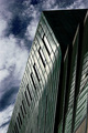
Sky highby TNCameronComment: Critique Club
Really a nice image. I love the lines and how my eye goes from the building straight to the sky. Nice repeat pattern as well. The DOF is nice and the focus is spot on. I like how clouds have a sort of 3D look to them. Very nice colors. The blue is nice to the eye. It almost has an abstract feel to it. The only thing I think you should fix is the noise. It seems there is quite a bit of noise in this image. If that was intentional then I am sorry. Maybe through some sort of sharpening or downsizing you lost some data. But a nice image to look at for sure. |
 Photographer found comment helpful. Photographer found comment helpful. |
| 06/06/2006 02:05:01 PM |
Atlanta Capitalby AriskenComment: Critique Club
Well. There is a lot IMO that can be improved upon here. I think a portrait crop would work great here. As it is now the trees are in the way and the statue takes my attention away from the capital building. The focus sems a little off but you could probably fix that witha slight sharpen. The color in the sky is a nice bright blue that makes the building stand out. I would say with the time that you took it that a tripod and a longer shutter speed would help you. The lighting on the capital shows up good but everything else is very dark. Also the building looks tilted and that probably hurt you more than anything on your score. |
| Photographer found comment helpful. |
| 06/06/2006 01:17:22 PM |
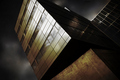
Full of energyby Ragga2000Comment: Critique Club
Very nice image. I like the angle. It is different and that is good. The lighting is great. I see you had 10 second exposure so it must have been fairly dark. The focus and DOF are right on also. I also really like the reflection of the clouds in the windows. Very nice image to look at. There is one thing that I think is wrong with your image though, I think you cropped the top too much or if you didb't crop then I think you should have backed up a little to get the whole building in the shot. It is a different and nice perspective though. Also a very nice score. IMO it is a nice shot that could have scored a little better with just a few minor improvements. Hope this helps. |
| Photographer found comment helpful. |
| 06/02/2006 02:21:27 AM |
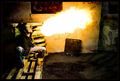
Spitting Fireby kyeboshComment: Critique Club
Very cool image and dengerous. Well it appears you scored very well. I love the colors and the editing in this. Looks as if the fire was the only light you had. Composition is great change nothing. Focus, well you can see some motion blur but I think that adds to your photos rather than takes away from it. The graffiti in the background really adds a lot also. The only problem I see is I think the border takes away from this photo. The black tends to get lost and I think a thin white border would look so much better. |
| Photographer found comment helpful. |
| 06/02/2006 01:16:34 AM |
...Hold Infinity in the palm of your hand, And eternity in an hour. (William Blake - 1757 - 1827)by xianartComment: Critique Club
Man this is a really cool image. I really like what you have done. I think the focus could be a little sharper and the crop a little tigher would greatly improve an already great image. I think this would have scored better if you were to crop more off of the right hand side of the photo. I see some lines just below where the finger meet the hand. That could be a little motion blur. I really wish the pinky finger was not in the way of the viewing of the flame. The red hot charcoal really adds to this also. Nice image IMO. |
| Photographer found comment helpful. |
| 06/02/2006 12:27:19 AM |
Overdressed on a sunny dayby oskarComment: Critique Club
Well I think you just entered this in the wrong challenge. Technicall I would say it is near perfect. The only thing is that it doesn't really speak "heat" to me. Well your DOF is perfect and the focus couldn't be any better on the model. The colors are right on as well. It would have been better if she would have smiled for you. The tight crop really works great here as well. If this were a protrait competition then I would know you would have placed well with this shot. Either way this is one great image to catch on the fly while you are supposed to be doing something else. |
| Photographer found comment helpful. |
| 06/01/2006 11:48:39 PM |
Me, Myself, and Iby nlghttrainComment: Critique Club
Very nice image. I was wondering how you done this. A little play with mirrors. The idea is a great one. However focus seems to be a little off. I would just like to see crisper lines and don't really see anything in real good focus. The lighting is just where it needs to be to give that spooky effect which is what I think you were going after. The tight crop works well also. Also I think it would do better if you were to look at the camera and kinda get that connection with your viewing audience. |
| Photographer found comment helpful. |
| 06/01/2006 11:43:22 PM |
How my children see me...by lauraodomComment: Critique
Well a lot can be done to fix this image IMO. The first thing that pops out at me is the fact that the words are backwards. Obviously you shot this in a mirror. I would suggest like the others that you flip it in your editing program to make them read the right way. I don't really care for the crop as it cuts off your hair. Seems as if you lost something on the upload or during the editing process. Also the finger lines up perfectly with your hair. The background I think I would have left as is because it would fit your title better. Focus and lighting appears to be god though. Just maybe bumped the contrast a little to give the photo some depth. |
| Photographer found comment helpful. |
| 06/01/2006 10:47:03 PM |
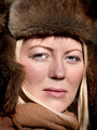
Behind "Blue Eyes"by GivemeashotComment: Critique CLub
I think what hurt you more than the thumb being left in the shot was the fact that there is so much space left around you. I think a lot tighter of a crop would work a ton better. I relly like the blue being left in. The jeans really help this photro. The focus is on the eyes which is great. I also love the color you put there. Really is a nice image. |
| Photographer found comment helpful. |
| 06/01/2006 09:32:17 PM |
Splitby justin_hewlettComment:
Critique Club
Lighting IMO is ok. Perhaps too dark on the left side of your face. And the straight line shadow on your shoulder should go also. However it seems to me that you oversharpened a little too much. all your detail is lost and there is no detail left to see in the hair or eyes which is where you want detail in portrait work. The crop is great. You have a close up view which is what you also go for in portrait work. Nothing cropped out or cut off that shouldn't be. The background is good also for a quick makeshift one. I really like the fact that you left the wrinkles there. If you would have made the background flat then I believe you woud have lost all the depth to this photo. The border was a nice choice. |
| Photographer found comment helpful. |
Home -
Challenges -
Community -
League -
Photos -
Cameras -
Lenses -
Learn -
Help -
Terms of Use -
Privacy -
Top ^
DPChallenge, and website content and design, Copyright © 2001-2025 Challenging Technologies, LLC.
All digital photo copyrights belong to the photographers and may not be used without permission.
Current Server Time: 08/14/2025 04:26:02 PM EDT.