| Image |
Comment |
| 12/29/2006 03:01:18 PM |
Day 28 : Honorby ShaneBlakeComment: I think it is a nice macro shot. YOu can really see the detail in that ribbon. Nice saturation of the colors. Only thing I would do differently and I know it is in a shadow box is to try and eliminate the shadow. |
 Photographer found comment helpful. Photographer found comment helpful. |
| 12/29/2006 09:18:45 AM |
0001.jpgby oscarmeyerComment: I like the image. I think the duotone was a nice choice and the composition is great. My one complaint, I wish it were bigger so I could see more detail. Message edited by author 2006-12-29 09:18:53. |
| Photographer found comment helpful. |
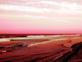
| 12/29/2006 08:42:47 AM |
Fun With a Beachby TCGuruComment: It is a nice photo but my problem is these colors don't look very realistic. I know some prefer this type of style but I would much rather see more real colors. If you leave it like this I think it would look better if the clouds stood out more. |
| Photographer found comment helpful. |
| 12/29/2006 08:38:36 AM |
Barbed wireby DianeSComment: Well this looks like the one with the fewest comments. So I will ad to this. IT is a nice shot but a few things I would suggest. Maybe move the barb to use the rule of thirds and put it toward the left of the image. Now to make this one stand out from the rest I would have had a friend come out with me and stand in the background with a cowboy hat on. Then you would have a silouette behind the barb wire which would add more interest. I know you may not have had a chance to do that but just my suggestion. |
| Photographer found comment helpful. |
| 12/29/2006 08:34:25 AM |
Lindsey, againby tryals15Comment: I love looking at portraits and this one is awesome. I love those eyes. Nice crisp focus and a nice bokeh on the background. That 50mm is a kickin lens. Awesome shot. |
| Photographer found comment helpful. |
| 12/29/2006 08:30:26 AM |
Mother and Sonby pamelasueComment: Only probem I have is her face is slightly obscured by the bush in between you and her. I know you may not have had the chance but I would have moved her closer to her son and used the bush as a natural frame for them. DOF seems a little of. The boys face is in focus and the lady's face is not. I would like it much more if both faces were in focus. You have some good work in your portfolio. Keep it up. |
| Photographer found comment helpful. |
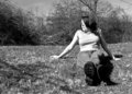
| 12/28/2006 10:38:21 PM |
Distractedby bs-photosComment: I like this shot also. Only thing I would change. I really like to see peoples eyes and think this would be a super image if you were looking at the camera. |
| Photographer found comment helpful. |
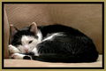
| 12/28/2006 10:32:50 PM |
I'm trying to sleep,. Quit with the flash.by cryingdragonComment: Wel this one caught my eye. Very nice crisp image. That border is a little tacky which is what probably hurt you more than anything. I don;t agree with the comment stating you need more space. I think the crop/comp. is fine how it is. |
| Photographer found comment helpful. |
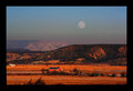
| 12/28/2006 10:28:44 PM |
Dec-moon-rise-(edited).jpgby bvlindalouComment: Beautiful shot. I think if you would have cropped it so the barn was more to the left of the image it would have made a good image a great image. I like it though. The border is a little thick but it doesn't take away from your image. |
| Photographer found comment helpful. |
| 12/28/2006 10:27:28 PM |
In the Dugoutby SquishyBComment: Very nice image. Even though 20th place here is a heck of an achievement I think you could have done better with a little lower angle and showing more of the baseball field and sky. |
| Photographer found comment helpful. |
Home -
Challenges -
Community -
League -
Photos -
Cameras -
Lenses -
Learn -
Help -
Terms of Use -
Privacy -
Top ^
DPChallenge, and website content and design, Copyright © 2001-2025 Challenging Technologies, LLC.
All digital photo copyrights belong to the photographers and may not be used without permission.
Current Server Time: 08/10/2025 05:23:37 AM EDT.