| Image |
Comment |
| 04/22/2006 04:07:08 PM |
Still a Fire Withinby ArtysteComment: This is one of the most wonderful portraits I've seen. What a face on that guy. Great job processing, too. Wow! Also, I know that titles don't mean everything, but this is such a moving title, I can't not mention it. Congratulations on the whole package! |
 Photographer found comment helpful. Photographer found comment helpful. |
| 04/22/2006 04:00:40 PM |
|
| Photographer found comment helpful. |
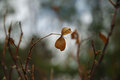
| 04/22/2006 03:56:43 PM |
Leaves of a Roseby AStarWithinComment: Wonder how this would be if it were cropped so the leaves were not dead center? The background helps the leaves and their stem to stand out nicely. |
| Photographer found comment helpful. |
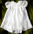
| 04/22/2006 03:51:41 PM |
My Grandmother's Christening gown - 1911by xianartComment: Beautiful dress - what a great heirloom. I'd love to see a soft light on the dress, so the pretty details could come out more. A different background might work, too. The dress is sweet. |
| Photographer found comment helpful. |
| 04/22/2006 03:49:10 PM |
|
| Photographer found comment helpful. |
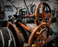
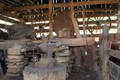
| 04/22/2006 03:44:15 PM |
Blacksmith Shopby dale99Comment: Definitely meets the challenge topic, without a doubt. However, the focus and business detracts from all the interesting stuff this scene has to offer. Keep trying, and keep entering challenges! You've found a nice scene here. |
| Photographer found comment helpful. |
| 04/22/2006 03:42:36 PM |
Another Storm Approachesby sir_bazzComment: Wow, wow, wow - I want to know how you processed this! I would love to be able to make a picture like this, with this light. This inspires me incredibly. |
| Photographer found comment helpful. |
| 04/22/2006 03:40:02 PM |
Used to be someone's loveby timluComment: Beautiful composition. I think the light is either harsh or flat. I'm not that good with this stuff yet to be more specific, but can see that if the light were a little more dramatic or softer, this would be a winner. |
| Photographer found comment helpful. |
| 04/22/2006 03:35:00 PM |
Old School Hi Matic Gby youngnovaComment: This is interesting. At first glance, I thought it looked oversaturated. Now, on closer inspection, it seems extra, but not over saturated - it's kind of cool. The folded cloth with lint (I know the lint comment is picky -sorry!) is a little distracting. Would also like to see equally sharp focus on the camera body text as on the lens text. I like the colors reflected in the lens. |
| Photographer found comment helpful. |
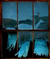
| 04/22/2006 09:25:39 AM |
Blowing in the wind...by CEJComment: This wins the prize for world's most perfect crop! The curtains are wonderful. My eye keeps going up to the chimney reflection in the background though, darn it. The bottom half of this is a 10 for me, top half only a 5 - guess I'll split the difference and give you a 7.5 = 8 :-) |
| Photographer found comment helpful. |
Home -
Challenges -
Community -
League -
Photos -
Cameras -
Lenses -
Learn -
Help -
Terms of Use -
Privacy -
Top ^
DPChallenge, and website content and design, Copyright © 2001-2025 Challenging Technologies, LLC.
All digital photo copyrights belong to the photographers and may not be used without permission.
Current Server Time: 08/13/2025 09:41:12 AM EDT.