| Image |
Comment |
| 02/06/2005 04:20:35 AM |
The Long Crossingby docpjvComment: Really nice. The fact that you've cropped all but the crosswalk and used a fisheye (?) to make the curvature draws my eye to the upper right nicely, and it such a way that it feels the crosswalk never ends. Fantastic b&w balance, too. |
 Photographer found comment helpful. Photographer found comment helpful. |
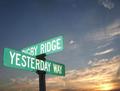
| 02/06/2005 04:18:00 AM |
yesterdaysby sacredspiritComment: Beautiful colors - the D, G, E lack of focus is a little distracting and maybe a little burnt. I I I I think the color balance and composition as a whole are good. |
| Photographer found comment helpful. |
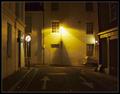
| 02/06/2005 04:14:37 AM |
Choicesby e301Comment: Nice setup - the street lamp adds a lot, and good lighting on the two road signs (especially the 'no right turn') so they're still visible. It's too bad that there's a street lamp over the 'no entry' sign. Good composition / cropping. I think the graininess adds to the image, but would like to see a lilttle more sharpness around the signs - otherwise, I like the soft focus. |
| Photographer found comment helpful. |
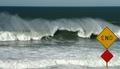
| 02/06/2005 04:10:21 AM |
Says It Allby sfaliceComment: Fantastic wave! This is my favorite so far - the cropping is beautiful and it's great that you managed to get that wave so perfectlly frozen. I like that you didn't show any sand. Perfect colors, too. |
| Photographer found comment helpful. |
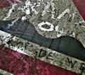
| 02/05/2005 06:38:35 PM |
Bump Mappingby glodaComment: This is confusing for me - I like the colors and lines, but feel frustrated by not being able to figure out what the words say. |
| Photographer found comment helpful. |
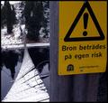
| 02/02/2005 01:02:43 AM |
Tread On Your Own Riskby MonaComment: Haha! What an appropriate warning. The prominence of your sign in the foreground, with the bridge in background focus and showing perspective is really good. |
| Photographer found comment helpful. |
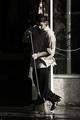
| 02/01/2005 12:50:31 PM |
Another beautiful day at workby mirdonamyComment: Nice color treatment and very cool action candid. I'd like to see a little less shadow on the left, though - but maybe the darker shadows is the way you intended it to be. |
| Photographer found comment helpful. |
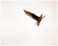
| 02/01/2005 12:46:02 PM |
Lightness of Beingby aznymComment: The title matches the photo perfectly. You've got a nice double meaning here. The shot may have had even more impact had it been in color. |
| Photographer found comment helpful. |
| 02/01/2005 12:44:54 PM |
Source of Lightby mpalitangComment: Nice arrangement. It could've benefited from the light being lit, if that were possible through some legal trick of Photoshop. The photo seems a little "flat" to me, but I like the background color and light you've chosen very much. |
| Photographer found comment helpful. |
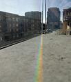
| 02/01/2005 12:42:39 PM |
Found Prism and Concrete Stepby joroComment: I think this prism is awesome. The photo would've benefited from a total crop right down to the apex of the prism, though. You've got it nice and sharp there and the prism is what makes this photo interesting. The buildings don't add any interest (in my opinion) because the glass is dirty and the focus didn't come out too well. But that prism, especially at the apex, is as sharp and beautiful as can be. |
| Photographer found comment helpful. |
Home -
Challenges -
Community -
League -
Photos -
Cameras -
Lenses -
Learn -
Help -
Terms of Use -
Privacy -
Top ^
DPChallenge, and website content and design, Copyright © 2001-2025 Challenging Technologies, LLC.
All digital photo copyrights belong to the photographers and may not be used without permission.
Current Server Time: 08/04/2025 06:10:35 PM EDT.