| Image |
Comment |
| 05/04/2005 05:15:55 PM |
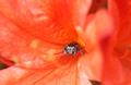
I'm watching you!by BeetleComment: I missed this one in the voting, but would've given it a high score. It's really nice colors and the cutest damn spider ever! |
 Photographer found comment helpful. Photographer found comment helpful. |
| 05/04/2005 05:13:33 PM |
Johnny Guitarby pawdrixComment: I was one of the two who gave this a ten. I didn't realize until now that I read the comments that maybe it wasn't exactly a "minimal" study, but I was (and still am) so taken by the beauty of this shot that I suppose I forgot to think of this challenge's theme. All the same, I would give it the same vote again. The colors, composition, and the idea that in some people's minds, this cool guy might be considered "minimal" <-- but I hope not. Glad you entered this and I wish it had scored higher. |
| Photographer found comment helpful. |
| 05/04/2005 05:06:38 PM |
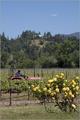
Cultivator revisited.by whagerbaumerComment: This looks really good - what an improvement over the other in colors. I thought the width was nice in the original version, though - maybe you could also try cropping in from the bottom instead of such a sharp crop on the sides (but I like this crop, too - it's just an idea). |
| Photographer found comment helpful. |
| 05/04/2005 04:32:41 PM |
|
| Photographer found comment helpful. |
| 05/02/2005 04:17:05 PM |
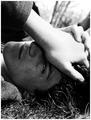
Meloncholyby TranquilComment: I like this shot - it's too bad you didn't enter it in Moods. The hand has some hot spots that distract from the face, which is very expressive. Nice and clear image. |
| Photographer found comment helpful. |
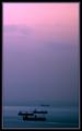
| 04/30/2005 06:29:45 AM |
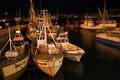
Boats on the Mistby MAKComment: These soft pastel pinks and purples draw my eye right down to the subject. Very well done and nice composition. |
| Photographer found comment helpful. |
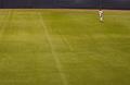
| 04/30/2005 06:28:02 AM |
8by gppacecarComment: Perfect for this challenge. I don't get the title, but I don't vote according to titles :-) The only thing I could wish for this is that the only background was the huge playing field, which would cause the subject to not have his head in the brown and grey of the field's edge. |
| Photographer found comment helpful. |
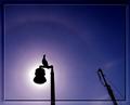
| 04/30/2005 06:25:50 AM |
haloed gullby beafliesComment: I love, love, love the subject and the colors - the only things that distract for me are the border (I like it, but it's a little too strong for my taste) and the crane in the lower left, which takes my eye away from that beautiful sillouhette of bird and lamp. |
| Photographer found comment helpful. |
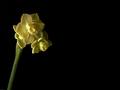
| 04/30/2005 06:23:53 AM |
Narcissus 'Mini Me'by srbrubakerComment: Nice use of negative space, and good color combinations. I'd love to see a little stronger focus on the blooms, especially the big one facing the viewer. I also like the angle of the stem, that it's not perfectly straight up and down. I wonder if people will comment that the subject is not sufficiently minimal - for me, it's on the border, so I am not going to vote this one according to whether the subject is minimal, but on the image itself.
(edit was just to correct a spelling error) Message edited by author 2005-05-04 14:12:11. |
| Photographer found comment helpful. |
| 04/30/2005 06:19:50 AM |
Flightby myceliumComment: I love this image - color saturation, contrast, and sharpness all seem perfect. Fits the challenge nicely, too. The only thing that would improve this is if it could be a huge image - and I know you've used the whole 640 pixels. I'd love to see it at about 900 pixels: I bet it would be beautiful as a print. 9 |
| Photographer found comment helpful. |
Home -
Challenges -
Community -
League -
Photos -
Cameras -
Lenses -
Learn -
Help -
Terms of Use -
Privacy -
Top ^
DPChallenge, and website content and design, Copyright © 2001-2025 Challenging Technologies, LLC.
All digital photo copyrights belong to the photographers and may not be used without permission.
Current Server Time: 08/07/2025 06:56:56 AM EDT.