| Image |
Comment |
| 05/17/2003 07:11:41 PM |
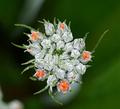
big things, little packageby ellamayComment: Wow! What a striking image - the composition is great - not just your own but the spacing of the buds that happen to have burst open to orange. Your viewpoint is well chosen.
Changes in colour in out of focus backgrounds don't always bother me but the white area at the lower left does. The background also seems rather grainy - perhaps the whole image is but this is less easily noticable in the central area. |
 Photographer found comment helpful. Photographer found comment helpful. |
| 05/17/2003 07:09:03 PM |
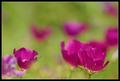
Impressionist canvasby GordonComment: I love this abstract - a cross between a painting and a photo - perhaps leans towards the painting even more than the photo! Great DOF - love the way it reduces the flowers and grass to mere blurs of colour. Only thing I'd change would be to deadhead that flower at the very bottom left!!! ;) |
| Photographer found comment helpful. |
| 05/17/2003 07:07:16 PM |
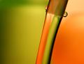
Fluid painting by christoComment: Wonderful - really simply and I love the way the water splits the colours in the background. The two main droplets add further to the strong composition. I also like the graininess in the green, but less so in the orange. Am curious to learn whether it was a deliberate choice (ISO etc) or an artifact of compression. |
| Photographer found comment helpful. |
| 05/17/2003 07:03:13 PM |
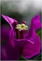
Bunga Kertasby tkonxComment: A lovely image and I like the DOF and composition and the variation of colour in the background. The way the water droplets catch the light is very appealing. I'd like just a touch more light in the lower left area of the flower. |
| Photographer found comment helpful. |
| 05/17/2003 07:01:24 PM |
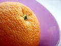
Untitledby jdavisComment: I like the composition here very much and the juxtaposition (oh dear, that's the second time in as many days that I've used that word!!) of the textures of the orange skin and the plate. Lighting on the near side of the orange is a touch dark for my preference. |
| Photographer found comment helpful. |
| 05/17/2003 06:59:24 PM |
Green Water Dropby craigantComment: Great composition, content, lighting and colour however picture quality appears quite poor. |
| Photographer found comment helpful. |
| 05/17/2003 06:58:17 PM |
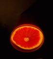
Juicyby ElizaComment: Freaky lighting - I like it a lot!
I would like just a wee bit more black space at the bottom - not much, just a touch. |
| Photographer found comment helpful. |
| 05/16/2003 12:25:35 PM |
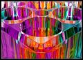
Prism²by crabappl3Comment: Wow! What a striking mix of colours - I love the way in which each colour appears in such random segments. I think the shapes are secondary to the colour here. This works well as an abstract. Because of the way that the shapes are overwhelmed by the colour I think composition is quite hard to appreciate. |
| Photographer found comment helpful. |
| 05/16/2003 10:52:57 AM |
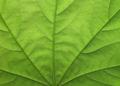
Green Maple Leafby WILDBLUEComment: Lovely detail - I think this would be a good desktop wallpaper or a great postcard. I like the detail of the white veins and the compositional strength of the thick green veins. |
| Photographer found comment helpful. |
| 05/15/2003 02:20:44 PM |
Water Colorsby crabappl3Comment: Ooh this is clever - is the one vase actually yellow and red or did you use some clever lighting or liquid content? I like the even lighting - not too strong or too feeble - brings out the colour of the glass. The composition is nice. The background is a little bland in comparison to the glass and I think the crop at the top feels a little odd - not sure whether it might be better to include a touch more vase necks? |
| Photographer found comment helpful. |
Home -
Challenges -
Community -
League -
Photos -
Cameras -
Lenses -
Learn -
Help -
Terms of Use -
Privacy -
Top ^
DPChallenge, and website content and design, Copyright © 2001-2025 Challenging Technologies, LLC.
All digital photo copyrights belong to the photographers and may not be used without permission.
Current Server Time: 08/20/2025 04:57:29 PM EDT.