| Image |
Comment |
| 01/06/2004 04:51:04 PM |
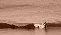
Flowing on a wave of Energyby MadMordegonComment: What an unusual surfing shot - a very different feel from most. I think the strongest element here is the composition - the slightly diagonal line of the wave is very very strong and the position of the surfer cuts is just at the right point. This is a great example of a composition that doesn't use the rule of thirds but works superbly. I like the choice to go black and white but find the tone too pink. |
 Photographer found comment helpful. Photographer found comment helpful. |
| 01/06/2004 04:49:01 PM |
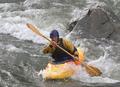
Stompin the Chuteby dan_pendletonComment: Good capture of motion - I like that you've got the canoeist face on and even have some eye contact. I've seen a lot of shots of this sport where that has not been achieved. In this case it helps communicate his determination and concentration. I'd crop a little more tightly at the left but otherwise, I think composition is good, aided by the rock and the diagonal of the oar. |
| Photographer found comment helpful. |
| 01/06/2004 04:47:14 PM |
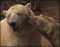
Polar Bear Loveby GolferDDSComment: Aaaaaaaaaaaaaw that's just lovely. This image doesn't necessarily shout "Action" to me - I think "motion" shots can do that more effectively. But this image has undeniably captured an intimate action that was just a moment in time. Composition is strong, close crop works well, background colours complement foreground subjects and I like the reduced colour palette that results. |
| Photographer found comment helpful. |
| 01/06/2004 04:43:53 PM |
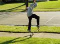
Skating Boarding Actionby Crafty SueComment: Nice motion capture but more attention needs to be paid to background and position of elements in it. In this case I feel that the position of the post on the opposite pavement (UK for sidewalk) interrupts the outline of the skateboarder. I think composition also needs attention - this might work better in portrait and would benefit from additional space at the top to balance that at the bottom and ensure the skater's hand were not chopped off. |
| Photographer found comment helpful. |
| 01/04/2004 04:28:04 PM |
A cold wet winterby NatatorComment: I was drawn to this because I submitted an image with similar subject matter! :o) I really like your use of light and shadow, particularly the inclusion of a large area of negative space. Though the water does add interest my feeling is that fewer larger drops of water might be more visually dynamic. That said, I do like this image very much. |
| Photographer found comment helpful. |
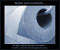
| 12/30/2003 07:07:31 PM |
Respect....by willemComment: Very witty and the image works so well with the message. In terms of the image itself the close up crop, the angle of viewpoint and the colour tone all work well. The balance of text, borders and image also work. |
| Photographer found comment helpful. |
| 12/30/2003 07:04:52 PM |
Key to successby drydocComment: What a clever idea - I like the way the image really is key to the message (no pun intended!). A really unusual idea! Not keen on the font of the word Success - was that already enamelled onto the keyring or added by you? |
| Photographer found comment helpful. |
| 12/30/2003 07:03:29 PM |
|
| Photographer found comment helpful. |
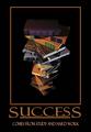
| 12/30/2003 07:02:58 PM |
Successby SonifoComment: Nicely put together - good colour choices for border and text. Not sure I like the perspective/ angle of view on the pile of books. |
| Photographer found comment helpful. |
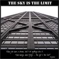
| 12/30/2003 07:00:35 PM |
Sky is the Limitby flip89Comment: Image isn't as strong as it might be though it is an apt choice for the saying. Nicely processed, good borders, text choice, positioning etc. |
| Photographer found comment helpful. |
Home -
Challenges -
Community -
League -
Photos -
Cameras -
Lenses -
Learn -
Help -
Terms of Use -
Privacy -
Top ^
DPChallenge, and website content and design, Copyright © 2001-2025 Challenging Technologies, LLC.
All digital photo copyrights belong to the photographers and may not be used without permission.
Current Server Time: 08/26/2025 05:36:42 AM EDT.