| Image |
Comment |
| 01/29/2004 12:50:31 PM |
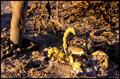
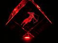
El Alacrán (scorpio)by Evil_MunkyComment: His camouflage colourings mean he doesn't stand out against the drab background, especially because the strong light is creating so many shadows from the rubble and branches. I would also suggest the composition might be better if he were looking into rather than out of the frame. |
 Photographer found comment helpful. Photographer found comment helpful. |
| 01/29/2004 12:49:22 PM |
|
| Photographer found comment helpful. |
| 01/29/2004 12:46:29 PM |
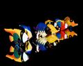
Geminiby Firstrich1Comment: Simple and attractive though i think it lacks a focal point. |
| Photographer found comment helpful. |
| 01/29/2004 12:45:58 PM |
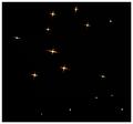
Aquarius - the water carrierby johnmComment: Personally, although I'm happy to accept that your interpretation is as valid as more obvious ones, it certainly doesn't convey the theme to me in any way.
Colour, close up and angle are quite striking. |
| Photographer found comment helpful. |
| 01/29/2004 12:43:11 PM |
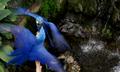
Cancer Charmby ShannonComment: A little too low-key for me. I like the idea of placing the subject in the corner and including a lot of negative space but I find that the subject is too near to the edges of the frame - feels a bit tight to me. |
| Photographer found comment helpful. |
| 01/29/2004 12:42:10 PM |
The Aquarium Water Boy With A Water Ho´sby MundiComment: I don't know if there's some additional message here, perhaps related to the use of rather than in the title but if so, I'm missing it.
I assume the link to challenge here is that this boy swims underwater and that this is is air tank? Not sure it's a strong link to the challenge myself but it's certainly an interpretation.
Interesting use of harsh lighting and black and white treatment - shadows are quite interesting. |
| Photographer found comment helpful. |
| 01/29/2004 12:38:54 PM |
Gemini twins bicker in the house of Aquariusby ccraftComment: I think the concept is better than the execution in this one - though I do like the eye contact with one bird and also the motion blur in the ings. The crop feels a little too tight top and bottom, particularly at the bottom. Whilst I sometimes like the inclusion of background to provide environment and also the off-centred composition, I'm in two minds about it here - I wonder if this image would work best as a close up study of the two birds? |
| Photographer found comment helpful. |
| 01/29/2004 12:36:44 PM |
Fire Signby RgarciaComment: Interesting use of light and colour. The composition, with the four triangles of blackness at each corner of the frame, doesn't work well for me. |
| Photographer found comment helpful. |
| 01/26/2004 03:44:06 AM |
|
| Photographer found comment helpful. |
| 01/26/2004 03:42:42 AM |
|
| Photographer found comment helpful. |
Home -
Challenges -
Community -
League -
Photos -
Cameras -
Lenses -
Learn -
Help -
Terms of Use -
Privacy -
Top ^
DPChallenge, and website content and design, Copyright © 2001-2025 Challenging Technologies, LLC.
All digital photo copyrights belong to the photographers and may not be used without permission.
Current Server Time: 08/26/2025 08:51:48 AM EDT.