| Image |
Comment |
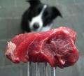
| 02/09/2004 10:43:16 AM |
Temptation by stickylizardComment: I like the unusual viewpoint here - shows such a different perspective. Although the meat gives a wonderful rich colour against the black, white and grey of dog and paving, I don't know that it's the most appealing foreground subject - and I quite like the look and feel of raw meat. Wonder whether a doggie biscuit would have made a good alternative or whether the lack of vibrant colour would have made it too dull? Anyway, this one has certainly made me think about the image. |
 Photographer found comment helpful. Photographer found comment helpful. |
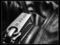
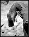
| 02/09/2004 10:40:03 AM |
Overlooking The Parted Tracksby tyt2000Comment: Beautifull composed - I love the angle of the zipper pull and the "topography" of the leather. Black and white really allows the excellent use of lighting to stand out. A great image. |
| Photographer found comment helpful. |
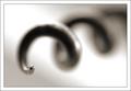
| 02/09/2004 10:36:53 AM |
Cork Screwby JackoComment: Oooooh! Love this! Just wonderfully wonderfully representative of shallow DOF and also a fantastically composed and balanced image. The tip of that screw seems rather oversharpened but I think that actually it might just be that there is a lot of detailed pattern reflected in the surface there rather than smooth colour. I really like this one a lot, and were I someone who felt it worthwhile paying for postage from DPC Prints I'd buy this one.
:oP |
| Photographer found comment helpful. |
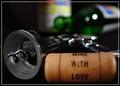
| 02/09/2004 05:54:18 AM |
A "Key" To Good Timesby Russell2566Comment: Responding to your request for comments in the forums:
Actually I'm not going to be so helpful as I would have scored this a 6 or 7.
I like the feel of perspective that you have achieved by going close in to the subjects in the foreground and also by using a low viewpoint. I also really like the low DOF that has resulted.
Another thing I like is the inclusion of the cork text - adds an interesting detail.
I would say that the overall image is quite dark - not badly lit, just in terms of choices of backdrop and subject matter - which may not appeal to a lot of voters.
I'd also add that composition isn't particularly strong or balanced - there is an interesting diagonal from the corkscrew and top right bottle but otherwise the composition feels very random, and doesn't click for me.
|
| Photographer found comment helpful. |
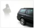
| 02/09/2004 04:46:09 AM |
Capturing Eleganceby KonadorComment: Excellent shot - and I love the pose of you/ your shadow - which is pretty cool since you only took the one shot! |
| Photographer found comment helpful. |
| 02/02/2004 08:13:28 AM |
|
| Photographer found comment helpful. |
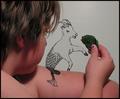
| 02/02/2004 08:12:34 AM |
Capricorn Feeding Timeby leskatausComment: This is soooooooooooooooooo clever! I have never seen an image like this! I'm not sure the image itself is particularly pleasing aesthetically but the content is so fascinating that it compensates! 8 |
| Photographer found comment helpful. |
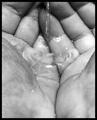
| 02/02/2004 08:12:27 AM |
Water Bearerby sherComment: Great composition - the lines from the folds and edges of the hands and fingers make a great pattern and the water looks great. Lighting seems to be a little brighter in the foreground though perhaps that's because the low DOF blurs away the the shadows in the skin detail in the lower part of the frame. Black and white a good choice. 8 |
| Photographer found comment helpful. |
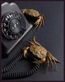
| 02/02/2004 08:12:12 AM |
Cancer - pointless metaphor n°3by jjbeguinComment: Not sure I get the title nor the thought behind the phone but the photo itself really appeals on a visual level. I really like the browns of the crabs against the greys and blacks of the phone and background. Composition really is spot on. 8 |
| Photographer found comment helpful. |
| 02/02/2004 08:12:05 AM |
Iconicby crabappl3Comment: Strong compositional balance, good use of DOF, lighting results in a good contrast between foreground and background without causing any loss in detail in the main subject. 8 |
| Photographer found comment helpful. |
Home -
Challenges -
Community -
League -
Photos -
Cameras -
Lenses -
Learn -
Help -
Terms of Use -
Privacy -
Top ^
DPChallenge, and website content and design, Copyright © 2001-2025 Challenging Technologies, LLC.
All digital photo copyrights belong to the photographers and may not be used without permission.
Current Server Time: 08/26/2025 01:29:38 PM EDT.