| Image |
Comment |
| 08/30/2004 05:53:22 PM |
Go to the ball Cinderella, but be back before midnight!by smokeditorComment: My joint favourite in this challenge. I love the creativity behind this - taking a toy that comes from our rich library fairy tales and then adding something so simple as a sparkler to make it come alive. Simple in thought and brilliant in execution, nice composition, nice vibrancy! |
 Photographer found comment helpful. Photographer found comment helpful. |
| 08/30/2004 12:45:43 PM |
|
| Photographer found comment helpful. |
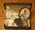
| 08/29/2004 06:16:33 PM |
She is married nowby photomComment: I guess this is a cultural reference that doesn't really ring bells with me - is it a hope chest or hope drawer type thing? I like the arrangement of the still life within the case but the image itself lacks punch - the interest is in the still life not in the image itself. I don't think the vivid flooring works well with the muted colours of the aged items in the case. |
| Photographer found comment helpful. |
| 08/29/2004 11:29:35 AM |
The Ten of Spades?by kyeboshComment: The idea is very clear in this image and it's easy to see how it relates to the challenge theme. The image has a gritty feel to it that comes from the grubby nature of the cards and the dark background. The image is interesting to me in that it does tell a story, but not particularly appealing aesthetically in the sense of my wanting to return to look at it again and again. |
| Photographer found comment helpful. |
| 08/28/2004 06:45:39 PM |
Hope........for a home!by suemackComment: This is a very moving image. I can clearly see the connection the challenge topic. There's such a sad ambiance to this image because one wonders whether the poor animal's hopes for a new home are in vain. The eye contact is the most powerful aspect of the image fo me and I like that none of the wire fence interrupts the main part of his face. The way that the low DOF throws out the fence works well adn IO like the way that the inside of his shelter is completely dark. The way the entrance to it curves in a full arc is a nice contrast to the squares of the fence wire. All round strong composition. |
| Photographer found comment helpful. |
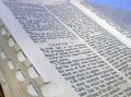
| 08/28/2004 05:48:25 PM |
FAITHby SDWComment: Faith and hope are certainly often very closely related for those who are religious. Given that I am not this image doesn't appeal to me hugely in terms of content. More than that, the image itself isn't aesthetically striking in any way - the angle of the book doesn't seem particularly interesting; I can see a tiny sliver of the surface beneath the book at the left corner and yet because it's so much darker than the main content it pulls my focus to i, the edges of the book are dirty and unattractive; the blue crinkly material at top right doesn't seem to go with the material and adds another colour to the mix. Hope this is of some use and not too negative a criticism. Best of luck. |
| Photographer found comment helpful. |
| 08/28/2004 04:47:01 PM |
Hope for toleranceby nico_blueComment: A stunning image and one that relies on a less-is-more approach. I love that there is so little on display and yet such a strong sense of theme. The negative space really plays a role here. Wonderful.
EDIT to correct typo! Message edited by author 2004-09-01 06:54:08. |
| Photographer found comment helpful. |
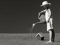
| 08/28/2004 04:44:38 PM |
The Sapling by BradComment: This is another of very few entries that stand out to me as really conveying the theme to the viewer. I like the high contrast approach. The lack of any detail in the background adds a really surreal touch for me because I can't imagine where she could be that there would be nothing whatsoever in the backdrop. Very nice. |
| Photographer found comment helpful. |
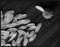
| 08/28/2004 02:04:22 PM |
He loves me.. he loves me not.......by gaurawaComment: One of the best entries... even without the context of the challenge this would instantly evoke a memory of that hopeful question that leads to this well-known game. Slightly dark overall but lovely composition and detail. |
| Photographer found comment helpful. |
| 08/27/2004 05:24:57 PM |
Natashaby photoqwestComment: The darkened area around her looks very odd indeed, I assume it was added afterwards? I don't think it enhances the shot. Could do with some colour touch up to compensate for contrast between tanned and untanned areas. |
| Photographer found comment helpful. |
Home -
Challenges -
Community -
League -
Photos -
Cameras -
Lenses -
Learn -
Help -
Terms of Use -
Privacy -
Top ^
DPChallenge, and website content and design, Copyright © 2001-2025 Challenging Technologies, LLC.
All digital photo copyrights belong to the photographers and may not be used without permission.
Current Server Time: 08/28/2025 09:06:34 AM EDT.