| Image |
Comment |
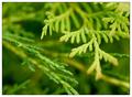
| 09/28/2004 05:10:56 PM |
Natureby KonadorComment: This image has grown on me each time I've viewed it. It's now among my 10 favourites for this challenge.
I really like the simplicity of presentation of a complex subject. The colours are incredibly vibrant. The shallow DOF works very well, especially because I think you've got the plane of focus in exactly the right place. I like the way I can see the detail of the design of this tree in that plane and yet just the shape of it in front of and behind the plane. I think what I'm saying is that I like the way the plane of focus is not the foremost part of the object. Composition works well for me with the curve enclosing the bottom left corner and the other main branch thrusting out from top right to lower right.
Very nice indeed! |
 Photographer found comment helpful. Photographer found comment helpful. |
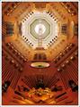
| 09/28/2004 05:08:01 PM |
Hall of Steel by BobsterLobsterComment: Despite having no interest in the steel implements themselves I love the "pattern" of this image. It makes a great geometric abstract and I like the colours, shapes, light and shadows. Not only a great choice of viewpoint but also great composition choice not to centre the ceiling in the frame. One of my 10 favourites in this challenge. |
| Photographer found comment helpful. |
| 09/28/2004 05:06:23 PM |
Intricate Versus Linesby banmornComment: Wonderful composition. I really like how you cut the frame in half diagonally - it echoes the divide between the old and new styles of architecture within this city. I also like the two golden window lines of the new building - they definitely add to the overall pattern for me. This is one of my top 10 for this challenge. |
| Photographer found comment helpful. |
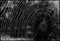
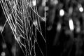
| 09/28/2004 05:04:58 PM |
Nature's Ownby karmatComment: My second favourite spider web image and in my top 10 favourite images in this challenge. I really like the off-centred composition, the high contrast and the strong geometric pattern. |
| Photographer found comment helpful. |
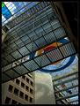
| 09/28/2004 05:03:07 PM |
Finding your wayby jjbeguinComment: An unusual viewpoint plus some great geometric shapes and colours makes this one of my top 10 in this challenge. I like the way that you've taken a fascinating architectural site but created something fresh and new in your view of it. The composition just screams out to me. It feels so dynamic. |
| Photographer found comment helpful. |
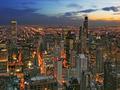
| 09/28/2004 05:01:46 PM |
Second City by kirbicComment: Wonderful!
What depth of detail! The colours and shapes of the buildings and lights are excellent. Feels like I can fly right into it and still see more and more. And a lovely sky to top it all off.
This is one of my top 10 images in this challenge. |
| Photographer found comment helpful. |
| 09/28/2004 04:55:43 PM |
Arachne's Tapestryby AmiYuyComment: One of my top three and certainly my favourite out of the various excellent spider web entries. I expected to like one of the more complete webs more, one of those where the centre of the web was carefully positioned off-centre within the frame and droplets caught the light. But this assymetrical one appealed more. I like the loose composition, the texture of light and shade in the background and the high contrast black and white treatment. Lovely! |
| Photographer found comment helpful. |
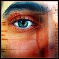
| 09/28/2004 04:53:33 PM |
Photoreceptionby JPRComment: This image fascinates me. I had to think long and hard about my score for it because I really felt I was marking the work of art rather than the photograph itself. I decided in the end that since the main element of the art was a photographic image and that the composition and content of that image appealed strongly that I'd give it a high score anyway. It's one of my favourite three. |
| Photographer found comment helpful. |
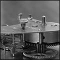
| 09/28/2004 04:51:04 PM |
Clock Worksby gandersComment: This is one of my top 3 images in this challenge and that's nothing to do with your being my hubby.
I really like the way the top plate thingy creates a sweeping and slightly curved line across the image. I like the way the upright thingies create strong verticals to balance that. I like the shallow DOF that throws out the background. I like the repetitive patterns of the cogs, I like the way the light is reflected by the metal but the way I can still see the texture of the surfaces. And I like the conversion to black and white. And the crop. |
| Photographer found comment helpful. |
| 09/28/2004 03:37:20 PM |
|
| Photographer found comment helpful. |
Home -
Challenges -
Community -
League -
Photos -
Cameras -
Lenses -
Learn -
Help -
Terms of Use -
Privacy -
Top ^
DPChallenge, and website content and design, Copyright © 2001-2025 Challenging Technologies, LLC.
All digital photo copyrights belong to the photographers and may not be used without permission.
Current Server Time: 08/28/2025 02:55:15 AM EDT.