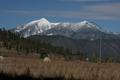
DPChallenge: A Digital Photography Contest You are not logged in. (log in or register
 
Browse Settings
Currently viewing:
Registered UserKavey

Show comments:

Per page:

Order:

Comments:


Comments Made by Kavey
Pages:   ... [217] [218] [219] [220] [221] [222] [223] ... [410]
Showing 2191 - 2200 of ~4095
Image Comment
Secret Garden
11/15/2004 11:35:41 AM
Secret Garden
by Neil

Comment:
What wonderful richness of texture and colour created solely by movement of the camera. You have chosen just the right composition/ distance to the subject to make this work. This is exactly the kind of image I'd buy as a greeting card.
Photographer found comment helpful.
Run, rabbit run
11/15/2004 11:30:30 AM
Run, rabbit run
by arngrimur

Comment:
This is wonderful! Even with all the fluid motion there is still sufficient detail in ears, eye, tail and body shape to really see what one is looking at and yet... such an impression of the fleeting nature of the moment. Just lovely!
Photographer found comment helpful.
Air
11/15/2004 11:28:54 AM
Air
by arngrimur

Comment:
What a lovely study of fluidity and motion. I like the white on white aspect very much.
Photographer found comment helpful.
Falling in November
11/15/2004 06:08:09 AM
Falling in November3rd Place
by Rando D300

Comment:
So glad this ribboned - it's my second favourite in the challenge!
Photographer found comment helpful.
September
11/15/2004 06:01:41 AM
September1st Place
by moodville

Comment:
Woo hoo Moods!
Photographer found comment helpful.
Simply Amazing
11/14/2004 06:00:18 PM
Simply Amazing1st Place
by bruski

Comment:
WAY TO GO, BASIL!
Photographer found comment helpful.
Fender Stratocaster
11/14/2004 04:53:13 PM
Fender Stratocaster
by gudbjargarson

Comment:
Critique Club

Initial thoughts
Nice choice to go black and white, interesting study of small detail area, nice use of shallow DOF.

Composition/ Content
I like the content here very much. Knowing nothing about guitars I would not know what this was without the title (and, to be truthful, still don't entirely know what I'm looking at) but that doen't matter at all. I particurly like the inclusion of the text showing the manufacturer, model and origin of the item. It makes this feel like an attempt to really share with me the details of something precious to someone.
I think the high contrast black and white works very well, especially where the strings show so strongly against the darkness behind. Detail in the texture of the surfaces is also picked out nicely by that high contrast.
Composition is reasonable but doesn't really resonate (no pun intended). The knob at the top centre is what makes it feel a little unbalanced to me. The partial knob in the upper rightof the frame is fine and feels more balanced by the solidity of the text and shadow at the lower left.

Background
I like your decision to spot light only the area being shown to us and leave everything else in dark shadow. It instantly creates a more intimate ambience to the image.

Camera Work - Technical
I'm a big fan of shallow depth of field and I like how it's used here to throw out the foreground text and the furthest knob.

Digital Processing - Technical
Nothing that stands out in terms of the image itself.
Personally Iike the border and find the thin white inner border and thicker black outer border work well with the content of the image.

Fits The Challenge
Yes.

My Opinion On The Photo
I like it very much but would be interested in slightly different angles/ compositions to see if one of those changed it from a "nice" to a "wow".
Photographer found comment helpful.
Fall Mulberry
11/14/2004 04:35:55 PM
Fall Mulberry
by dr rick

Comment:
Critique Club

Composition/ Content
The leaves themselves are pretty, particularly the detail of the veins. However this is offset for me by the lack of any balanced composition and by the post processing.
There is no flow to the arrangement of leaves and no real focal point ΓΆ€“ instead my eye returns to the bright white circle at the top left. You might consider cropping to a landscape orientation by losing about a quarter of the height from the top and losing a little at the bottom (up to, but not touching, the red tip of the largest leaf). To my eye this strengthens composition considerably and allows you to lose that distracting white circle. It also strengthens the diagonal provided by the central vein of that largest leaf as it now comes from the bottom right corner and leads the eye into the centre and towards the other leaves.

Background
Not of huge interest. I'd be interested to see a version where shallower depth of field throws the background out of focus.

Camera Work - Technical
Lighting seems harsh as it has created some glaring reflections from the leaf surface, which I'm not keen on.

Digital Processing - Technical
Whilst I like vibrant colours this image strikes me as rather over saturated and over sharpened, though perhaps that's actually an effect of the harsh lighting?

Fits The Challenge
N/A

My Opinion On The Photo
Whilst the subject matter holds a little interest this composition and treatment doesn't really display that very strongly for me.

As always, this represents a personal opinion and other CC members may feel very differently about the image.
Photographer found comment helpful.
Flagstaff,AZ
11/13/2004 08:03:01 PM
Flagstaff,AZ
by prbetts

Comment:
Critique Club

Composition/ Content
Although the real scene may well be quite sloped, because we can't see all of it, it gives instead the impression of a tilted horizon. I think the image would benefit from a little rotation anti-clockwise.
In terms of content I find this somewhat non-descript. I can see what I'm guessing to be a couple of hay bales (hard to tell), a lamp post and a few poles. None of these hold my interest nor are they positioned in such a way as to create pleasing shapes or lines.
Finding a vantage point which excludes these more mundane objects and perhaps includes instead a more interesting and visually appealing foreground object would strengthen this image considerably.

Background
The mountains at the back are the one element of the image that appeal to me: interesting shapes and lines and nice contrast between dark slopes and snow cover.

Camera Work - Technical
Focus seems OK.
Might be interesting to bring out the rich blue of the sky a little more by using a polarising filter although, of course, you may already have used one to bring an even paler sky to the shade of blue I am looking at?

Digital Processing - Technical
As mentioned, a little rotation might improve the image ΓΆ€“ in particular, the lamp post, being the only straight line, would work better if it were accurately parallel with the edge of the frame.

Fits The Challenge
N/A

My Opinion On The Photo
This strikes me as a scene which is just beautifil when seen in person (we have a much better ability when viewing things in real life to be able to ignore distractions such as lamp posts and so on) but one that just doesn't translate into an image that packs the same punch in 2D.
Main suggestions for improvement on this one would involve searching for alternative vantage points, excluding any elements that don't positively contribute in some way to the composition/ content and searching for a more interesting foreground subject.
Photographer found comment helpful.
September
11/13/2004 08:26:37 AM
September1st Place
by moodville

Comment:
Such an unusual depth of colour to this image. And even at this limited size it somehow conveys more strongly than many landscape photographs a real vastness of scale and also serenity. 8
Photographer found comment helpful.
Pages:   ... [217] [218] [219] [220] [221] [222] [223] ... [410]
Showing 2191 - 2200 of ~4095


Home - Challenges - Community - League - Photos - Cameras - Lenses - Learn - Help - Terms of Use - Privacy - Top ^
DPChallenge, and website content and design, Copyright © 2001-2025 Challenging Technologies, LLC.
All digital photo copyrights belong to the photographers and may not be used without permission.
Current Server Time: 08/27/2025 03:00:17 AM EDT.