DPChallenge: A Digital Photography Contest You are not logged in. (log in or register
 
Browse Settings
Currently viewing:
Registered UserKavey

Show comments:

Per page:

Order:

Comments:


Comments Made by Kavey
Pages:   ... [200] [201] [202] [203] [204] [205] [206] ... [410]
Showing 2021 - 2030 of ~4095
Image Comment
The Players Edge
01/10/2005 12:39:01 PM
The Players Edge
by GolferDDS

Comment:
Would love to hear how you did this and don't mind responses during voting period.
Photographer found comment helpful.
Treble 20
01/10/2005 12:33:50 PM
Treble 20
by Konador

Comment:
I think the idea on this is great! - The colours and shapes in the out of focus area are absolutely key to communicating what it is that we are looking at. There are a few reasons this doesn't score highly with me though and they are generally down to personal taste, though that's the case for all my votes! Firstly I just don't like the luminous colours on this board. I wonder if a traditionally coloured darts board might have appealed to me more? Secondly I am not hugely keen on the centred composition though it is nicely done. Thirdly I feel that the key part of the dart is the pointed tip not the flight so I'm not so keen on having that part of the dart fall into the out of focus area.
I scored this a 5.
Photographer found comment helpful.
Bleak Bokeh
01/10/2005 12:29:14 PM
Bleak Bokeh
by Bear_Music

Comment:
I really like the pattern of the bokeh area on this and the way it sits in a zig zag area between the leaf edges. The abstract pattern of the colours and shapes in that background are quite fascinating. What lets this down for me is the lighting on those leaves - too much shadow for my tastes. If the leaf on the left were lit to show colour as the ones on the right show I think it would balance the composition more strongly. Overall I find the colours a touch too muted though perhaps if there weren't so much shadow that would not be an issue. I voted this a 6.
Photographer found comment helpful.
Dormant Dandilion
01/10/2005 12:25:58 PM
Dormant Dandilion
by crabappl3

Comment:
I like this image a lot but don't know that the blurred areas of the image add that much impact for me or wow me with their aesthetic. Certainly I do think that the shallow DOF background works well for the image and I also like the little bit of detail and reflection on the container but - the shapes and colours of the background don't thrill me. There's also something weird about the luminous nature of the dandelion head - something about the lighting perhaps that looks odd to me. I voted this a 6.
Photographer found comment helpful.
coy
01/06/2005 10:05:14 AM
coy
by dwoolridge

Comment:
I found the other version of the haiku below - I'd initially scribbled it down and lost it and then rewrote by memory.

Here's the original:

long day fades
inner beauty is hidden
as petals clasp

Message edited by author 2005-01-06 10:05:24.
Photographer found comment helpful.
Walk Him Every Day
01/03/2005 01:18:23 PM
Walk Him Every Day
by Konador

Comment:
Yeah right! Bet your mum end's up doing it after the novelty wears off! Gorgeous image - lovely framing, nice use of shallow DOF, lovely light in her eyes... great angle to her head. CUTE!
Photographer found comment helpful.
rush
12/30/2004 06:25:21 PM
rush
by arngrimur

Comment:
What a lovely abstract.
I think I'd prefer the bottom cropped off though!
Photographer found comment helpful.
picture disC
12/30/2004 04:38:26 PM
picture disC
by messerschmitt

Comment:
Critique Club

Composition/ Content
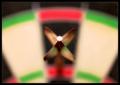
Perhaps this is one of those cases where the decorations looked better in real life than they come across in a photograph? Based purely on what I see in the image my first thought is not "classy". I would say that using the CDs to refract fairy lights is certainly a novel idea and was probably a lot of fun to do.
In terms of the image itself I find it very messy. The composition seems haphapzard ΓΆ€“ no obvious focal point that I can identify ΓΆ€“ and not particularly balanced. Some parts of the image are out of focus (due to the depth of field) but I can't see any rhyme or reason to the decisions made about which bits are in focus and which bits are not. The splashes of colour are spoiled by the strong white reflections which, because of their brightness in a fairly dark image, have more prominence than the subject matter.
Overall the content does not appeal to me either in terms what I am looking at or in terms of the abstract visual of colours and shapes.

Camera Work - Technical
Would recommend attention to lighting, unwanted reflections, depth of field (selecting an aperture deliberately to achieve a desired depth of field and deciding which elements of the image are inside and outside the plane of focus), composition.

Fits The Challenge
Communicating the somewhat loose concept of "classy" is a difficult challenge and, in my opinion, requires a very light hand. In many of the more successful entries I notice a tendency towards simplicity of content, minimalist composition (use of negative space) and limited colour palette.
Whilst "classy" is certainly in the eye of the beholder, this image doesn't strike me as one that would likely convey the concept to many viewers.

My Opinion On The Photo
An interesting idea in the flesh that didn't translate strongly into the photograph.

Photographer found comment helpful.
Smiles
12/22/2004 07:08:29 PM
Smiles
by BAMartin

Comment:
What a sweet candid-style image. I really like the way in which the girl is so relaxed and comfortable and the dog is perched upon her. It clearly shows a bond that is familiar and warm. The choice for black and white is good as it let's the focus remain on the eyes of both rather than on the furniture. Background is reduced in impact by being black and white which is a good thing in my opinion. That said, whilst this is a lovely picture, like most in the challenge, for ME it's one that will always hold more interest for those who know the subjects than it will for strangers.
Photographer found comment helpful.
Highlited X-Ray Frames (office art+multi-image)
12/22/2004 06:07:39 PM
Highlited X-Ray Frames (office art+multi-image)3rd Place
by MrYu

Comment:
Oooh, a tribute to two! Clever!
Photographer found comment helpful.
Pages:   ... [200] [201] [202] [203] [204] [205] [206] ... [410]
Showing 2021 - 2030 of ~4095


Home - Challenges - Community - League - Photos - Cameras - Lenses - Learn - Help - Terms of Use - Privacy - Top ^
DPChallenge, and website content and design, Copyright © 2001-2025 Challenging Technologies, LLC.
All digital photo copyrights belong to the photographers and may not be used without permission.
Current Server Time: 08/26/2025 08:25:51 AM EDT.