Snip & Pressby
Bear_MusicComment: Critique Club
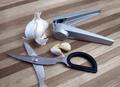
Initial thoughts
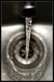
Composition lacks coherence, background conflicts with main content.
Composition/ Content
The content itself seems a strange choice. I like the idea of showing the garlic press and the garlic together but can't quite fathom where the scissors come in. Together they seem a little too random and unconnected.
Compositionally, the layout doesn't feel balanced. There's no flow in terms of natural eye movement around the image; my focus is stuck on the reflection on the garlic press; the lower right area of the frame feels oddly empty even though that corner is no different to the other corners. I think that's all down to the rather random layout.
Whilst I often find it works to crop part of the contents out of the frame it doesn't seem to work here � perhaps because it's only happening to one item and only at one edge of the image.
Coming back to content, I think it's important not only to find subject matter that fits the challenge theme but also to present it in such a way that it's aesthetically appealing or intellectually interesting.
Background
The wooden chopping board that you have used as your background seems at odds with the main content not only in colour but also in texture and in the shapes it provides. I find the strong parallel lines too overpowering for the contents placed on top of them.
Camera Work - Technical
Lighting and focus look OK but there is a patch of the garlic bulb that seems blown out.
Fits The Challenge
Yes.
My Opinion On The Photo
Too much concentration on meeting the challenge and not as much on producing an image that's appealing in it's own right.
EDIT: Corrected typo!
Message edited by author 2005-01-10 13:12:35.