| Image |
Comment |
| 12/29/2004 02:41:02 PM |
|
 Photographer found comment helpful. Photographer found comment helpful. |
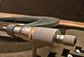
| 12/29/2004 02:26:06 PM |
Hands Requiredby Prime_TimeComment: I feel there's too much negative space at the top. I wish the arc were not tangent to the warm diagonal. The "tabs" lower right are eyetraps for me. Close, but needs fine tuning. |
| Photographer found comment helpful. |
| 12/29/2004 02:21:34 PM |
Stonegroundby Richie23Comment: That somebody found and shot a millstone, one of the more ancient mechanical devices, please me no end. The image itself is muddy and diffuse, to my eye. |
| Photographer found comment helpful. |
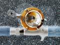
| 12/29/2004 02:20:15 PM |
Baitcaster X-rayby pahlComment: Gonna be fascinating to see how this was pulled off within the rules. Give it an "A" for technical wizardry. I just wish the resultant image pleased me more, but my aesthetic reaction is "heh!". |
| Photographer found comment helpful. |
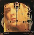
| 12/29/2004 02:17:40 PM |
Clock Faceby MarieWComment: This is creative, but it's not really singing to me. I'm not sure why. |
| Photographer found comment helpful. |
| 12/29/2004 02:15:10 PM |
|
| Photographer found comment helpful. |
| 12/29/2004 02:14:37 PM |
Happy 2005! Peace, Love, Health and Ribbon! by LuxvichComment: This is techincally well-done, but I'm not sure how the stopped motion helps the mechanical theme, besides, we don't use corkscrews on champagne... For these reasons, I rank it somewhat lower than I'd otherwise do. |
| Photographer found comment helpful. |
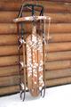
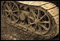
| 12/29/2004 02:12:56 PM |
Cat Traxby bryanbrazilComment: Lovely, massive feel to this, marred by an awkward framing of the key element. we need to see, at least, all of the rear rotor, and arguable some of the track above it. |
| Photographer found comment helpful. |
| 12/29/2004 02:11:27 PM |
Simple Machinesby troyloxComment: Conceptually pleasing. It would rank higher if it had the critical sharpness it's just begging for, and if the lighting were a little softer. I'd also question the very warm chromatics here. I wonder how it would work if the drivers were cool-ble-steel looking and the rest a more desaturated sepiaesque tone? |
| Photographer found comment helpful. |
| 12/29/2004 02:09:36 PM |
Retiredby scrum8Comment: extraordinary positive/negative dialogue; first the BG is UP, then the BG is DOWN, it cycles visually. I wish there were better separation between the teeth and the drak BG stripe. A real sleeper of an image. |
| Photographer found comment helpful. |
Home -
Challenges -
Community -
League -
Photos -
Cameras -
Lenses -
Learn -
Help -
Terms of Use -
Privacy -
Top ^
DPChallenge, and website content and design, Copyright © 2001-2025 Challenging Technologies, LLC.
All digital photo copyrights belong to the photographers and may not be used without permission.
Current Server Time: 08/29/2025 10:06:35 PM EDT.