| Image |
Comment |
| 12/30/2004 03:11:58 PM |
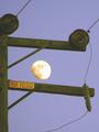
I'm Shocked, Simply SHOCKED!by GeneralEComment: I take it the face is NOT the man in the moon, but the 3 circles? If so, it's not really "facing off" for me. The image usffers from oversharpening on the moon, I think. The haloing is not good here. But it's an appealing image regardless. |
 Photographer found comment helpful. Photographer found comment helpful. |
| 12/30/2004 03:08:37 PM |
|
| Photographer found comment helpful. |
| 12/30/2004 11:39:34 AM |
Pasta by handby pupup33Comment: This is clean work, but nothing sets it apart really. one thing, incidentally, that's totally wrong is the use of dried, commercial pasta as a prop. The tomato, while making for a lovely reflection, is exceeding arbitrary also. If you'd shot this with ribbons of fresh pasta, I'd have bumped it up a point. Alaso, cropping is too tight all sides but right, IMO. |
| Photographer found comment helpful. |
| 12/30/2004 11:36:17 AM |
The mechanics of creating life...a machine-like process.by rmtm333Comment: I am sure there are going to be howls that there is nothing "mechanical" about this image. I am sure the photographer has reasoned backwards and decided that the entire process of creating life is fundamentally mechanical; that's what his title implies. It's an interesting position to take, although I'd argue that "biological processes" may result in "mechanical" objects, but the process is still biological. Regardless, I appreciate the out-of-the-bix thinking here; sheer chutzpah.
As for the image itself? It's nice, but nothing special, pretty standard backlit-pregnant-woman shot. |
| Photographer found comment helpful. |
| 12/30/2004 03:14:16 AM |
Linkedby carotop111Comment: This works way better as thumbnail, where it's quite striking. Suffers only from lack of sharpness on chain, anmd a little blocking of the dark areas. |
| Photographer found comment helpful. |
| 12/30/2004 03:11:03 AM |
Trustworthyby glad2badadComment: I was surprised to see so few hand cutting tools. This is quite appealing, but the tight foreground cropping is unfortunate. you have plenty of extra space up top, doing nothing much. |
| Photographer found comment helpful. |
| 12/30/2004 03:09:52 AM |
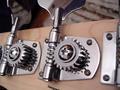
Loud gearsby boleComment: very tich tonalities and lighting. The cropping is cojunter-intuitive to me; that tab on the right doesn't contribute much, the machinery on the left is too truncated. I'd liek to see the rear key rotated a tad so it picks up a little more light. |
| Photographer found comment helpful. |
| 12/30/2004 03:08:13 AM |
A simple tap.by docpjvComment: I wish it had more of a subject/ground dichotomy, the image is not resolving itself visually I think. |
| Photographer found comment helpful. |
| 12/30/2004 03:06:03 AM |
The Unseen Handby SkipComment: Very appealing colors, but I can't pull any sense of order out of this chaos; what am i suppsoed to be looking AT? |
| Photographer found comment helpful. |
| 12/30/2004 03:05:06 AM |
A New Dayby photomComment: needs sharpness and white balance work, to my eye.N icely composed, though. |
| Photographer found comment helpful. |
Home -
Challenges -
Community -
League -
Photos -
Cameras -
Lenses -
Learn -
Help -
Terms of Use -
Privacy -
Top ^
DPChallenge, and website content and design, Copyright © 2001-2025 Challenging Technologies, LLC.
All digital photo copyrights belong to the photographers and may not be used without permission.
Current Server Time: 08/30/2025 02:39:05 AM EDT.