| Image |
Comment |
| 12/31/2004 12:01:22 AM |
|
 Photographer found comment helpful. Photographer found comment helpful. |
| 12/30/2004 11:58:38 PM |
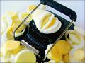
Egg Guillotineby SweetlipsComment: A strong "almost"... It would help if the lighting defined the slices better, and if the cyan overtones were eliminated. |
| Photographer found comment helpful. |
| 12/30/2004 11:56:40 PM |
Tired of numbersby ed-webComment: I like this conceptually. The cropping's way too tight int he foreground, and to my eye the yellow is overpowering the image. |
| Photographer found comment helpful. |
| 12/30/2004 11:55:37 PM |
Gimme Shelterby theysayjumpComment: muddy and fuzzy and green... there's a lot of potential in the object, but the execution needs work. |
| Photographer found comment helpful. |
| 12/30/2004 11:54:45 PM |
Mechanics - Ancient and Rawby IonComment: I love this, except that it lacks sharpness. I like the idea of the human skeletal structure as a mechanical device. others may disagree... |
| Photographer found comment helpful. |
| 12/30/2004 11:53:44 PM |
Magic Pencilby soupComment: a very unusual photo for sure. I'm not entirely comfortable with it in this challenge, because the pencil itself seems almost incidental to the magic it is working, but what do I know? |
| Photographer found comment helpful. |
| 12/30/2004 11:51:09 PM |
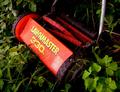
RETIRED MECHANICAL MARVELby kiwinickComment: This is pretty striking to the eye. Would be more so if you could rescue some detail in the trailing roller and the rearmost of the two handle forks. |
| Photographer found comment helpful. |
| 12/30/2004 11:49:53 PM |
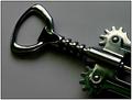
Screwedby MikeOComment: Nice to see a corkscrew on a non-competing background. Shadows too blocked up for my tatstes, though... |
| Photographer found comment helpful. |
| 12/30/2004 11:48:50 PM |
Pop goes the Santa....by HornOUBetComment: This is appealing. It improves ont he other jack-in-the-box in this challenge by emphasizing the crank, which is the direct mechanical tie-in. I sense a slight falloff of sharpness at the top... |
| Photographer found comment helpful. |
| 12/30/2004 11:46:13 PM |
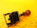
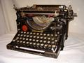
Computer's grandfatherby yomanComment: It's a wonderful object but the lighting and background don't begin to do it justice. As a sidenote, how is a tpewriter the
grandfather" of a computer? Wouldn't that be an adding machine? Or better yet, an abacus? |
| Photographer found comment helpful. |
Home -
Challenges -
Community -
League -
Photos -
Cameras -
Lenses -
Learn -
Help -
Terms of Use -
Privacy -
Top ^
DPChallenge, and website content and design, Copyright © 2001-2025 Challenging Technologies, LLC.
All digital photo copyrights belong to the photographers and may not be used without permission.
Current Server Time: 08/30/2025 08:59:46 AM EDT.