| Image |
Comment |
| 01/10/2005 02:27:53 AM |
|
 Photographer found comment helpful. Photographer found comment helpful. |
| 01/10/2005 02:25:32 AM |
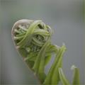
Holding on to lifeby mattrixComment: A delicious, muted, subtle image where the interplay between background and subject is palpable but underplayed. IN my book, a very nice piece of work. May not be artefactual enough to satisfy most voters. |
| Photographer found comment helpful. |
| 01/09/2005 06:40:47 AM |
|
| Photographer found comment helpful. |
| 01/09/2005 06:40:06 AM |
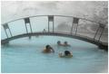
Smile for Daddyby GautiComment: an intriguing image, marred by what seems to me unrealistic use of selective desaturation. The steam, especially, should not be colored, and why is some of the water behind the bridge tinted, but not the rest of it? |
| Photographer found comment helpful. |
| 01/09/2005 06:37:59 AM |
|
| Photographer found comment helpful. |
| 01/09/2005 06:37:27 AM |
Love & Laughby rameviComment: cute and rich, a bit of an overall cyan cast that could be adjusted out |
| Photographer found comment helpful. |
| 01/09/2005 06:35:21 AM |
Snowbodyby LevTComment: more of an abstraction than a candid. zero emotional content. |
| Photographer found comment helpful. |
| 01/09/2005 06:34:04 AM |
Darynby moviemanComment: A striking image/expression. Pity the jacket's in sharper focus than the right eye. Color's a little to cyan, a white-balance problem, easily fixed. |
| Photographer found comment helpful. |
| 01/09/2005 06:32:26 AM |
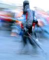
The Short Cutby ColeyComment: A striking image, marred by the artefacts in the sky. Nice control of the dark tones. |
| Photographer found comment helpful. |
| 01/09/2005 06:29:46 AM |
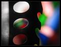
Bubble Boyby megryanComment: A pretty luscious image. I'm not wild about the selective desaturation. Maybe if the red were less agressive it would work better for me. |
| Photographer found comment helpful. |
Home -
Challenges -
Community -
League -
Photos -
Cameras -
Lenses -
Learn -
Help -
Terms of Use -
Privacy -
Top ^
DPChallenge, and website content and design, Copyright © 2001-2025 Challenging Technologies, LLC.
All digital photo copyrights belong to the photographers and may not be used without permission.
Current Server Time: 09/01/2025 09:15:36 PM EDT.