| Image |
Comment |
| 03/31/2005 03:52:35 AM |
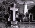
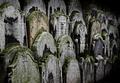
Old & Weatheredby HeavyComment: The two main elements here, the cross and the steeple/chapel, seem too closely juxtaposed to me. Moving sdlightly to the right might open this up a little more comfortably. This would laso help, perhaps, witht he unfortunate overlap of the foreground pedestal witht he background, jalf-round tombstone. There is considerable figure/ground merging where the cross tends to lose its right arm in the tree, the values are so similar. The sky seems unnaturally over-smoothed as well. Finally, I am a little bemused by the unfortunate phallic appearnace of that unusual steeple, but it is what it is I guess... For all of that this is a strong image and should do well. |
 Photographer found comment helpful. Photographer found comment helpful. |
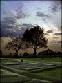
| 03/31/2005 03:47:22 AM |
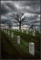
In nomine patris et filii spiritu sancti by sfboatrightComment: This is a very strong image, but certain aspects of it make me uneasy. primary among those are the almost perfectly centered and symmetrical trees, which seem too pat, and a sense of over-smoothing to the image. I can't see offhand any approach to it that woulkd change the compositional aspect favorably, at least not from anywhere close to where you shot from, though. Possibly if you'd moved up one or two ranks in the headstones, the closer tree would be a more dominat element, rather than existing on essentially the same plane as the other two.
Whatever, very skillfuly done and a very strong entry. |
| Photographer found comment helpful. |
| 03/30/2005 04:03:17 AM |
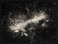
Hidden Beauty - An Unkempt Graveby mocabelaComment: I like this very much. I hope it does well. The tonalities are luscious, the understated nature of it is appealing. I wish the bright grass blades top center were burned way back though, I find them distracting. |
| Photographer found comment helpful. |
| 03/30/2005 03:59:14 AM |
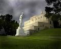
A View Of The Great Mausoleum At Forest Lawnby fulgentComment: In many ways this is just totally outstanding. The juxtaposition of the main elements, however, is not as good as it might be. The aggresive occlusion of the mausoleum by the tree on the right is particularly clumsy-feeling to me, and the statue seems too close to the mausoleum as well, not by a lot, but it's sort of uncomfortable. I think also a little too much foreground... nevertheless, a strong entry and should do well. |
| Photographer found comment helpful. |
| 03/30/2005 03:56:25 AM |
|
| Photographer found comment helpful. |
| 03/30/2005 03:55:44 AM |
Ash Wednesdayby e301Comment: Really strong and eerie, it leaves so many unanswered questions in my mind... |
| Photographer found comment helpful. |
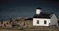
| 03/30/2005 03:53:16 AM |
A small churchyardby hvellurComment: I like this very much. I'd like it more if the building were aligned properly to the vertical, and if it were a little sharper. |
| Photographer found comment helpful. |
| 03/30/2005 03:52:12 AM |
Three Generalsby karmatComment: I find this curiously appealing. I think I'd find it even more so if the toning were other than this weak burgundy. My first reaction tot he overall tonal range was that it was too flat, needed some more contrast, but now I'm wavering on that. |
| Photographer found comment helpful. |
| 03/30/2005 03:50:44 AM |
|
| Photographer found comment helpful. |
| 03/30/2005 03:49:59 AM |
In Living Colorby grigrigirlComment: This is profoundly strange. Highly artificial and wildly creative. The use of neatimage isinteresting and effective; or whatever other means you used to get that effect. This is a shot that is staged in a graveyard but really is not "about" graveyards. That alone sets it apart. |
| Photographer found comment helpful. |
Home -
Challenges -
Community -
League -
Photos -
Cameras -
Lenses -
Learn -
Help -
Terms of Use -
Privacy -
Top ^
DPChallenge, and website content and design, Copyright © 2001-2025 Challenging Technologies, LLC.
All digital photo copyrights belong to the photographers and may not be used without permission.
Current Server Time: 06/24/2025 01:30:57 AM EDT.