| Image |
Comment |
| 11/15/2005 04:50:23 AM |
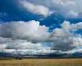
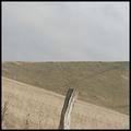
Season's Endby cools98Comment: This looks like the Southern Alps of New Zealand. Wherever it is, it's a terrific image. I love the fact that relegation of the 'land' part of the landscape to the bottom 20% of the frame actually makes it look even more spectacular. It emphasises the wonderful depth of the scene. Nice work. 7 |
 Photographer found comment helpful. Photographer found comment helpful. |
| 11/15/2005 02:14:20 AM |
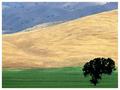
Aloneby bernmayComment: Terrific. An elegant, flag-like composition where each element plays a critical role, and nothing is superfluous. A nice example of vision too, because this landscape would not have looked like this from anywhere but right here. 9. |
| Photographer found comment helpful. |
| 11/15/2005 02:10:00 AM |
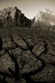
Desert Skinby crabappl3Comment: My favourite landscape in the challenge. I'm surprised to see it in B&W, given the colours that must have been there. Surprised, but not at all disappointed; this treatment allows the viewer to give due attention to the astonishing tone and texture of the thing. Absolutely absorbing image, beautifully composed and presented. 10. |
| Photographer found comment helpful. |
| 11/15/2005 02:01:44 AM |
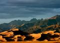
Xanadu by SammieComment: "Where Alph, the sacred river, ran
Through caverns measureless to man ..."
It's a lovely depiction of Xanadu and a striking landscape. The light and the textures are dramatic and memorable; I could recall how this image made me feel even after viewing a couple of hundred others, most of which I mercifully forgot in seconds. 10. |
| Photographer found comment helpful. |
| 11/15/2005 01:52:14 AM |
Smoulderingby GertComment: This is a very fine landscape image. It has a mystical quality about it that is helped by the presumably deliberately low contrast processing. I also applaud the title; it dares the viewer to think figuratively about the nature of the subject. That's always a good thing. 9 |
| Photographer found comment helpful. |
| 11/15/2005 01:48:23 AM |
Landscape with sheepsby RasmusComment: Very bold, and very good. The composition is refreshing. I love the diagonal sheep path intersecting with the foreground ridge line. Also the muted colours. So good to see such original thinking on the subject of landscape. 8 |
| Photographer found comment helpful. |
| 11/14/2005 06:01:50 PM |
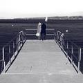
Impasseby aznymComment: Well, X, I confess I gave this only 6. For the first time ever, I reacted to a border (I usually think all this 'distracting border' crap is like dismissing a book because you don't like the typeface). But this border somehow prevented me from getting inside the image. So I took the easy way out (6) and moved on. But when later I saw tributes from JPR & goodman, I figured I'd better take another look ... there was obviously more there than I'd seen. It's not that I dislike wide borders, by the way; I love this and especially this, for example. But I did trip over this particular border. So I did something I've never done before; I copied the image. Then I changed the black border for white (same size). For me, the photograph was transformed. It went from being a nice picture to a totally absorbing work. Now I could get in there and roam about, happy as a sandboy. I'm not suggesting you should have used a white border, by the way; I figure this is my failing, not yours. After all, Lesley & Jason apparently had no trouble. I just thought you might be interested in a Philistine's view. Oh, and I did NOT save the white border version ... it's gone forever. Cheers, Paul. |
| Photographer found comment helpful. |
| 11/14/2005 06:03:33 AM |
Drugs, Alcohol.......Dead End...!!by philupComment: G'day Phillip, from the Down Under Chapter of the Critique Club.
The idea is not perhaps all that original, but I think you & Randy have done a pretty good job on it. It's true that the degradation and despair of drug/alcohol abuse is never more graphically portrayed than in the toilet. The juxtaposition of the two (drugs & toilets) has such strong allegorical appeal as well, especially to the sort of people who design anti-drug public service promotions. They would imagine this image would be a very effective poster in such a campaign.
I can't agree with the commentator who suggested it was somehow overprocessed. I think the raw and harsh feel you have established is just right for the subject & location ... it even captures the unlovely, morgue look typical of public toilet flourescent lighting. It's not supposed to be pretty.
I also applaud your chosen point-of-view, which is 'human'. In other words, you've presented the scene just as it would appear to a person walking in and finding this loser (sorry Randy) passed out in the stall. It's more in keeping with the 'documentary' photograph impact that you were obviously after. So I think all the technical aspects of the photograph are just fine; everything is consistent with the position you were taking ... this is no time for elaborately artistic composition or processing effects.
My only reservation about the image as a cautionary device against alcohol & drug abuse is that this is not what most abusers look like and behave like. They'd never pass out in the john. They look and behave just like me. This image has little potential to influence them, because they don't identify with it. Of course, all that is beside the point for you; you were just entering a photo contest, not trying to change the world! And your image was deservedly given a pretty decent score by the DPC voters. Nice work.
Paul. Message edited by author 2005-11-14 06:05:26. |
| Photographer found comment helpful. |
| 11/13/2005 01:02:10 AM |
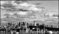
NYC from a bus windowby puzzledComment: This is a terrific B&W photograph! It's really well processed, too ... great contrast & beautiful rich depth of tone. I especially like the five ... what are they, chimneys? The ones all lined up from left to centre. They remind me a little of a Monty Python scene ... I expect Queen Victoria to spurt out of one of them at any moment. However, please feel free to disregard my Python fantasies. It's a view of NYC skyline I haven't seen before, and I like it. |
| Photographer found comment helpful. |
| 11/12/2005 09:23:45 PM |
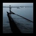
Dead Endby jjbeguinComment: Love the story told by the body language of the two people; despair and comfort (but she looks prepared to abandon him if necessary). I wanted to score it higher, but for me the faded blue tonings seem to rob it of some of its potential impact. 7 |
| Photographer found comment helpful. |
Home -
Challenges -
Community -
League -
Photos -
Cameras -
Lenses -
Learn -
Help -
Terms of Use -
Privacy -
Top ^
DPChallenge, and website content and design, Copyright © 2001-2025 Challenging Technologies, LLC.
All digital photo copyrights belong to the photographers and may not be used without permission.
Current Server Time: 08/16/2025 12:26:47 PM EDT.