| Image |
Comment |
| 12/24/2005 03:55:31 AM |
Isolatedby bryanbrazilComment: This will be very popular. It's a nice photo of the subject, and the depth of field has removed all possible distractions. That will be widely admired by the voters, as will the droplet of water.
I prefer those images that employ depth of field to some more ambitious artistic purpose, but that's just me. 6. |
 Photographer found comment helpful. Photographer found comment helpful. |
| 12/24/2005 03:45:14 AM |
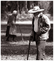
As life goes byby patrinusComment: My first choice in this challenge. The critical thing here is that you have used the depth of field to enhance both the look AND the meaning of your photograph, a possibility that does not appear to have occurred to those who decided that depth of field WAS the subject! Any image of an old person shuffling by with the aid of a stick is likely to be worthy and thought-provoking in itself, but this image, which includes the old lady as the perfect reciprocal of the old man, is by comparison laden with possibilities for deeper meaning. And of course the use of a shallow depth of field both literally AND figuratively isolates the two subjects from each other, leaving each to plot a lonely course, which presumably is the artistic point of the image. It's a thoughtful, confident yet quiet image. Such a welcome change. Bravo! 10. |
| Photographer found comment helpful. |
| 12/24/2005 03:14:00 AM |
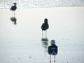
Distanceby ZigomarComment: What I like about this is that the out-of-focus elements of the photograph have a definite purpose; although those two gulls are visually subordinated to the leading gull, he would be diminished without their essential supporting performances. And that's what I feel this challenge is really about ... using shallow depth of field to take some sort of artistic position about your subject. Plus it's a very unusual but interesting and challenging composition. 8. |
| Photographer found comment helpful. |
| 12/24/2005 03:06:50 AM |
Dew dropby sangeethComment: This will score very high, I expect. However, I'm prepared to be unpopular and suggest that the employment of depth of field achieves little more here than would holding a bit of contrasting paper behind the subject. I mean the out-of-focus background has no contextual purpose. It is a technically proficient photograph, and the falling drop of course provides just the wow factor required for DPC success. It's just that I feel you've used depth of field as a drunk uses a lamp post ... for support, rather than for illumination. 6. |
| Photographer found comment helpful. |
| 12/24/2005 02:53:38 AM |
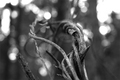
writhingby dunnewoldComment: Effective use of depth of field for two purposes. First, to isolate an essential aspect of the subject. Second, to establish a contextual mood that complements the statement you're making about that subject. A very nice, sophisticated work. Hope it doesn't get overlooked in favour of the merely pretty. 8. |
| Photographer found comment helpful. |
| 12/24/2005 02:48:09 AM |
les pommesby msieglerfrComment: Very clever to use the yellow/green apple as the in-focus subject, and the reds as the out-of-focus. The depth of field is employed with assurance and purpose here, but the beautiful composition and lighting should not be overlooked as well. Very nice photograph. 8. |
| Photographer found comment helpful. |
| 12/20/2005 09:05:06 PM |
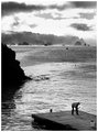
A Livingby JPRComment: Philosophers.
"We build because we must...
....or an angel's wings
Robert Ward
(bear_music)
Very fine tribute, bear. In a style reminiscent of Herman Melville's forecastle philosophising, and worthy of that comparison, too! |
| Photographer found comment helpful. |
| 12/13/2005 11:46:06 PM |
sixby dragonladyComment: Greetings from the Dead Critics Society!
There is much to like about this photograph. It's a very absorbing study of tone and shape, and the minimalist lighting was well chosen to accentuate those two qualities of the subject - tone and form. Several commentators endorsed your achievement in that respect.
Another comment, perhaps the most interesting and perceptive of all, applauded the "misleading" nature of the effect you have achieved. By this she clearly meant that the subject forks were presented in a way that disguised their identity, at least at first glance, but which instead revealed something important about their true nature or "personality" ... i.e. their clean, elegant lines, especially when seen as a group.
There are several things you have done to accomplish that in addition to the lighting; there's the top-and-tail arrangement of the forks, the cropping to exclude the tips and handles, and the rotation of the image to provide a less familiar viewpoint.
The result is two things. First, ambiguity. Ambiguity is always good in an artwork, because it forces into gear the brain of even the most lazy of viewers (well, maybe not literally the most lazy, otherwise this would have appeared on the first page of the challenge results). Second, it reveals and celebrates an essential quality of the subject that we would probably have overlooked had it been instantly apparent that we were just looking at half a dozen forks. My first guess, if I were seeing this image without the context of the challenge topic, would have been some kind of fine glassware.
Possibly a greater depth of field may have satisfied those viewers who need to see everything in focus to avoid 'distraction'. It may even have thereby resulted in a higher score for this thoughtful image, but I'm not sure that would have added anything to the considerable artistic merits of your work.
And that's the point of my critique. Those photographic pedants with elaborate equipment and perfect technique may feel they could take a better photograph of forks. But what they would be failing to understand is that yours is a photograph about forks. |
| Photographer found comment helpful. |
| 12/12/2005 08:40:06 PM |
Eye for Colours by librodoComment: Originally posted by jsas:
He must not have kids. |
Of course he doesn't have kids ... look at his profile, read his comments; he is a kid. |
| Photographer found comment helpful. |
| 12/08/2005 03:58:49 PM |
|
| Photographer found comment helpful. |
Home -
Challenges -
Community -
League -
Photos -
Cameras -
Lenses -
Learn -
Help -
Terms of Use -
Privacy -
Top ^
DPChallenge, and website content and design, Copyright © 2001-2025 Challenging Technologies, LLC.
All digital photo copyrights belong to the photographers and may not be used without permission.
Current Server Time: 08/16/2025 07:10:19 PM EDT.