Starlight Expressby
NatashaComment: ~~~~Critique Club Comment~~~~
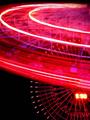
Composition (content)
A great idea to include the two different wheels. The big (famous) one in the back and this smaller one at a different angle in the foreground.
The composition is not optimal in my personal opinion, I'd have liked to see the heart of the rear wheel a bit lower and a bit more to the left, also to fill the black gap in the lower left corner. I don't know if that was possible and to still get a good shooting angle for the foreground wheel.
The angle at which you have shot the foreground wheel is quite interesting. The eye is fooled though. Because you used a relative fast shutterspeed the wheel's lights in the upper part of your picture makes you feel that the wheel moves at very high speed (the light trails look like a Le Mans 24h race car cornering a tight bumpy lefthander at 140 mph). By using the flash, you have also frozen the wheel, I like that. Crack crack goes the brain. So that is a nice contrast in motion you portray there.
However, the way the lights are captured in the upper part of your image doesn't look so nice (on the other hand it does show the motion and gives the high-speed car in a bumpy corner feel). A 1 second shutterspeed would probably have made the lines of the lights connect, taking away the black streaks in between. On the other hand, the 1/2 second was already enough to almost blow out the clock on the big wheel.
I would have to see both the 1s and 1/2 second to determine what
I would prefer.
Color is nice, but a bit monotone in the foreground/background relation. Ask the guys who run the wheels to use another color for the background one, blue or green. ;-)))
You could also try a tighter crop. Take off a piece of the bottom to just under the first or the second outer rim light on the background wheel.
Background
Big wheel in the background is slightly underexposed (except for the clock) and slightly blurred by the small aperture. This has the advantage that the viewer's focus quicly transfers to the foreground wheel. The clock is a bit distracting.
Now that I am thinking about it, how would this picture look just after sundown, when there is more light in the sky to give an extra touch to the background and better exposure for the background wheel.
From what side is this shot? Are we looking at the office buildings / mount Fuji side or at the bay rollercoaster side?
Camera Work (Technical)
No further comments. Focus and sharpness look good.
Digital Processing (technical)
For images with many sharp edges and small details it is important to save the image at the highest quality allowed on this site: 150kb
A higher jpeg quality saves edge sharpness, gives better color rendition and avoids jpeg cluttering of details.
Yours is only 80kb......
Not further comments.
My opinion
I like it, but I think the background could be better. It was a great idea to have both motion blur and to freeze it. I gives that extra touch that makes this picture different from normal motion blurred wheels.
One other note:
You are building up quite a collection of portrayal of Japanese (Tokio Bay area) live, country and culture here at dpc. Nice work!
Message edited by author 2002-12-23 10:04:27.