| Image |
Comment |
| 01/13/2003 04:51:04 PM |
Someone Pass the Tagametby TurbotechComment: Hi Turbo,
Interesting effect from the flash, the 602 really seems to benefit from them. I like it how the background provided enough bounce to prevent hard shadows. Something to keep in my mind. :)
And the orange screems at you. Would make me laugh in the humor challenge as well. ;)
One other note, the image isn't level / the horizon isn't straight. When you have photoshop you could set the ruler on one of the straight lines (follow the tilt) and then go to Rotation, Arbitrary to get the horizon straight really easy. |
 Photographer found comment helpful. Photographer found comment helpful. |
| 01/13/2003 04:43:39 PM |
Stranger in Candy Landby karmatComment: ~~~~Critique Club Comment~~~~
Composition (content)
I think this is too "set up", the big black hole between the "Squares" and the "Chicklets" gives it away too much. Another angle, more from above might have given a better, more complete, less obvious view. The shelf suggestion of Indigo is a good one. Another interesting idea is to put it in a sea of M&M's and paint a M&M logo on the tomato. The red M&M color almost matches the tomato's.
The "Kisses" produced a lot of nasty glare and are very dominant in the image.
Good lighting, no nasty shadows.
Background
See composition.
Camera Work (Technical)
Good exposure, but the foreground is a bit soft. Was this from close by? If so, try to stand back and zoom in to create a larger field of focus (increase the DOF at F8). The focus is good.
Digital Processing (technical)
It looks a bit oversharpend to me, a lot of jaggies around the curves of the M&M's and all the letters on the packages in the background. Colors are very good.
The jpeg quality can be a level higher as you have some room for a higher filesize. Stronger compression enhances the sharpening jaggies.
My opinion
The concept has some interesting potential, but as it shows too much that it is a setup. I don't have problems with setups. |
| Photographer found comment helpful. |
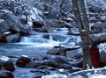
| 01/13/2003 04:21:16 PM |
WINTER by Tori Amosby indigo997Comment: ~~~~Critique Club Comment~~~~
Composition (content)
Nice composition. The tree and the person add depth and scale. The most striking part of the stream is in a nice position in the frame and it runs to frame well. The crop as it is, shows its natural surroundings. The blue cast adds cold.
Good choice of aperture and shutterspeed. The whole scene is interesting, so it benefits from a large depth of focus. The .3s shutter gave a nice flow motion blur to the water, a silky touch.
I get the feeling that the image is slightly tilted to the right tough.
It would have been nice when the lady in red would have looked at the stream, instead of the rock. The red of her coat adds some color, which is nice in my opinion.
Background
The snowy treebranches hold very little detail at this resolution, not a problem as it transfers the focus to the right side of the frame.
Camera Work (Technical)
See comments at composition. Exposure is ok, it tends to a little bit of underexposure, but that enhances the darker feeling of winter. No problem. Focus and sharpness seem to be ok (it looks like it is sharpened / USM'd in the digital processing as well). I wonder how a bit softer looks.
Digital Processing (technical)
No further comments.
My opinion
Perhaps it sound stupid, but I like the lower half the most. At this resolution the upper half looks busy and clutterd, I am sure it balances out at a higher resolution. Nice work, deserved to score this high. |
| Photographer found comment helpful. |
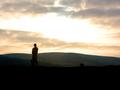
| 01/13/2003 02:21:45 PM |
It's too noiseyby PaulkComment: But the composition is pretty good. I like the human element, it creates depth and scale. |
| Photographer found comment helpful. |
| 01/10/2003 06:02:12 PM |
I Shadowby crabappl3Comment: Just a quick comment (read the cc forum).
The image is a bit on the soft side, I personally don't like that much. The lighting of the body is okish, but the differences in lighting of the face are a bit too big, the right side is fine, but the left side has shadows that don't look nice. Combined with the facial expression it looks (on the left) like someone who has been hit on the eye or didn't get much rest in her sleep.
The face and body language say "bored", don't like that. (scored it a 6) Message edited by author 2003-01-10 19:22:31. |
| Photographer found comment helpful. |
| 01/09/2003 04:57:02 PM |
Bird's Head Southby crabappl3Comment: Originally posted by DougPaz:
I hadn't noticed the bird outline until I read your note. |
Hey, didn't see it either. Very cool! (adds shot to favs)
|
| Photographer found comment helpful. |
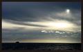
| 01/07/2003 03:14:33 PM |
Here Comes The Sunby jimmythefishComment: This is a very powerful picture. You could argue that it is empty, but I think that is nonsense in this case.
"Here comes the sun", well, it really shows that. The bright spot in the dramatic sky and the wonderful effect on the mist/haze is great. The sun also povides beatiful background detail without spoiling the image, the clouds over the mountains very nice.
The boat is a nice touch, provides frontal horizon filling and above all a scale to aprreciate the 'greatness' of the sun.
|
| Photographer found comment helpful. |
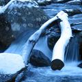
| 01/07/2003 03:05:00 PM |
Iceby lumbusComment: Nice flowing motion, and the glare on the branche is just enough to show the layer of ice. Blue is pretty dominant in this image, seems to create the right mood (cold). |
| Photographer found comment helpful. |
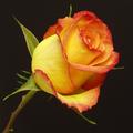
| 01/07/2003 03:00:53 PM |
The Roseby autoolComment: Excellent macro!!
Love the lighting and colors. Good choice of aperture, depth of focus from one side to the other. Nice composition, good crop, very good exposure, good detail.
|
| Photographer found comment helpful. |
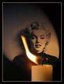
| 01/07/2003 02:50:56 PM |
Candle in the Windby Harz_JoergComment: Ace, love the composition. The portrait of MM in the background makes this the best candle in the wind shot. I rate it high (yep vote high) on the composition alone. The candle in the foreground is a bit to soft, but that could well be an aperture decision to allow a fast enough shutter for the blown away flame. I like the lighting of the portrait. The frame is also in balance with the pic itself.
Looking at MM herself, I like the left side of her face the most. :) |
| Photographer found comment helpful. |
Home -
Challenges -
Community -
League -
Photos -
Cameras -
Lenses -
Learn -
Help -
Terms of Use -
Privacy -
Top ^
DPChallenge, and website content and design, Copyright © 2001-2025 Challenging Technologies, LLC.
All digital photo copyrights belong to the photographers and may not be used without permission.
Current Server Time: 09/04/2025 01:55:56 PM EDT.