| Image |
Comment |
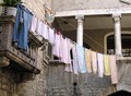
| 07/24/2006 09:45:04 AM |
Linesby sigrun_thComment: This is a cool shot. Nice texture and tones. Did you consider cropping top and right out some, leaving just the left steps, the round circle, and most of the inside rounded wall? I ask because the area behind the wrought-iron fence is distracting. I imagine you wanted to include the fence because it has lines as well, but the composition could have been stronger without it. It would have also moved the flower circle off-center some. JMO of course. ;^) |
 Photographer found comment helpful. Photographer found comment helpful. |
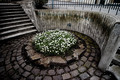
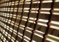
| 07/24/2006 09:38:03 AM |
Linesby MichaelsComment: This is a great catch! Demonstrates multiple line sets, yet is interesting to look at. |
| Photographer found comment helpful. |
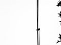
| 07/24/2006 09:36:09 AM |
Bird On A Wireby mrezaComment: Haven't decided if the leaves add or distract. Guess if it's made me think about this long, it's a good thing. ;^) Interesting take on the challenge. Good luck. |
| Photographer found comment helpful. |
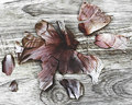
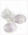
| 07/24/2006 07:44:59 AM |
Onion on Woodby posthumousComment: Just wanted to say that I really enjoyed your take on this challenge. Very unique image with wonderful tone and texture. I had meant to comment earlier but never got back to it. I gave this a 9 and I'm pretty stingy on those. ;^) Congrat's on your top 20 finish! |
| Photographer found comment helpful. |
| 07/21/2006 03:27:29 PM |
Linesby cuspieComment: From the thumbnail I found this more interesting to look at than after seeing it full-sized. Nothing personal. The DOF is a bit shallow and the image itself is too soft (blurry). Did you use a tripod for this?
Great idea, just off a tad on the execution. Best of luck to you in the challenge. |
| Photographer found comment helpful. |
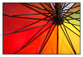
| 07/21/2006 03:25:32 PM |
umbrella linesby super-daveComment: This is a nice take on the challenge theme. Good composition by positioning the hub off-center. COlors are strong. Some noise in the top areas of the image, but nothing overly critical. Good luck. |
| Photographer found comment helpful. |
| 07/21/2006 03:24:16 PM |
Fun for a Girl or a Boy!by BakerBugComment: Bright and cheerful image. Should do fine with this one. I wish there wasn't quite so much red showing in the top left corner. Did you try a little lower angle for a more dramatic impact? Just a thought...this looks pretty good too! ;^) Good luck in the challenge. |
| Photographer found comment helpful. |
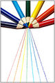
| 07/21/2006 03:22:17 PM |
Untitledby Buckeye_FanComment: Quite clever. This image works very well for the challenge. Couple of minor items: would have been nice if the white bg could have stayed clean except for the drawn lines, and the lighting is a little harsh on the pencils - did you try to diffuse the lighting some?
Anyway...good luck in the challenge. |
| Photographer found comment helpful. |
| 07/21/2006 11:45:00 AM |
Subtle Flavorby FirstyComment: Going for a high-key approach? Good concept overall. I'm not sure how this is going to go over with voters given that highly saturated colors are the current fashion, and this is rather toned-down and flat. I find the selection of the onion area and the distinct line with the white background a little distracting. I think the onions should have been selected a little tighter, or maybe feather the selection more, or even use levels/curves more to bring the white up instead. JMO of course. Good luck. |
| Photographer found comment helpful. |
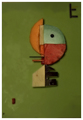
| 07/21/2006 11:39:05 AM |
Kitchen Kandinskyby sibelingComment: Don't have any idea what a 'Kandinsky' is, but your image is fun to look at. Lighting seems a bit off, like the image is underexposed. |
| Photographer found comment helpful. |
Home -
Challenges -
Community -
League -
Photos -
Cameras -
Lenses -
Learn -
Help -
Terms of Use -
Privacy -
Top ^
DPChallenge, and website content and design, Copyright © 2001-2025 Challenging Technologies, LLC.
All digital photo copyrights belong to the photographers and may not be used without permission.
Current Server Time: 08/21/2025 08:52:19 PM EDT.