| Image |
Comment |
| 10/19/2006 12:09:00 PM |
Street Roadby RompyComment: Wonderful find and the image is in good shape technically. I really like the blue sky and clouds in the background. Nice and simple. That's good for this image - anything else would be distracting from the subject. The one problem I see is the placement of the subject. Danged if you do, and danged if you don't I think on this one. As is, it's very centered. Some will like that. Many won't I'm afraid. That cloud in the background...it has a nice diagonal line to it. If the sign was positioned a little lower (meaning you would have had to elevate yourself), and to the right in relation to that background cloud it would be a stronger presentation IMO.
Sorry if it sounds like I'm nitpicking, but it's the minor details that can really move (or lower) a photo in these challenges.
Best of luck to you. |
 Photographer found comment helpful. Photographer found comment helpful. |
| 10/19/2006 11:11:32 AM |
Act Naturallyby MeGoobieComment: Wow. This looks surreal. Kind of like cutout art or something. The hand and face kind of blend some with the background yet the eyes just jump out. How'd you do that (without selective editing)? Cool effect (like one of those movies where you see the eyes moving in a painting. :) Good luck in the challenge. |
| Photographer found comment helpful. |
| 10/19/2006 10:40:55 AM |
Sure Betby David1411Comment: Well, did you win? :D It was a sure thing right? He-he. Very nice job of putting the oxymoron together with an appropriate image. Finding that not a common circumstance in voting this challenge thus far.
Very well captured photo. Nice composition. I like the shallower DOF. Well focused with good bright colors and lighting. I hope you do well with this. My top pick for the challenge at this point. Good luck! |
| Photographer found comment helpful. |
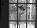
| 10/19/2006 10:36:18 AM |
Uninvited Guestby gdob27Comment: Good choice to go B/W to minimize background color distractions. The tonal range is a little short IMO and contrast could stand a small boost. Perhaps a trim/crop on the right side to take the deer off-center?
As for the image, good job getting the photo in the first place. I imagine there wasn't a lot of time to react to the situation. Good luck in the challenge. |
| Photographer found comment helpful. |
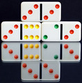
| 10/19/2006 10:23:46 AM |
Even Oddsby BeckyTComment: I like how the reflection makes the dots look to be bumps instead of indentations. Too bad about the distracting double-reflection from the glass/mirror. Some minor tweaks in levels or curves (even a contrast boost) would have blacked out the background (removing the texture). Good luck in the challenge. |
| Photographer found comment helpful. |
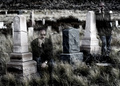
| 10/19/2006 10:21:19 AM |
The Living Deadby SammieComment: Hey. Almost didn't see the "second" guy on the right. :D Fun image. Wish it wasn't so blurry, but it's still cool. Good luck. |
| Photographer found comment helpful. |
| 10/19/2006 10:18:53 AM |
Hot Chili (Peppers)by cyanComment: Nice image in the form of a high key look, very stockish. Simple, white background, highly saturated colors, sharp and well focused. All said, I'm not getting the oxymoron connection. The are hot (spicy) chili peppers. Is it supposed to be like Hot/Chilly? Sorry, not trying to be a pain in the neck, just wondering...guess I better check out that oxymoron url link. :D
Anyway, good luck in the challenge. |
| Photographer found comment helpful. |
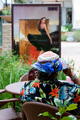
| 10/19/2006 10:09:43 AM |
Pretty uglyby MelethiaComment: Not sure I'm getting the point here. Why the background print? Is the girl in the print pretty and the person (guy/girl?) at the table is ugly? Or, is it the hat/shirt combo you're refering to? Well, at least you're getting the viewers to stop and ponder it some. :D As for the image itself, I think a polarizer would have helped with the glare on the chair and table - overall the image feels slightly overexposed in the highlights.
Best of luck to you in the challenge. |
| Photographer found comment helpful. |
| 10/19/2006 10:06:06 AM |
|
| Photographer found comment helpful. |
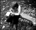
| 10/19/2006 09:34:58 AM |
Alone Togetherby pocketedComment: That's a cool bench! I'd like one of those. :D Ok, serious now. This is a nice emotive shot that fits the oxymoron theme you've selected. With or without the title, this shot could stand on it's own merit as a photograph of interest. That, to me, is substantial. Only nit is I wish the bench, far left, wasn't blown out, but that's minor in the overall scope of things. Good luck in the challenge. |
| Photographer found comment helpful. |
Home -
Challenges -
Community -
League -
Photos -
Cameras -
Lenses -
Learn -
Help -
Terms of Use -
Privacy -
Top ^
DPChallenge, and website content and design, Copyright © 2001-2025 Challenging Technologies, LLC.
All digital photo copyrights belong to the photographers and may not be used without permission.
Current Server Time: 08/26/2025 01:31:13 PM EDT.