| Image |
Comment |
| 01/29/2005 11:35:48 AM |
|
 Photographer found comment helpful. Photographer found comment helpful. |
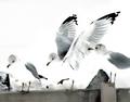
| 01/29/2005 11:34:59 AM |
Whyby kennytComment: My girlfriend liked the idea, the simplicity but I hate the tones and don't get almost anything at all from the image. |
| Photographer found comment helpful. |
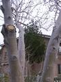
| 01/29/2005 11:34:12 AM |
THREE BRANCHESby hauntingimagezComment: This is perhaps the worst image on the challenge. The light is awful and it has pushed the tones very unsatisfying. The only good color contrast shines in cut branch and that makes me wonder what exactly are the three branches as the trees are full of branches and there's even more branches on the background. The house on the background is falling backwards. The composition doesn't really highlight what's the photographers point here. I'm sure you had good intentions, but I'd say there's lot of potential for you to develop your senses by retaking this image. Choose better lighting, experiment with dozens of different compositions and arrangements with this exactly same subject, work on the image when it's on the computer by chaning it levels, diminishing the unneeded background etc. Then compare to this take, and I'm sure you'll get some "hmm...Hmmm..." -moments! |
| Photographer found comment helpful. |
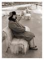
| 01/29/2005 11:27:45 AM |
3 guys 3 zingby jjbeguinComment: The guy and the chair are marvellous and perfect for a subject on their own, but the background doesn't add up meaningfully. The other people are quite a bit of stretch so the image doesn't fit too well on this theme. I'd like to give you much higher number, but can't in this category. And you'll make the image better by reconsidering the tones on the ice (and border). |
| Photographer found comment helpful. |
| 01/29/2005 11:24:35 AM |
flytrapby grahampComment: Almost feels like these are animals on their own :). |
| Photographer found comment helpful. |
| 01/29/2005 11:24:17 AM |
-3-by mbardeenComment: This is extremely nice. Composition works, and the idea is great. If only the bottommost spike wouldn't shine that much nor the leave glow that much on the bottom part (the top part is great)! |
| Photographer found comment helpful. |
| 01/29/2005 11:22:24 AM |
"I'm all in"by hdogg4uComment: Harsh light works surprisingly well. Usually these kind of images would be trashed by the flash. The ring doesn't fit with it's high contrast and almost out of image position. Background, on the contrary, is marvellous! |
| Photographer found comment helpful. |
| 01/29/2005 11:18:49 AM |
Trinityby cadbikeComment: We're tilting here, or at least the feeling is so. Image is simple in a good way, if maybe a bit uninteresting. Also the general feeling is quite gray. |
| Photographer found comment helpful. |
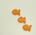
| 01/29/2005 11:17:44 AM |
3x The Solutionby bruskiComment: I have absolutely no idea what these are, but I'm surprised how well does the harsh light work here. I don't like seemingly burned areas, but the compostion is very intriguing if maybe a bit too unbalanced. |
| Photographer found comment helpful. |
| 01/29/2005 11:16:23 AM |
Trianglesby fplouffeComment: There's definitely some triangles here. But what's the reason for the thin "light-rays" from the top to the bottom like what one can see on sky when sun shines through the broken clouds. Composition is surprisingly stabile compared to the position of main triangle, the sharp end of shadown and the unstable position of the triangle. |
| Photographer found comment helpful. |
Home -
Challenges -
Community -
League -
Photos -
Cameras -
Lenses -
Learn -
Help -
Terms of Use -
Privacy -
Top ^
DPChallenge, and website content and design, Copyright © 2001-2025 Challenging Technologies, LLC.
All digital photo copyrights belong to the photographers and may not be used without permission.
Current Server Time: 08/16/2025 01:53:11 PM EDT.