| Image |
Comment |
| 10/09/2005 01:54:04 PM |
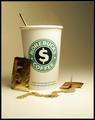
Morebuck$by muur88Comment: You've shown your thoughts on a major coffee chains prices extremely well. On my monitor I can see some wavy lines that look like noise artificats (luminance channel?) and it's a bit distracting. This would be in the upper right hand corner. With that said, I love the tag line on the coffee cup and the sugar packets are priceless. Nice satire. |
 Photographer found comment helpful. Photographer found comment helpful. |
| 10/09/2005 01:45:16 PM |
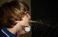
It smells so much better than it tastes.by LewisellComment: You've stopped the motion effectively. The colors are flat and the background is distracting. If the subject had been spitting up into the air you would have had a nicer arc in the spew. Really though, overall, this shot lacks visual appeal. The action of spitting is distasteful and there doesn't seem to be a good reason for it, ie. no bugs or anything in the cup. |
| Photographer found comment helpful. |
| 10/09/2005 01:41:38 PM |
Baseballby hstegComment: Sorry, I don't see the relevance to the challenge theme. Overall, it's a decent shot of a baseball. |
| Photographer found comment helpful. |
| 10/09/2005 01:40:43 PM |
Missing you... by MirceaComment: This is just fantastic. What a fabulous idea! Good composition, nice setting of mood, I think this could be a winner. Great work. (10) |
| Photographer found comment helpful. |
| 10/09/2005 01:39:43 PM |
|
| Photographer found comment helpful. |
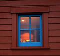
| 10/09/2005 01:35:44 PM |
The Back Roomby GermaineComment: Perspective is skewed, I presume to avoid flash reflection in the window? The crooked lines are distracting, and there isn't much inside the window with visual appeal. You've done a good job showing the warmth inside the building. |
| Photographer found comment helpful. |
| 10/09/2005 01:33:45 PM |
|
| Photographer found comment helpful. |
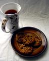
| 10/09/2005 01:32:33 PM |
Mmmmmm!by Ice-Tea-1983Comment: You've got a decent composition here. I might have put the cookies on a different colored plate so they would stand out more. The lighting is uneven across the frame, and doesn't seem to highlight any portion of the composition with intent. Lastly, the tablecloth is very wrinkled which detracts from the overall visual appeal. Overall, this is a decent shot that didn't meet it's potential. |
| Photographer found comment helpful. |
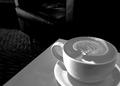
| 10/09/2005 01:27:09 PM |
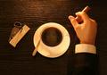
coffee cultureby whiteroomComment: You've hit just the right note here. I like how you've used the natural lines of the table to enhance the composition. Good work! |
| Photographer found comment helpful. |
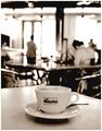
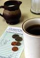
| 10/09/2005 01:26:29 PM |
Check, please!by 3eyedcrowComment: Good composition. Did you consider black and white here? This is more than a snapshot, but the colors are kind of flat and overall it lacks tons of visual appeal. I can see you worked hard with the set-up -- good luck in the challenge. |
| Photographer found comment helpful. |
Home -
Challenges -
Community -
League -
Photos -
Cameras -
Lenses -
Learn -
Help -
Terms of Use -
Privacy -
Top ^
DPChallenge, and website content and design, Copyright © 2001-2025 Challenging Technologies, LLC.
All digital photo copyrights belong to the photographers and may not be used without permission.
Current Server Time: 06/19/2025 07:45:27 AM EDT.