| Image |
Comment |
| 11/06/2006 10:30:56 AM |
Autumn orangeby tomkinsComment: An interesting approach to the challenge - obviously thought some about color coordination, however the shutter speed or focus is off on this image and everything seems fuzzy. The main subject is too incidental to the image, leaving a question is the person or the stack of leaves the real focus.
A good question to ask: Is this an image I would print and place in an album, frame or on the wall. If not, it should be rethought.
Score: 2 |
 Photographer found comment helpful. Photographer found comment helpful. |
| 11/06/2006 09:40:46 AM |
DPC Timeby ElaineComment: The dark room with a person staring at the monitor is unfortunately very overdone. To achieve an impact, the image should be very unique, with a quality of light and shadow that add extreme interest. This image comes off like a 2 minute setup, with not much thought to the overall exposure or subject matter.
Focus is great and the screen exposure is good, but the real subject is lost to the darkness.
While it meets the challenge, the image is not interesting. Question: would you print this and place it in a photo album?
Score: 2 |
| Photographer found comment helpful. |
| 11/06/2006 09:31:07 AM |
How Do I Do This?by pixeldustComment: Meets Challenge Superbly, however there are glaring issues here, specifically blown highlights in the windows, harsh reflections in the screen and the screen's image is also way blown out. There is less subject overall than overexposed area.
A faster shutter speed for this image and/or a smaller F-stop would greatly reduce these problems. Your hand appears blurred, due to slow shutter (everything else is in focus). Unfortunately, a somewhat boring image.
Score: 2 |
| Photographer found comment helpful. |
| 11/06/2006 08:38:29 AM |
How Can I Help You Todayby blemtComment: While very easily meeting the challenge, I find the red cast and exposure of the image detracts from the quality of the image, leaving it noisy and forcing the surrounding items to compete directly with the main subject. Unlike some images where the photographer is incidental or minimized in the overall presentation, this one unfortunately seems that it should be predominant, but is lost in the shadows and other incidentals.
A bit more light (perhaps a diffused flash)to eliminate shadows and red cast, a closer crop to eliminate some of the cameras and a bit of rotation to straighten out the shelving in the background.
apologies: Score: 2 |
| Photographer found comment helpful. |
| 06/04/2006 06:27:02 PM |
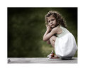
Little Girl Lostby TrynityRoseComment: So after reviewing your portfolio, I am compelled to say, "If I could be half the photographer at 40, that you already are at 16, I would be very happy."
Kudos to your sharp eye and style. Seriously consider making this a career choice. |
| Photographer found comment helpful. |
| 05/31/2006 11:36:11 PM |
|
| Photographer found comment helpful. |
| 03/15/2006 03:09:54 AM |
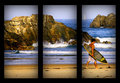
Infiltrated!by emmylouComment: This is a great shot and I think you could have achieved the fuzz factor with a much smaller aperture, longer shutter and tripod.
Very nice job! |
| Photographer found comment helpful. |
| 02/25/2006 08:15:54 PM |
|
| Photographer found comment helpful. |
| 02/25/2006 08:04:08 PM |
|
| Photographer found comment helpful. |
| 02/25/2006 07:52:34 PM |
|
| Photographer found comment helpful. |
Home -
Challenges -
Community -
League -
Photos -
Cameras -
Lenses -
Learn -
Help -
Terms of Use -
Privacy -
Top ^
DPChallenge, and website content and design, Copyright © 2001-2025 Challenging Technologies, LLC.
All digital photo copyrights belong to the photographers and may not be used without permission.
Current Server Time: 08/20/2025 07:32:20 PM EDT.