| Image |
Comment |
| 02/10/2007 05:04:15 PM |
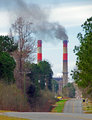
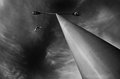
Day 5by EBJonesComment: Hi Eric.
Have to say on this one I'm not a fan of the over saturated feel. I think it would have been a lot more dramatic to go closer to the desaturated side but still leave hints of color in the image. Doing so would leave very little green (bushes become less of a focal point) and the grass along the road and the red hints of the smokestacks put the opposing forces in their natural place.
Oversharpen a bit to give it a gritty feel and the whole thing becomes dirty...just like that smoke. |
 Photographer found comment helpful. Photographer found comment helpful. |
| 02/10/2007 04:55:56 PM |
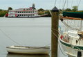
Boats X 3by MelonMusketeerComment: The composition is great in this picture. It comes off as an un-bordered triptych. Why did you not spend any time post processing? A short work in PS would greatly enhance the image and take it to a better level where the people who spend two seconds viewing an image might decide to spend more time on this one.
Perhaps burn the water and sky a bit. Dodge the whites of the vessels and drop a strong sharp on it. At least a point if not two in a challenge setting. |
| Photographer found comment helpful. |
| 02/10/2007 04:51:38 PM |
fenceby whiterookComment: While the sunlight may have overpowered this image, I think that if you had boosted the contrast in an editing program, you would have found more depth of color in the subject matter may have offset the lighting challenges. |
| Photographer found comment helpful. |
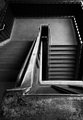
| 02/10/2007 04:38:01 PM |
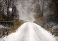
Day-6-Rural-Ontario..jpgby IvoryComment: Very ominous... Looks like a daylight scene from Steven King's 'The Fog.' Never know what's up around that corner there. |
| Photographer found comment helpful. |
| 02/10/2007 04:35:39 PM |
|
| Photographer found comment helpful. |
| 02/10/2007 04:35:03 PM |
|
| Photographer found comment helpful. |
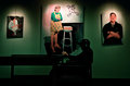
| 02/10/2007 04:33:33 PM |
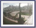
Color At The Libraryby jdannelsComment: Yup ... I DO like this one much better. It comes off like the silo is flat and there is a 3D hand like he's part of the exhibit! |
| Photographer found comment helpful. |
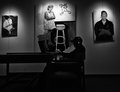
| 02/10/2007 04:31:52 PM |
At the Libraryby jdannelsComment: Nice catch with the light on the hand and the slight highlighting of the earphones. This is a well composed shot. A bit tilted to the left, but very artsy nonetheless. |
| Photographer found comment helpful. |
| 02/10/2007 04:29:21 PM |
Day 05 - Sateliteby JimyThingComment: Hi David.
I have to admit that I am no longer a fan of the 'long-exposure red-shift' light trick that digital cameras often play on us. If you have PS or PS elements, a curve change might correct this, but I find the easiest cheat here is to convert to b/w and eliminate the red altogether.
Your clone tool or healing brush will eliminate the smudges for the most part and even in basic editing, you'll want to eliminate those quickly to save a point or two in the challenges. |
| Photographer found comment helpful. |
| 02/10/2007 04:21:14 PM |
My house... is in the middle of the street.... My house...by TCGuruComment: Hi Johnna.
This looks like your camera chose to focus on the tree on the left side and that the aperture was set very wide. If you can control the ISO rating on your camera, try moving it up to a higher rating and see if you can force the aperture to a deeper focal length (5-8)...you'll have to be very steady, because the shutter speed will be a lot slower, but your focus area will give you a lot more room to play with. |
| Photographer found comment helpful. |
Home -
Challenges -
Community -
League -
Photos -
Cameras -
Lenses -
Learn -
Help -
Terms of Use -
Privacy -
Top ^
DPChallenge, and website content and design, Copyright © 2001-2025 Challenging Technologies, LLC.
All digital photo copyrights belong to the photographers and may not be used without permission.
Current Server Time: 08/20/2025 04:33:28 AM EDT.