| Image |
Comment |
| 11/24/2004 01:37:05 PM |
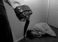
Man's Imposed Authority over Womenby ijerryComment: I'd have given it a different title. But that's not so important. The composition is nice, I feel like the watcher of that scenery, which makes me feel unconfortable, and that's the best part of this picture. The woman crouches in a corner, clearly tries to protect herself, and the way the man holds the belt clearly shows his intentions.
A bit mor light would have made the details come out nicer. The guy's hand is either too blurred or not blurred enough. The crop is perfect. You might have taken te picture in the other side of the corridor. Having the doorknob in it would have brought in an additional element: a possibility (the only one) to get away. |
 Photographer found comment helpful. Photographer found comment helpful. |
| 11/24/2004 01:29:01 PM |
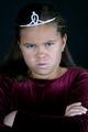
Because I'm the Queen, That's Why!by debitiptonComment: Ooh, that's a good reason :) I like that. Children love to see how much authority they have on others. She looks really annoyed. The way she folds her arms adds to that. Nice idea, but I'd have liked her shirt to be brighter. |
| Photographer found comment helpful. |
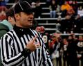
| 11/24/2004 01:20:02 PM |
I dare you!by twentyfivesComment: Yeah, this one's great. Very clear colours, a simple message with an ironic comment in the title. I don't know why, but the rotation's nice, too. Perhaps, sometime, you can teach me why.
I guess I can finally handle out a 10. Well done. |
| Photographer found comment helpful. |
| 11/24/2004 01:17:05 PM |
Moral Authority (for some)by snackwellsComment: Nice shadow effect. I'd prefer a lower angle. The '(for some)' in the title is not required. It just deminishes the firmness of your message. |
| Photographer found comment helpful. |
| 11/24/2004 01:15:09 PM |
Rules of the Gameby kearockComment: A bit too dark, I'd have liked to see the exression in his eyes. I don't like that dude behind him, but I know it's hard to get a good composition when everything's changing all the time. |
| Photographer found comment helpful. |
| 11/24/2004 01:10:23 PM |
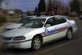
Authorityby GolferDDSComment: I like that his soles are in the image. Looks like he was standing on my face. He should have put on different shoes, though. |
| Photographer found comment helpful. |
| 11/24/2004 01:03:59 PM |
That's Enough!by GPComment: Yeah, you damn pigeons! If ever I catch one of you sh**ting on my head... ;o)
Okay, let's talk serious. This statue definitely suggests authority, but the 'marks' on his head make him look too ridiculous to be impressive. And what's that blue spot? A star? That doesn't fit in there. |
| Photographer found comment helpful. |
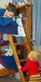
| 11/24/2004 12:56:44 PM |
Big Brotherby cloudsmeComment: Nice idea. But there's too much confusion, too elements yoked together, no composition. |
| Photographer found comment helpful. |
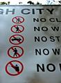
| 11/24/2004 12:53:44 PM |
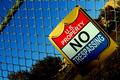
Noby NodeComment: As your title suggests, the important element of this picture is the word NO. However, leaving parts of the words that follow the NO makes me wanna NO...eh know, sorry, what they mean. You should have taken a frontal shot of the sign and cropped away the other words *completely*. Same remark for "...gh city". |
| Photographer found comment helpful. |
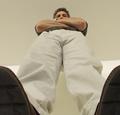
| 11/24/2004 12:51:23 PM |
12 Drinks Too Manyby bruskiComment: This is a great example of facing authority exactly at the moment you least need it. I like the blur at the sides. Did you use a lens the wrong way round? Suggestion: shooting through the bottom of a beer glass creates a similar effect, plus some distortion. |
| Photographer found comment helpful. |
Home -
Challenges -
Community -
League -
Photos -
Cameras -
Lenses -
Learn -
Help -
Terms of Use -
Privacy -
Top ^
DPChallenge, and website content and design, Copyright © 2001-2025 Challenging Technologies, LLC.
All digital photo copyrights belong to the photographers and may not be used without permission.
Current Server Time: 09/04/2025 06:36:05 PM EDT.