| Image |
Comment |
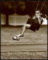
| 08/16/2004 08:19:49 AM |
Growing Upby pitsamanComment: Grr - another favorite lands mid pack. What was the problem with the voters this time? Not enough feet for them? Lovely image, says so much, those little feet so far off the ground. |
 Photographer found comment helpful. Photographer found comment helpful. |
| 08/16/2004 08:17:44 AM |
Tired Little Boyby OneSweetSinComment: Thi is lovely and should have placed higher - I think too many voters get hung up on the crisp image to appreciate the softer ones. Soft is so appropriate for a sleeping child. |
| Photographer found comment helpful. |
| 08/16/2004 08:15:45 AM |
|
| Photographer found comment helpful. |
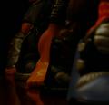
| 08/14/2004 05:52:27 PM |
Out of Uniformby FSCNitroComment: uh oh - this is going to suffer from the uncalibrated monitor syndrom. It is very dak on my lap top, I canonly make out yhr orangr foot in th middle . White balance adjustment might help in addition to levels and curves. It seems to orange and too dark. |
| Photographer found comment helpful. |
| 08/09/2004 08:47:45 PM |
|
| Photographer found comment helpful. |
| 08/04/2004 12:04:22 PM |
|
| Photographer found comment helpful. |
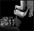
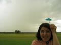
| 08/04/2004 12:00:51 PM |
Raindrops Keep Falling on my Head!by dahvedComment: Cute - more attention to detail would have made it better. take the black thing off her neck (her walkman head phones?) tilt the umbrella so it shows better. Focus on her face and let the background blur if it has to. I think the focus problem might be camera shake, not DOF. Try a tripod, or try metering on her face and keeping the shutter half depressed and recompose the shot. Besides being out of focus, her face is too dark. Since you want the background to look stromy, it would be ok to lighten her a little but not too much. It looks like there are more interesting clouds right behind her head than the clouds you have chosen to show. I love the concept and I love her expresiion and her upward glance. 7 |
| Photographer found comment helpful. |
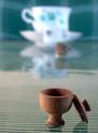
| 08/04/2004 11:46:20 AM |
Miniture wooden bowl with lidby kirtiebuComment: hmmm - I hate a tilted horizon and it isn't clear if this is tilted or straight so it just ends up being unsettling. The foreground feels off while the background feels straight. You'd be surprised how many points you can lose when the viewer feels slightly disoriented by the horizon line. Either tilt a lot for effect or get it straight. |
| Photographer found comment helpful. |
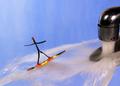
| 08/04/2004 11:43:30 AM |
Miniture surf board - or - " Sink Surfing" by graphicfunkComment: This is really nice. Seems like half the people got the miniature part but forgot that it also had to be an interesting photo. Here a clever idea is also a well executed image that tells a funny story. Here is what like: focus, movement both of water and implied movement of the surfer, colors muted blue contrasts with the colorful surfer, thirds, leading lines are esp nice: Since the faucet is the first visual draw, the image reads from right to left which is a more dynamic direction. so, the faucet leads in, the water lines lead left, the angle of the surfer leads back into the image indead of continuring the line out. As soon as the voters eye is lead off the page his brain thinks "Done, next please". If you can draw the quick viewer back in he'll take another look and appresicate your picture more. |
| Photographer found comment helpful. |
| 08/04/2004 08:54:54 AM |
|
| Photographer found comment helpful. |
Home -
Challenges -
Community -
League -
Photos -
Cameras -
Lenses -
Learn -
Help -
Terms of Use -
Privacy -
Top ^
DPChallenge, and website content and design, Copyright © 2001-2025 Challenging Technologies, LLC.
All digital photo copyrights belong to the photographers and may not be used without permission.
Current Server Time: 06/22/2025 04:24:11 PM EDT.