DPChallenge: A Digital Photography Contest You are not logged in. (log in or register
 
Browse Settings
Currently viewing:
Registered Useremorgan49

Show comments:

Per page:

Order:

Comments:


Comments Made by emorgan49
Pages:   ... ... [165]
Showing 401 - 410 of ~1645
Image Comment
White Knight Saves Pawn King from Black Hole IMG_0335a.jpg
08/04/2006 09:15:04 AM
White Knight Saves Pawn King from Black Hole IMG_0335a.jpg
by Shy Clicker

Comment:
Can you straighten up the king? Leaning pictures are a pet peeve of mine but the tilt can also hurt your score. Even if the viewer doesn't identify the problem as a tilt, they can feel that "something is off" and knock off a point. Or rotate it some more so that the tilt feels deliberate instead of accidental.
Photographer found comment helpful.
From pillar to post
07/19/2006 08:26:50 AM
From pillar to post
by joynim

Comment:
Here is a lovely photo which will have trouble competing in the photoshop DPC world. Post it to the forums and let the PS ghurus have a go at it after the challenge is over.
Photographer found comment helpful.
Fountain by the river
07/19/2006 08:07:02 AM
Fountain by the river
by RiderGal

Comment:
This is such a busy week, I might not make it to vote 20% - I will try because I want my 10 on this photo to count!
Photographer found comment helpful.
The Desolate Swimmer
06/26/2006 08:45:39 AM
The Desolate Swimmer
by Shermy

Comment:
WHy didn't this win???
Photographer found comment helpful.
fairies
06/13/2006 11:11:20 PM
fairies
by bucket

Comment:
Magic!!
Photographer found comment helpful.
Enlightening
06/07/2006 10:44:23 AM
Enlightening
by DigiFotoBuddy

Comment:
I think this image also could have suffered from "voter-monitor-calibration-syndrome" Not all monitors are calibrated equally and dark images often suffer. I just looked at this on a work monitor and it is so dark I can hardly make out the person. The spot of light seems very bright.
Photographer found comment helpful.
Growing Up
05/19/2006 12:20:56 PM
Growing Up
by arnit

Comment:
10, as usual.
Photographer found comment helpful.
How I Deal With the Price of Gas
05/19/2006 12:19:52 PM
How I Deal With the Price of Gas
by weisz

Comment:
oh drat! I didn't mean to vote on this challenge but NOW I have to vote on 20% so i can give this a ten! Excellent, those oranges make it perfect.
Photographer found comment helpful.
The Single Photographer
03/31/2006 06:36:26 PM
The Single Photographer
by JPR

Comment:
I like this but could you post a link to the original? The only one I can think of is In this collection the girl with the meerkat on her head.
Photographer found comment helpful.
"Floating Heart"
02/27/2006 08:06:15 PM
"Floating Heart"
by crystaldm

Comment:
Hello from the critique club -

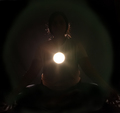
This is a fairly simple image. The challenge was "Heart", this is a heart. It didn't score very well, mostly 4s and 5s. Why?

I suspect the main reason is Voter-Monitor-Calibration-Syndrome. On my monitor it seems very dark, much darker than your other images. Too dark for my liking. Perhaps you intended for it to be dark, but remember a dark image will appear even darker on some peoples monitors. Too dark is one reason for a low score.

Another DPC voting pattern is the Found-Object-SYndrome. Voters will vote lower it you photograph a found man made object than if you photograph a "found" leaf or flower or rock. Somehow there is a perception that it is cheating to use something that someone else has fashioned. Figurines, toys, statues will always get marked down.

So we can blame half of your poor score on the idiosyncracies of the DPC votors. What could you have done to improve your photo? Lighting is the big problem. It is too dark. The light is causing unattracive glare on the surface of the heart. Perhaps the glare cold have been softened by simply putting something transluscent over the light source. Even a piece of paper or a tissue can soften a harsh light. The light is making intersting shapes inside the heart. I see a man with a hat. But again, the are too dark to hold my interst for long. What if the light had made these same shapes show as shadows on the red background?

The sharpest point of focus seems the be the left, or further away, edge of the heart. I think it light look better to have the edge that is in the center and more towards the viewer be in shape focus.

Your composition is simple, an off center subject with some negative space in the background. But why? It feels awkward to me. Why is the heart off center and what does the negative space add? Perhaps it gives the man with the hat inside the heart room to step out of the heart? He seems to be facing in that direction.

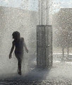
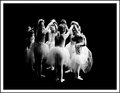
Next time you choose to shoot a still life, take a good look at your portraits and see what lessons you can learn. Your photos of people, especially the children are STUNNING. When you photograph children you seem to have a natural eye for balance in composition, placing the eyes where they will grab the viewer most effectively. You make it look so easy and unforced! You DO have a great sence of design but it doesn't show in this heart submission. You can doo much better.

Disclaimer: this is all just my opinion and I am be no means an expert. Ellen

Message edited by author 2006-03-03 10:38:29.
Photographer found comment helpful.
Pages:   ... ... [165]
Showing 401 - 410 of ~1645


Home - Challenges - Community - League - Photos - Cameras - Lenses - Learn - Help - Terms of Use - Privacy - Top ^
DPChallenge, and website content and design, Copyright © 2001-2025 Challenging Technologies, LLC.
All digital photo copyrights belong to the photographers and may not be used without permission.
Current Server Time: 12/21/2025 01:02:36 PM EST.