| Image |
Comment |
| 09/16/2002 02:26:00 PM |
A is for Apple!by ZeissmanComment: Waaay under rated! This is a ten for sure. The butterflies on the bracelet makeit perfect! |
 Photographer found comment helpful. Photographer found comment helpful. |
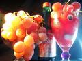
| 11/25/2002 11:27:00 AM |
Grapeteaserby quarxComment: There is a lot going on in this photo - way too much. It is a great idea for the challenge and the title is perfect. I think the idea is worth reshooting to make a great photo (suppose the grapes are gone by now). The colors are great and the shapes are sensuously round - I especially like the round blob on the stem of the glass that matches the grapes. However, the whole thing is just too busy! And unfortunately the thing that draws the eye is the screw cap on the wine bottle because it's color and focus are harsher. The rest of the photo has a lovely soft look. The cap balances the glas stem on the right and the big grapes on the left to make a visual triagle, but it's defests dominate the effect. Obviously the lighting is a problem as many pointed out, too glaring on both sides. Pay careful attention to unwanted elements in the background, the spoon on the refrig is also distracting. How about recropping the photo? the glass on the left isn't necessary, though it;s grapes are. the cooler blue background on the right is better than the black on the left. If you crop just to the right of that vertical stem I think it looks better. Can you get the base of the glass and the bottle back? They look cut short and the rounded shapes of both would have added to the compossition. Then take the cap off the bottle and scrape the label off the glass. It really could have been a much better photo with a few changes. It is worth trying again. A photo is only as good as it's worst elements (sad to say). The lighting and the cropping decisiosn both spoil this one. I gave it a 4 - just below average. |
| Photographer found comment helpful. |
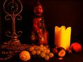
| 09/10/2002 10:59:00 AM |
Renaissanceby stephanComment: Way to many inrelated elements (sorry, if this is a collection of some religious ceremonial significance)ad they crowd the boarders. Lose the sea shell, he doesn't belong and he;s too bright, leave the brightness off the the candle/ Try to make it look like the really is candle is the only light source which means fix the lighting on that nut or fig. ANd give the sculpture things room to breathe at the top. It doesn't contribute to the composition to have them cut off. |
| Photographer found comment helpful. |
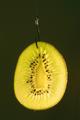
| 09/10/2002 05:04:00 PM |
Hooked on Kiwiby bamasterComment: The hook is nice but not the kiwi. When the contest is done, beef up the green to a nice bright on and make te background less yuck brown/ |
| Photographer found comment helpful. |
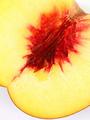
| 09/10/2002 06:22:00 PM |
Peach Explosionby floydComment: Yikes, is pornography allowed here. 9 for now, awaiting jusdgement on X rating, then may move it up to a 10 |
| Photographer found comment helpful. |
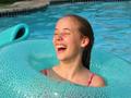
| 09/04/2002 12:48:00 PM |
Poolside Funby xertionComment: my top ten! Great moment, great photo both! That pool blue is always such a perfect contrast to human flesh color. Here's what I ike: She tips right, the poll edge tips left. It ia all blue excpet the pink straps her pink lips and her ear. She is nicely placed in the tube and in the picture frame. The lighting is great, the shadows are soft on her face and neck. the spots on the tube contrast with the surface of the water and the squrares of the edge/. What would I like? Maybe if the othe float wasn't there t and also edit out the grass. When the contest is over you can just extend the marble up to the corner. 9 |
| Photographer found comment helpful. |
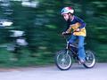
| 09/05/2002 02:07:00 PM |
Speed Racer!by KarenBComment: Ooooh, such a nice picture!! What do I like? Well, the obvious, blurred background clear face, look of determination, speed. But there is also the sublte stuff. Look at the balance of colors: Red on helmet, red on bike..blue on helmet, blue jeans. Yellow dead center does not have to have a match to balance it. round helmet on top, round wheels on the bottom. I like all the background lines horizontal. Suggestions? None... well, one....when the contest is over, make that triangle between his legs green. Murphy's law haas made brown leaves there and it looks odd. |
| Photographer found comment helpful. |
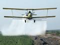
| 09/04/2002 11:44:00 AM |
Tense Momentby autoolComment: And then what happened?.....great shot. Nicely balanced. A lot of good elements: the blurry prop, the foggy spray the rocky ditch. What more would I like?? Maybe richer colors? That plane could be yellowed up once the contest is over nad the restrictions are off/ |
| Photographer found comment helpful. |
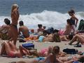
| 09/05/2002 02:14:00 PM |
Checkin it Outby GotchaComment: This is terrific. At first glance he's the only guy on the whole beach. But I guess he's just the only one payng attention. Nice set up, Vetical bodies on the sides, horizontal bodies in the front frame the gys face. I like that his face is dark in all that sunlight, makes him stand out. I like the communication between him and the girl in front with the pony tail. What would make it better?? Duh, loose the other guys, but that's just faantasy. |
| Photographer found comment helpful. |
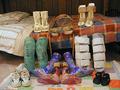
| 08/26/2002 12:40:00 PM |
|
| Photographer found comment helpful. |
Home -
Challenges -
Community -
League -
Photos -
Cameras -
Lenses -
Learn -
Help -
Terms of Use -
Privacy -
Top ^
DPChallenge, and website content and design, Copyright © 2001-2025 Challenging Technologies, LLC.
All digital photo copyrights belong to the photographers and may not be used without permission.
Current Server Time: 08/05/2025 12:40:56 AM EDT.