|
|
|
Showing 1551 - 1560 of ~1646 |
| Image |
Comment |
| 01/20/2003 01:58:57 PM | |  Photographer found comment helpful. Photographer found comment helpful. |
| 01/20/2003 10:02:00 AM | | | Photographer found comment helpful. |
| 01/20/2003 10:00:02 AM | | | Photographer found comment helpful. |
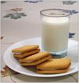
| 01/20/2003 09:56:08 AM | Got Cookiesby daysezComment: Oooh this is the best of the milk and cookies crowd. This is realyy really nice - could be my favorite of them all. | | Photographer found comment helpful. |
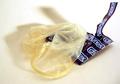
| 01/20/2003 09:32:05 AM | tired of sexby andresComment: Hello from the Critique Club. Sorry I am a bit slow. I don't know how to take this photo. I'm not sure what you were thinking when you submitted it since it is your first and only submission. There are several ways I can take it so I am going to write three different reviews.
Review #1 - You are a jerk!
What is THIS? I am a little old lady. Do I really need to look at this? There are kids as well as oldies who submit to and vote on these challenges. There was a discussion of that was appropriate and inappropriate. Several images have been disqualified for blatant sexuality. Is this submitted for it's shock value? If so, go look for attention somewhere else.
Review #2 - This is a joke!
And a pretty funny one too. I find that photographers are a pretty up tight bunch. I think they are always trying to prove to the world that photgraphy is art, that it takes talent. and is not just a cheaters way to paint or draw. On this site people get really worked up about their score and the rules. It is refreshing to see a tongue-in-cheek submission.
Review #3 - This is a serious submission!
Believe it or not, I gave this picture a seven. I don't know the song but I've heard of the band. Didn't they do that Buddy Holly song? I'm tired So tired I'm tired of having sex (so tired) . I imagine loud rock, lots of drums, screaming lyrics and some feedback.. Am I close?
The composition of this photo is very nice. the package and the condom make a strong diagonal and the shadows make a weaker diagonal in the othe direction. nice. I like the upright torn part of the package and it's corresponding shadow. they seem to represent....ummm...you know...uprigtness. The condom is is certainly tired looking. The colors are nice, the three colors balance eachother. The lighting is very good.
Techinically I agree with the commenter who thought that the white balance was off. I also think that the dark values are off. If the contrast was increased slightly do you think the browns and blues would look richer and less washed out? The lighting is very good, as is the focus.
How sad to be tired of sex. And how sad that the condom has become the symbol of sex. Back when I was young and wild and the dinosaurs roamed the earth and HIV didnt, a condom was just the least preferred method of birth control. This picture, with it's title, packs an emotional punch. It represents the ultimate in youth alienation. Yep, this picture looks bored (but not boing).
I'm tired of having sex (so tired)
i'm spread
So thin
I don't know who I am (who I am)
Now for the disclaimer- remember that this review is just the opinion of one (far from expert) person. And sorry for the duplicate review. Just shows how opinions can differ.
Message edited by author 2003-01-20 11:58:18. | | Photographer found comment helpful. |
| 01/20/2003 08:35:28 AM | Look, I Can Use a Spoonby karmatComment: Hello - Greetings from the critique club. Funny thing, I usually draw a few pictures at a time so I can mull them over for a day or so. One week I got all train station pictures and this week I have all baby pictures. Good thing I like babies more than I like trains.
First, I have to ask. What is that stuff??? It really doesn't look edible to me!!
Usually, as I look at a picture over and over again, I like it better and better, Unfortunately this is one I like less. It just doesn't have any spark to it. I know your work and I know you can do much better with lighting and composition. This is the same fellow with the sparkle in his eye in the "Spoon Fed" picture so I know that he is much cuter than this.
What's wrong? Okay it's funny...and it's messy..and it's cute. So why isn't it wonderful? Maybe because no one looks happy? A happy baby is absolutely contagious and I don't get that feeling here. I wonder if you added a tiny highlight to his eye if it might make all the difference in the world? Everything seems sort of flat. His expression is flat. The colors are sort of dull. The soft focus, though very well done adds to the dullness.
Your composition is nice at first glance. The hand on the left, balances the kid on the right and the spoon connects the two weighted areas. The hand is great and in it's "thirds" position but the complimentary spot should be the eye, that lack-luster eye. So instead my viewers eye travels down to the ear which is the second most interesting thing in the picture but seems irrrelevent to the story.
Technically (this is my weak point) it is lovely, The soft focus is lovely but seems unsuited for the occasion, it would be nice if he were sleeping or cuddling. I like that the kid is soft and the goo is sharp. Is it too sharp? around his mouth it looks like cement. The use of the uncluttered background in nice. And the choice to leave out any distractions, like tray or bowl or Mom is nice. Would it have looked better in black and white? Maybe the white balance is wrong, maybe that;s why the colors seem so uninteresting.
I'm so sorry to be so harsh because I'm hitting below the belt twice, critisizing your photography AND your baby. Yikes! I should be banned from the site. The problem is that I think you can do much better. Message edited by author 2003-01-21 11:59:14. | | Photographer found comment helpful. |
| 01/18/2003 05:37:30 PM | Love Potion #9by CreativeFlyPhotoComment: oh he was correct - It was black! I just remembered the words - Oh but red is sooo much better. Red for love, right?
lalalalla and looked like India Ink
I held my nose
I closed my eyes
I took a drink | | Photographer found comment helpful. |
| 01/17/2003 10:48:24 AM | Love Potion #9by CreativeFlyPhotoComment: Hello from the Critique Club -
This is a nice phote and a very clever submission to the challenge (great song too). Technically it is beautiful. The focus is perfect, the lighting is perfect. I especially like the lighting. I love the way the light shines through the potion onto the table, I love the little square it makes. I like the way the semi circle of light and shadow in the background mirrors the semi circles of the bottle. I like the sliver of light on the bottle top.
The bottle itself and the label and the flowers are adorable. Please tell me that is your parents in the picture..grandparents? The scene is carefully arranged with no distracting elements. Very nice. Like a magazine add.
However something is wrong. What is it? Well, the colors are slightly washed out I think it is the blacks that are the problem. Could the darks be a hair darker? And perhaps the composition is just too stages and too simple to be stiking. The bottle is in the center. Too centered? the flowers are in the rule of thirds spot. good. Why does the bottle look crowded? Maybe simply switching to portrait view instead of landscape - then the flowers would be crowded but the bottle could have some more room.
Great picture! Careful set up! Terrific lighting! Don't drink that stuff all in one gulp!
Please remember that this is just one persons opinion, mine and I am FAR from an expert here. Message edited by author 2003-01-18 15:46:43. | | Photographer found comment helpful. |
| 01/16/2003 10:57:56 PM | Megan at the Train Stationby lisaeComment: Hello from the Critique club- Here is my (FAR from expert) opinion on your travel picture.
I am at a loss how to "critique" a perfect picture. Critique implies being critical or offering suggestions for improvement. So I will just blab a bit on why I like this photo so much. Don't expect this to be too organized.
First, this is a compositional masterpiece. There are three conflicting parts and each is distinctly diferent visually also. First is the Goth Girl, very very modern and very very out of place. She is all black, the darkest and most "contrasty" thing in the image. Nicely placed on the rules of thirds line. Second there is the modern boring industrial world represented by the squared containers in the background. These are all oriented the other way, laying down , in opposition to the upright girl. They are all a monotone monotonous lower contrast grey tone. Third is the old fashioned train station represented nicely by the filligree above the columns.
Now look at the lines - Perfect. You have the diagonals leading off into the distance, That's where the viewers eye finally travels off too. But the contrary girl looks defiantly in the other direction. The lines of the boxes are all horisontal. The girl is slouchy and bent, the only not straight line in the picture. The negative shapes that are formed by the columns and the roof and the platform are lovley as the diminish in size to the distance. The front post which so nicely divides the picture emphasizes the sense of division as a whole, those three elements of time which do not fi together.
Techincally I can't add anything. the focus and exposure are perfect and both were clearly difficult to achieve. This is an indoor/outdoor exposure, both. The staion is dark but not to dark, the backgroud is bright but not too bright. The foreground (post) midground (girl and station) and the background (containers and even some rural looking scenary) and all in perfect focus. It is sharp without a hard edge, soft without any blur. Black and white was a good choice. Who needs color when the message is so simple.
Emothionally the picture is STUNNING. The alienation of youth, no where to fit in this mundane world. The containerised goods represent the conforming society, row housing, packaged breakfast cereals, bland TV shows, it's all there in those grey boxes. Ms. Goth is too out of place even to protest. She just looks bored and disgusted and trapped. Here she is on an old fashioned train platform, itself a symbol of another age that doesn't fit. Trains? who even thinks about trains in this world of planes and cars? Certainly no one has remodeled that train station in 75 years. Hey are there even any trains running that could take her out? Doesn't look like it. maybe she is waiting for nothing. Nothing here either but hills and more hills. The dilemna of the youth "I don't want to stay here, I don't want to go back and I don't want to move forward". It's amazing that we, any of us, grow up.
Ummmm...maybe, before you hang this in a gallery you could edit out that bright spot behind the front pillar. and send me an invitation to the show! Message edited by author 2003-01-17 10:46:23. | | Photographer found comment helpful. |
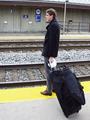
| 01/14/2003 12:59:55 PM | "Take the A Train"by GolferDDSComment: Hello from the Critique Club -
This photo didn't do very well in the ratings did it? I gave it a six because it met the challenge and was a little better than average. Technically it is pretty well done. The focus is good, the suitcase and the guy being sharp and the back wall almost sharp. The lighting is good being a greyish day. I think the colors look a bit washed out. I would have fiddled with it a bit in post processing.
However the composition leaves a lot to be desired. I think this picture would have benefitted from the rule of thirds. If the guy had been over to the right, looking down the tracks, more of the tracks showing might have improves the idea of the endless wait for the train to come. The central focus of the shot, the place where the viewers eye ends up is that big black blob of a suitcase. While it adds to the story (big bag, stuffed, probably long trip, maybe somewhere interesting) it is not very interesting visually. The bag is too black and too big, it unbalances the scene.
The composituional lines here are pretty basic, maybe too baix to be interesting. The figure is right in the middle making a strong upright, The train tracks are straight across (well, a little bit diagonal) and also centered. The exact center of the picture is the mans hand holding his suitcase with a handerchief, why the handkerchief? it is distracting. There is nothing in three of the rule of thirds points and the suitcase in the fourth. With all those straight lines, the barrel distortion from the lens bothers me. I do like the repeat of the yellow stripe top and bottom. The signs on the wall, the lamp post and the strair railing all seem to be cluttter. Also the way the railing grows out of his back emphasizes his poor posture.
Wait - It's not a total loss. The main elements here are striking and worth noting. The station, the packed bag, the intent look on the mans face, the way he looks down the tracks and the tracks themselves are all worthy parts of the picture. What to do? Hmmm.... get the empahais on the guy. Move him off center. Move the bag. Lose the hankie. Maybe try a landscape view so there are more tracks to look down? Pay more attention to the junk in the background, like move so the stairs are in a different place. And jazz up the color in post processing. You've got the yellow lines, they work. You've fgot the blue signs, maybe they could be balanced by a blue luggage tag, or even a red one. Leave the guy grey, like the day and the stones and the station. He works well like that, any color on him would be a distraction.
Please remember that this is just one opinion, mine, and I am far from an expert. | | Photographer found comment helpful. |
|
Showing 1551 - 1560 of ~1646 |
Home -
Challenges -
Community -
League -
Photos -
Cameras -
Lenses -
Learn -
Help -
Terms of Use -
Privacy -
Top ^
DPChallenge, and website content and design, Copyright © 2001-2025 Challenging Technologies, LLC.
All digital photo copyrights belong to the photographers and may not be used without permission.
Current Server Time: 08/05/2025 12:40:21 AM EDT.
|