|
|
|
Showing 1541 - 1550 of ~1646 |
| Image |
Comment |
| 01/29/2003 06:36:00 PM | At the Corner of Charles and Mapleby karmatComment: Hello from the Critique Club (again).
Good find! You just came accross these road signs? No vandalism was involved I assume. I suppose anyone could have stumbled upon a broken road sign but what you chose to do with it was really interesting. This is really a great photo!
The point of view here makes a statement. It's almost as if you are trying to put that sign back up. You got down under the sign and took it from just about the angle it was intended to be viewed at. That's what creates the stunning visual contrast. It strengthens your statement that "here is a sign out of place". Great start.
Next you made a wonderful composition out of that sign. The X it forms in the not-quite-center of the photo is a strong arrangement (good thirds). The x shape itself is wonderful because ti creates four visual leading lines. You have chosen to emphasize one and use the other more subtley. Charles is the less dominate line but you have used it to mirror the slant of the hill and the pitch of the background trees. Maple is the dominant line and you have pointed it right at a tree (I think it's an oak). Ah but wait, you did another reverse. you have lighted the less pronounced side of the X to make it stonger and left the stronger side dark so that it doesn't carrry more weigt. Lovely.
More...Now you made use of the word MAPLE by putting two trees in the V under it, one horiaontal, one upright. Nice. And repeated the V in the branching of the tree- nice. I particularly like how you cleaned off the P (middle letter) in the word maple for emphasis, otherwise the word would have beeen too dark and maybe missed.
Colors are natural. Focus and DOF are perfect. Lighting is exquisite, hard to achieve at mid day. Mabe the snow could have been a bit whiter? On my monitor the whole picture is just a hair too dark. And I think it is a bit over sharpened. The words have some jaggies and the background treetops are sparkly. I think that's what dragged you down to 29th place. Could have been higher!
Okay - the usual disclaimer - this is just my opinion, I am not an expert by ANY means. Message edited by author 2003-01-30 09:41:49. |  Photographer found comment helpful. Photographer found comment helpful. |
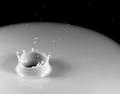
| 01/28/2003 12:13:45 PM | A drop in a cup of Milk.by SharQComment: Hello from the Critique Club.
I'm sure you think this photo should have done better so I'll address the scoring issue first. Your score suffered from burn out (does that phrase translate out of English, I wonder). There have been several droplet phots submitted in other challenges in the past. Most recently was a photo called Blueberry splash, which got a ribbon. In this challenge I think I counted six milk splash photos. Even though the photos are randomly sorted for each voter, by the time you get to the third, you begin to get sick of them. Many voters score down for "copy cat" images, so all the splashes were at a disadvantage from the start. So why did yours place last of the spashes?
Your picture is technically excellent. The stop action is perfect, DOF is perfect, focus is perfect, lighting is perfect. But all this doesn't add up to a perfect picture. It lacks human interest. It feels like it belongs in a physics textbook.
The composition is lacking. The crown is placed in the "thirds" position but to me it is too far off center. It is the focal point of the scene, but no compositional elements lead to it or away from it to anything in the rest of the shot. It seems like two thirds of the photo is dead weight. The high droplets are a little interesting and maybe the edge of the cup looks like a planet, but neither have enough draw to justify ther inclusion in the crop. This is a phot that would benefit immensely from a different crop. Try an up and down orientation so you get the sense that the sinker started from above, sunk and splashed the milk up. Try getting rid of the black rim altogether leaving a white on white image like the more sucessful photo of the flower in the milk bath.
Probably this submission would have done better is you had spent as much time polishing it up as you did perfecting the technique. But Hey! Now you are a master at the droplet techinique and you can out splash anyone here next time. Just don't submit a milk splash for a few weeks. Message edited by author 2003-01-29 18:32:56. | | Photographer found comment helpful. |
| 01/28/2003 10:01:08 AM | My New Tatooby AnachroniteComment: This is way way way too dark on my monitor. I think you lost a lot of points for that. Is your monitor calibrated? Mine isn't. But if you get a lot of comments about that perhaps there is a problem. If it had been properly lit I think it would have won. Scout around and look at the image on other peoples computers, it might look darker thatn yours. | | Photographer found comment helpful. |
| 01/27/2003 11:45:40 PM | signs of sea dogsby andresComment: This is beautiful. Am I the only ten? I like to go back to my tens (I only give three or four) and see where they place. I hate it when they end up way down here. | | Photographer found comment helpful. |
| 01/27/2003 11:33:50 PM | Drink Milk?by rj324Comment: This is a stunning photograph and I STILL think it should have won! | | Photographer found comment helpful. |
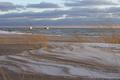
| 01/24/2003 11:09:47 AM | Sunset on Lake Ontarioby firstduchessComment: Hello from the Critique Club - Sorry to be late with my review. Sometimes life intervenes.
This is an extraordinary photo! My first instinct is to only write "GASP!" and leave it at that. But probalby you want more words. Since it is perfect in my eyes, I can only tell you why I like it so much. I can't offer any suggestions for improvement.
This image brings to mind the very tightly controlled japanese gardens where even the stones and dirt are raked into lines to compliment the plantings. You have created a wild version of that idea. Had you raked the snow and sand and waves and clouds into that perfect pattern you could not have made it more precise. I suppose those are tire tracks, but WOW, they are lovely as they snake from right to left. Yes, the movement in the picture is all right to left, rather than the more common left to right. The wind blows left, the lines point left, the bouys are left, the snowbank piles up left. Nice!
You have three elements here: foreground, mid ground and back ground and each is exquisite in it's own right, But you make them tie together and compliment each other so the sum is even more than the perfect parts. Foreground: swirlies, moving grasses, muted tans, absolutley in focus. Mid ground: Ocean - white caps mirror the snow banks, flecks of white pick up the snow and clouds, muted blues, bouys as a point on interest (in the rule of thirds place, too). Background: Mirrors the fore and mid grounds, stripe of tan stripe pf blue. Now the tan is narrow, like the ocean and the sky is wide like the beach. The swirls are in the blue clouds. Gorgeous.
Textures! WOW! look at all those textures - grass, sand, snow, waves, clouds. They all work together without competing or getting cluttered! I can HEAR this scene, whoosh wind, swish little waves, swoosh draw me in.
I love the colors, they all go together so well, tans and blues, such soft colors, such sharp focus. I love the muted light. Sunset? It must have been FREEZING yet the picture has a warmish inviting feel despite the snow. I like the two little dabs of man made colors, red and blue.
Okay, I have a pet peeve about tilted pictures and I agree with the commenter who said the horizon is just a hair tilted. There! I found something to improve. Message edited by author 2003-01-28 12:11:21. | | Photographer found comment helpful. |
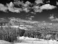
| 01/23/2003 09:57:05 AM | Mohonkby davisspragueComment: Hello from the Critique Club- First I have to say that I know nothing, absolutely nothing about infra red photography. Since this is your first submission I don't know if it is your favorite method. The critique club computer assigns pictures randomly so perhaps someday, on a future submission, someone who knows infra red will review you.
This is New York, right? I know what this coniferous/deciduous landscpe looks like in the winter - bleak. And I also know how cold it was last week. You were brave to get out there at all. I totally disagree with the people who thought this might look better in color, blue and green and grey and white are not so interesting. At first glance it looks almost south western with that jutting rock formation. I think they were expecting some red clay or something. We forget that the East Coast was shaped by the same dramatic geological forces as the rest of the country because it is all covered with trees. Your picture portray a vast, lonely, emptyness that we don't associate with New York.
Your choice of black and white (and probably infra red, but I can't say) empasizes the Earth below and the Sky above, And deemphasizes the trees and bushes that try to cover it up. your sky of course is stunning, no one could have missed that. I like the way that the clouds are mirrored on the land in the corresponding patches of snow.
I like the compositional lines, the Z shape is a nice one for the eye to travel. Leads right to that pinnacle on the bluff. And a matching smaller peak of snow at the other end of the Z is a nice balance. What ever that pinnicle is, it looks man made. It even looks like a religious point of focus - saying "Look what God made".
However, I'm not religeous so I will accept it as an awesome visual point, like a beacon in the wilderness.
Out of focus? I don't see that, the blurry look is just all this bare tree, right? the sky is in focus, the ridge is in focus. My first thought was that this is the wrong venue for a picture like this. Small format, low jpg size doesn't do it justice. It wants to be a BIG print. I seems to vast a landscape to fit on my little screen. Not saying you should crop it, because the compostion is REALLY nice. I'm just thinking it might have scored better if it was less ambitious. 95th place is fine, doesn't make it any less of a photo! It's the same picture no matter where it places.
On the infra red issue, I will repeat what another commenters said. "if this is an infrared image, which is my guess at the moment, then I know firsthand how tricky it is getting things in your image sharp. Infrared has a different focusing point than the one given by your camera". DPC is a bunch of amateurs. I wonder how many even recognized that it was infra red?
Forgot my disclaimer - Please remeber that this is only one persons. far from expert, opinion Message edited by author 2003-01-23 09:58:32. | | Photographer found comment helpful. |
| 01/21/2003 12:02:51 PM | Tumble Dry on Lowby DougPazComment: Hello from the Critique Club - As I promised, I am back to review your photo. I'm sorry that this is the picture I have to critique, cute as it is, because some of your other work is so stunning. I think the lady in the faucet is the best picture ever posted here. I loved the belly button fisher too.
This is an adorable picture (adorable kid to, but you only get partial credit there). And of course it is funny. The poor kids looks dizzy. I hope you didn't really spin him. Perhaps the picture looks a bit too posed with the socks on his arm. I think the white thing in front could look more like a "blankie" Like you washed the wrong item. Don't tell him that, he looks too old for one of those.
Your composition is nice and simple - Both boy and the darkest spot in the picture (dryer cavern) are in the "thirds" position. All the lines are straight except for the kid and let's call it his blankie. Many of the diagonals point straight at the kid, see the lines of dots on the dryer door, and the baseboard and the blankie. The focus is perfectly sharp as it should be with a squeeky clean kid. Also the color composition is lovely. Everything but the kid is muted beige tones, but he is pink and blue. Even his hair matches the beiges. This helps to unclutter the picture, not that it is cluttered. My next point is how uncluttered it is. Everything that is there belongs there. You paid careful attention to everything you included, either in set up or cropping, probably both. That is your trademark, the careful set up, attention to detail and lack of extraneous visual distractions. Maybe that's why the only fault I can find with this picture is that it looks set up, not quite candid enough for the subject. The sparks in his eyes are great too.
Although this is a expertly done photo, it probably scored lower that it's quality would indicate because it does not have a universal appeal. "Dad takes picture of cute kid, mildly amusing" would be the first reaction. And with DPC voting it's that frst reaction that counts. There is nothing here that anyone could score down, nothing techinically wrong. But it takes a minute or so to sort out the precision here. Keep this one for the family album and don't try to enter it in the same gallery show as the faucet lady.
PS. Someone said that the color balance was off, hands were too pink. I have looked at this on three dfferent monitors, and yes, on my cheapo monitor at home, they were too pink and he had lipstick on too. But here at work the colors are just right. Taught me a lesson!!! My editing from home has looked awful. I won't submit from that monitor again.
and the disclaimer: Please remember that this critique is just the opinion of one far from expert viewer. Message edited by author 2003-01-22 09:37:59. | | Photographer found comment helpful. |
| 01/20/2003 02:36:48 PM | | | Photographer found comment helpful. |
| 01/20/2003 02:17:21 PM | | | Photographer found comment helpful. |
|
Showing 1541 - 1550 of ~1646 |
Home -
Challenges -
Community -
League -
Photos -
Cameras -
Lenses -
Learn -
Help -
Terms of Use -
Privacy -
Top ^
DPChallenge, and website content and design, Copyright © 2001-2025 Challenging Technologies, LLC.
All digital photo copyrights belong to the photographers and may not be used without permission.
Current Server Time: 08/04/2025 10:10:45 PM EDT.
|