|
|
|
Showing 1531 - 1540 of ~1646 |
| Image |
Comment |
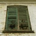
| 02/04/2003 08:30:16 PM | Souvenirby lionelmComment: Hello from the Critique Club-
Sorry to be so slow - This image is taking me longer than usual' I just keep wondering what those children are trying to TELL me. I know they have a message for me. But they just stare silently.
What should I go after first? The things I like or don't like. I'll start with what I see as flaws because that will be much shorter. Actually there is only one thing that bothers me. I haven't decided whether I really dislike it or if maybe it is effective. The problem is with the perspective. The window has such a great , exaggerated looking up point of view but the pictures of the kids do not. So at first glance it makes them look out of place. But as I stare at it, the ghosts seem to sit up and come alive and look down at me. I think I'd prefer it if they stayed in their windows and had the same perspective as the shutters.
Thanks for the hint. It's snowing. I wish there was more snow. There isn't any on the kids. Can you make another layer and fake some? I think the snow adds something to the mood. Snow is so immediate. It is happening in the present. It enhances the contrast between past and present. Also the snow streaks are moving while the children sit so eerily still and watch it.
Everything else I like.
The point of view is wonderful, looking up. looking back in time. (I have to note that all the critical lines are straight, this is my personal pet peeve, tilted pictures). Three nice sets of lines, balancing each other. The window frame has such strong verticals leading up. The horizontal repeating shutter lines are irregular and contrast with the also irregular bricks. Textures are great. The window looks like I could touch it. The colors are wonderful. Just the two tones of green and yellow. Very unusual choice of color scheme but very effective. The children are slightly brownish like a amberotype (spelling?) and that slight brown cast is picked up in the unpainted chipped bricks.
Wow! What a mood! Yes, the house looks old, and the window looks old too. Perfect place for lots of history and ghosts. I wonder what happened to these two little ones. Something tragic? Or did they just grow up and move away leaving their "child-selves" behind. Lots of stories for the imaginative mind.
I love the way you put each child's eyes on a wider slat in the shutters. THis makes the eyes the whole focal point of the picture. I find myself using the word picture rather than photo because this has the feeling of a painting, or maybe even a dream. The eyes are in those two magic thirds spots. You have obscured their mouths and noses, putting even more emphasis on the eyes. What are they watching? Are they waiting for something? Are they watching what the world has become? The shutters are closed. That is important to the scene. It shuts these silent children off from us, as they are shut off by time. They look spooky, not scarey but a litlle bit critical. I hope you'll let us know what they want to say. Do you even know? or is it meant to be a mystery?
Technical stuff (this is my weak point) all looks fine to me. Focus is good, angle is great, Lighting is perfect, lucky you got a grey day. Ghosts cast no shadows, and it fits that there are no shadows al all in the picture. The subdued look is just right, the subdued colors are just right.
The usual disclaimer: Please remember that this is just my opinion and I am no where near an expert.
Okay, I think that's it. Ellen Message edited by author 2003-02-07 10:35:38. |  Photographer found comment helpful. Photographer found comment helpful. |
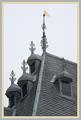
| 02/04/2003 03:14:16 PM | Craftsmanshipby AzrifelComment: This was one of my favorites- top three!!! I guess I should have givien it a ten instead of a nine. I love the roof and I love what you did with it. I HATE borders usually but I think this one should be posted as an example of when a border is well done it really adds to the photo! Where did all the votes go? I was sure you'd get a ribbon. | | Photographer found comment helpful. |
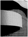
| 02/04/2003 02:23:06 PM | Wall of Windowsby NatashaComment: Hello from the Critique club -
Wow! ! Wow! Wow! Do I have to say more??
THis photo is a classic. Do you think you could have gotten any more textbook design elements into one photo? Shall I point out a few? Line? Exquisite! The straights, the curves. Leading lines? Start at the bottom, shadow leads me in, curve leads me out, swoopy shadow leads me back in, swoopy curve back out. Perfect zig zag and I've covered the whole picture. Shape? Great shapes, mirroring each other in dark and light. Texture? Yep. Pattern? Three different window patterns cantrast and complement eachother without every making the picture busy. Because they are divided by yet another design clasic, shadow. Your choice of black and white gives the shadows a shape and weight of their own, equal to the windows, used to separate and balance the square patterns. lovely. Refection? Yes, the reflections in the larger grid of windows gives them depth and helps create the contrast with the smaller grid of tiles. Perfect.
More? Theres a long list of design elements and you've got them all except color which works by it's absence. How about unity, grouping,placement, balance, contrast, mass? I don't need to point out everything. My personal favorite here is movement and rythm. your picture is like a little dance..or a flag flapping..You took a ten ton wall and made it sway. I love it! Everything in the picture works in it's own right, all add up to the whole.
I am the nittiest of pickers and I can barely see the wire some people complained ot. I think you did an excellent job of camophlaging it, and I love the dangly shadow it casts. Like a strand of hair out of place on a beautiful woman. Without that strand, the scene would have been too perfect, even harsh. A great touch. Also I can't stand an off kilter photo. You worked hard and succeeded in making sure all these tilted lines feel straight.
Technical aspects - all perfect- lighting, focus DOF- post processing, cropping border. Everythings just perfect.
You got a lot of useful comments on this photo. The best images always generate the best comments. Let me just summarize the adjectives for you. Very nice (6). Very well executed. Nice. Perfect. I love it (3). Well done (2). Really cool. Fun. Bravo. Wow. Powerful. Interesting. Great (3). Interesting. Excellent (3). Beautiful (4). Thanks. Gorgeous. Eyecatching. Wonderful(2). Elegant (2). Solid. Strong. Superb. Favorite (2). Good job. I couldn't have said it better. Clap, clap, clap. clap. Stand up and take a bow.
So what should you do now? Find some nit picky way to DQ two more photos? Then you could get the ribbon you deserve. Or get an even better shot next week?
And the usual disclaimer - remember that this is just my opinion and I am not an expert. But a lot of people agreed. Message edited by author 2003-02-06 10:45:35. | | Photographer found comment helpful. |
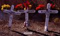
| 02/04/2003 12:19:45 PM | Road Sign Memorialby AnachroniteComment: Hello from the Critque Club - sorry to be so tardy. Sometimes life intervenes.
A personal comment before I start my review. I submitted one of the other road side memorial pictures. It was a tree with wreaths on it. My son's friend Steven was killed there just before Christmas. (Twilight Zone music begins to play here). I felt compelled to enter his tree, I even went out late Sunday afternoon to take the picture before the deadline. That Friday, during the voting, my own son was in a similar accident. Lucky for him there was a wide stretch of snow bank to hop up on and slide over before he hit (and snapped off) a stop sign. Son is fine but don't ask me about my car.
This is a powerful photo! Two lives lost, two children gone. The home made look of the memorial makes it so personal. The stuffed animals emphasize their youth. The dates tell a story: the kids were sixteen and seventeen. But also they died in 1995 but here eight years later there are fresh flowers on the crosses (oh, maybe tey are plastic - I'll pretend they are fresh). Gone but not forgotten. I like the way the croses reach out to eachother like they are trying to hold hands even in death.
Techinically the picture isn't as stong as it is emotionally. It is dark, to my taste. I have calibrated my monitors so most pictures look much better now. Back lighting is hard to get right but I think you got it. the shadows in the front all to the picture and the rim of haloed light around each cross adds to its religeoud undertone. Focus is good.
Composition is straightforward, one, two three. Three crosses in a row. the tilt of the left one breaks up the repetition. Tilts to the right, shadows lead off to the right. I agree with the commented who wanted to see the full shadows, they hint at making a nice design, maybe they even merge together and the two separate lives were merged in death like on the center cross. Although it as unavoidable I think the image is too cluttered. There is too much stuff with texture, the ground, the bushes the tufts of grass. And that water is totally confusing at first glance. Teddy bears all over, some in shadow, some in sunlight and all the flowers. You can't leave any of this out but it does create a cluttered image.
Now I'm going to say some wierd stuff - play that music again please. This picture is oddly religeoius, as are many of yours. I'm betting that it is unintentional and maybe all my interpretation. I am not a religeous person but I keep fgetting the same disturbing quasi ancient christian feeling from some of your work. Here are three crosses, the holy trinity. Here are teddy bears nailed to crosses like christ and the others. Here are the blood red flowers, the spikey crown of thorns. The same blood red as the blood of the deer (oops I was the one who called you an old lady as I recall) in the ritualistic sacrefice, where a cup was filled with blood to drink...communion? I got the same disturbing sense from your picture of your hands, like these were meant to be the hands of god, the way they were lit. And that church doorway with the beautiful but blue light shining from within..is this the doorway to the devil in the wrath picture... Enough of the wierd stuff, you can turn off the music now. I was never even a catholic.
There is something powerful going on in all your photos. Even your DPC humor entry which you thought was so funny (so did I) had a dark and dangerous undertone to it. Don't you think if the tattoo had been on a cute young chick it would have won? I think your images unsettle voters and they unconscienously drop you a notch. Calendar photos they are not. Don't water down your energy to play for votes.
Now the disclaimer: Please remember that this is just my opinion and I am not an expert by any means.
Message edited by author 2003-02-04 14:13:45. | | Photographer found comment helpful. |
| 02/04/2003 10:45:42 AM | | | Photographer found comment helpful. |
| 02/04/2003 10:37:33 AM | | | Photographer found comment helpful. |
| 02/03/2003 10:03:38 AM | | | Photographer found comment helpful. |
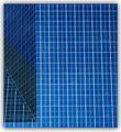
| 01/31/2003 10:23:19 AM | ArchiSquaresby Dallas_TXComment: Is this a building or a showerstall? I like that there is no frame of reference. | | Photographer found comment helpful. |
| 01/31/2003 09:43:25 AM | lonely roadby imagesloyolaComment: Hello from the Critique Club - Sorry I'm late. Life intervened in the form of a sixteen year old son, a stop sign, and the side of my car. Son is fine, car is not.
I'm glad, actually, that I waited to review your photo because in the meantime I have calibrated all the monitors that I use and now your road looks much better. I can see the children in your other two submissions too. I think that many people who vote do not have their gamma thing adjusted and therefore see a photo like this one very dark. There were several comments about it being to dark, which it is not. And while I'm on the subject of voters, remember that this is an amateur bunch. Some do not even own cameras. In your case you lost a lot of points because people couldn't read the sign. If it had been a familiar US roadsign which have standard recognizable shapes it wouldn't have been an issue, but it is in arabic and people wanted to know what it said. We Americans are a narrow minded bunch. We forget the rest of the world exists.
Looks like I have started out with the negative stuff so I"ll continue and then get to the good stuff. Another reason I think you are not gettting the scores you deserve on all three of your previous entries is that they are "too small". You are not taking advantage of the maximum size allowed. I think this is a mistake because you lose a lot of potential for detail if the image appears smaller on my screen. Lonely road is only 328 x 476 pixels when the rules state that you can use anything up to 640. Why not take advantage of the max?
That's the end of my bad comments- just that voters are picky and that pixels are lacking. Now the good comments. This picture is STUNNING!
Lonely Road is a perfect photograph in all respects. Where can I start? It is a masterpiece of composition!. First it is divided into thirds, that magicly pleasing division based on the biology of a humans field of view. The lower third is darker and weights the upper two thirds of sky.
The leading lines of the road go to a vanishing point in another thirds position. All the curved lines lead into the picture, nothing leads out. It feels like a black hole. Even the lines of the clouds are pointing and swirling towards that distant destination. The uprights of the road signs (I don't care what they say) all contrast with the curves of the road, but they, too, tilt slightly inwards as if they are being sucked into the vortex. I love the repeating patterns of the dots and dashes. The dots in the center strip are echoed by the dashes at the edge of the road and again but the concrete barriers which are dashes with dots on top. Lovely. Texture in the foreground smooths out in the background and reappears in the sky.
Black and white is the perfect choice. The grey tones are all muted except for the road sign which stands out by being dark. Nothing is bright white. Nice. Another advantage of chosing black and white is that I think it makes the photo sort of universal. For me, and where I live, I imagine that there is an ocean out to the right, beyond the barriers, and that the buildings on the left are coastal. But I can also imagine how it could be interpreted as snow over there, or sand, or a large lake. No matter what you think you see it is in the "vast nothingness" category, or maybe I mean "vast nature-being-stronger -than-man feeling". The road is clinging to the frontier of overpowering landscape and weather. Just barely holding on, maybe about to be flooded, or blown away. The little human buildings on the left look fragile and temporary. And there is no one there. Lonely lonely. Lonely because there is barely a trace of humans. The road signs and lamp posts don't feel like they were put there by people, they feel like part of the landscare. Only the building looks man made, but maybe deserted. ANd lonely because of the hugeness of the sky and land you show, a person would feel very tiny. Would he even cast a shadow? None of the road posts do.
Techinical stuff? all perfect, perfect focus, perfect lighting, perfect BW balance, perfect post editing (if any, maybe the photo was perfect to begin with), percect focus....um what else is there? I'm sure it is perfect even if I forgot to mention it.
This is a very tight, professional, controlled, planned out photo. Nothing extraneous to the visual or emotional message was included. I hope you continue to submit. The rest of us could learn a lot by studying your images. Next time, please, make the picture bigger. You deserve to win some ribbons here.
Now the disclaimer - remember that this is only my opinion and I am not an expert, far from it. Message edited by author 2003-02-04 12:05:20. | | Photographer found comment helpful. |
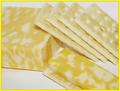
| 01/30/2003 09:48:08 AM | Cheese and Crackersby HBunchComment: Hello from the Critique Club -
Okay, I have to start with the most glaring error her and get it out of my way before I can move on. that awful border. With all the arguement about boarders being allowed/banned, here is a perfect example where the border detracted from the photo. I bet you would have scored at least 30 places higher if you hadn't added the border. What's wrong with it? A simple mistake - the color. The yellows in your photo all have a red (orange) cast and the yellow in the border has a green cast, Yuck - clash. When i see a color issue or a brightness issue, I like to look at the photo on several different monitors. On one, the yellow looked like yellow and on three it looked like neon with the greenish slant. Perhaps it looked OK to you. try desaturating all the green and blue. Too many people (me included) marked you down for the border color.
Hmmm ... I better say something nice quick so you'ss keep reading. This photo has a lot of potential but fell short. the idea is good, meets the challenge and all. I like the textures especially. Nice contrast of textures. I love the composition, but do you think it feels crowded? I'd have like to see a little leg room or head room on one of the sides. I think the top would be my choice for a sliver of more background. The compositional lines are lovely, you have a good eye, I've noticed that in your other shots too. Nice diagonals, crackers point to cheese right to left, cheese slice leads the viewer back left to right. makes a circular pattern for the viewer whis is very pleasing. The repeating lines are great too, the lines in the piles of crackers are viaually interesting.
So composition is your strong suit, it seems to come naturally to you. Some other stuff needs work. Is anything in focus here? I would have preferred a nice sharp focus to emphasize the play of textures that you have set up.
Given your natural artistic eye, I'm wondering if the other flaws here could be as simple as a monitor calibration problem. You say you adjusted your colors in post processing. But to me everything is too light and the colors are not bright enough, they look deliberately washed out. Did they look better on your computer? Cheese and crackers are pale enough without making the photo too light in addition. The natural color wou;ld have been effective. And that blankety blank border - how did that look to you? Is it a glaringly bright and mis matched?
Just for the sake of arguement I think you should go back to this photo and fix it. Give it a different border and boost those colors. (Don't change the whote balance, you got that on the money.). hey, then you could reenter it in the Before and After challenge.
Now the disclaimer - remember that this is only one opinion - mine - and I am very far from an expert here. I'm sorry that it was a harsh critique. Message edited by author 2003-01-31 09:40:53. | | Photographer found comment helpful. |
|
Showing 1531 - 1540 of ~1646 |
Home -
Challenges -
Community -
League -
Photos -
Cameras -
Lenses -
Learn -
Help -
Terms of Use -
Privacy -
Top ^
DPChallenge, and website content and design, Copyright © 2001-2025 Challenging Technologies, LLC.
All digital photo copyrights belong to the photographers and may not be used without permission.
Current Server Time: 08/05/2025 04:07:55 AM EDT.
|