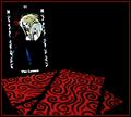
DPChallenge: A Digital Photography Contest You are not logged in. (log in or register
 
Browse Settings
Currently viewing:
Registered Useremorgan49

Show comments:

Per page:

Order:

Comments:


Comments Made by emorgan49
Pages:   ... [147] [148] [149] [150] [151] [152] [153] ... [165]
Showing 1491 - 1500 of ~1647
Image Comment
Blues
03/03/2003 09:19:06 AM
Blues
by nathaliedoo

Comment:
I hate it when my favorites end up low - I gave this a nine - I thought he/she was singing also. a waay under rated photo
Photographer found comment helpful.
 Seeing Beyond
03/03/2003 08:52:58 AM
Seeing Beyond
by Natasha

Comment:
This was my favorite from the challenge - I only gave one ten. I think it faltered in the placing because it didn't fit peoples preconcieved notion of stock. None the less it is a beautiful photo... and yes, it is more "emotive" - a step away from your tightly controlled work. VERY nice use of color.
Photographer found comment helpful.
Invitation To A Suicide
02/25/2003 01:32:15 PM
Invitation To A Suicide
by Gotchya

Comment:
love the picture, hate the border, how to score it?
Photographer found comment helpful.
Stranded
02/25/2003 01:27:32 PM
Stranded
by GolferDDS

Comment:
the best snow picture
Photographer found comment helpful.
Alone In Glory
02/25/2003 01:05:29 PM
Alone In Glory
by Shiiizzzam

Comment:
ouch - okay, this one made me cry
Photographer found comment helpful.
Help Us, Lord
02/25/2003 01:00:32 PM
Help Us, Lord
by rmockmt

Comment:
don't chop off her fingers
Photographer found comment helpful.
...isn't free.
02/25/2003 12:08:44 PM
...isn't free.
by jimmyn4

Comment:
Hello from the Critique Club -

My favorite comment on this picture is "don't see love". Yep, that was the message, and he got it. Love isn't Free. Money can't buy (me) love. There's more to life than money. Old George has the answer.

This is a really nice macro. First because it is technically fine and second because the composition is interesting, So, you got the focus right, and the lighting right. Color balance is right too.

It's a trick to take something so familiar to most of us and turn it into an interesting picture. A dollar bill, big deal. I like that this is a used dollar. The fold down the middle which you have placed exactly on the diagonal makes a balancing line for the stronger horizontals near the top (X is always an interesting arrangement) and the semi circle around George. George is dead center, at least his eyes are but you create an optical illusion so that he doesn't appear to be in the middle. I like that one of his eyes is sharp and looks right at the viewer and the other is faded. That worn fold is also used as a texture contrast with the dotted and thumbprint patterns on the paper. Even though it was not your decision, the duotone green and black is nice.

I don't have any suggestions for improvement - You took a simple image with a thematic punch and made all the right design choices. 1. you eliminated any extraneous background. 2 you chose a worn out bill, 3. you put it on the diagonal, 4. you put george in the middle with his eyes on the opposite diagonal so he appears to be making eye contact with the viewer. 5 you included just enough lettering to be interesting without being distracting. people need to be able to read letters but if there is too much to read it dominates. 6 you used the circle effectivley. 7. I like your Macro lens.

Disclaimer: Remember that this is just my opinion and I am NOT an expert.

PS - I like some of your othe pictures too - the uniform, the barbeque, the keyhole. Nice work

Message edited by author 2003-02-25 17:24:06.
Photographer found comment helpful.
Vampire Tarot ~ The Lovers
02/24/2003 04:55:29 PM
Vampire Tarot ~ The Lovers
by Annida

Comment:
Hello from the Critique Club -

Is there a card in your deck that fortells that you will get a new camera? I have read in the forums that yours is a (forgive the expression) crappy camera. However, you can't hide behind that as an excuse. WHen I click on the camera name in yor profile, it brings up a bunch of very nice photos taken with the camera. And lo! many of them are in focus. I think the lesson here is that a photographer should know his equipment and understand st's strengths and weakenesses.

Here you have tried to take a shot that is beyond your camera's ability to focus. Clearly you are frustrated that your designs cannot be executed, but that is not an excure for submitting an out of focus picture. Look at Lisa's with the bread dough, camera won't focus? create a motion blur. Your own yellow photo is quite sharp. Can't take a low light photo? Then don't. Just as a gallery show is only as good as it's worst piece, a photo is only as good as it's worst part. Your focus problem is compounded by your choice to include printed words. Humans have an uncontrollable desire to be able to read what they see. There was recently a glorious photo of a road winding off into the mist that got panned because the road sign was in arabic and many viewers complained that they couldn't read it. Photography is a sport that needs an audience, therefore to be effective it has to pander to some of the biological brain functions of it's viewers. I spent far too long trying to figure out what the picture on the card is. It looks like a vampire leaning over the shoulder of the PlayBoy bunny with floppy ears and a bow tie.

Now lets say, for the sake of arguement that the photo was in focus, even what we sometimes incorrectly refer to as soft focus (ie, only a little out of focus) then the rest of the elements here are very nice.
This is a carefully crafted composition. Here are the parts that I like, in no particular order:

The colors - are great, the blood red cards, black background, white text and figures with just a splash of blue to help draw attention to the vampire. I love the way the black pattern on the cards is blened with the background so that the swirls and edges of the face down cards make an abstract design, and the way the face up card has no substance, just an image on the black.

The lines - are stunning. The strong straight black lines point out into the empty, dangerous black nothing space (I can't agree with the commenter who said there was too much negative space). Those strong lines are mirrored by the whilte lines formed by the text. One set tilts right, the other tilts left. And the little figures in the text, are they leaves? mirror the larger swirlies on the cards. The black on red swirls also point into the void, even more seductively that the straight lines. But luckily the cross hatches on the leaves bring me back, saying "maybe not, don't know". That vampire is a trick image for me, yesterday I figured out what it was and thought ah ha. But today it has turned back into the bunny. The vampire leans towards the void but the bunny just looks silly.

Composition - very nice - lower third is all red, left third has the vampire card, That leaves to upper four ninths deep black. The black negative space is an equal player in the scene, it has to be larger to balance out the visual attractiveness of the red and black patterns which in turn have to be larger than the representational image of the vampire and the words. You have created a perfectly balanced picture according to how the human visual system works.

So keep saving your pennies for that new camera. This is a "could have been great" image but I, for one, can't forgive the lack of focus. It seems like cheating to whine about the camera.

Now the disclaimer: Please remember that this is just my own opinion and I am NOT an expert by any standard.


An aside note about your Stock photo which I like very much: When my Dad died last year my mother was being picky about the urn to bury his ashes in. She said "Henry would have liked something like this sake bottle he brought back from Japan". In the end we made a paper funnel and poured him into that sake bottle, sealed him in with sealing wax and planted him with a stone lantern as a marker.

Message edited by author 2003-03-04 15:49:55.
Photographer found comment helpful.
A Prize Inside
02/24/2003 11:52:50 AM
A Prize Inside
by sher

Comment:
use more of the 640
Photographer found comment helpful.
Storm Brewing
02/24/2003 11:46:52 AM
Storm Brewing
by Gracious

Comment:
Pretty - there were pictures I liked better, but this is the only one that is perfect for stock - that seagull is a good tough.
Photographer found comment helpful.
Pages:   ... [147] [148] [149] [150] [151] [152] [153] ... [165]
Showing 1491 - 1500 of ~1647


Home - Challenges - Community - League - Photos - Cameras - Lenses - Learn - Help - Terms of Use - Privacy - Top ^
DPChallenge, and website content and design, Copyright © 2001-2025 Challenging Technologies, LLC.
All digital photo copyrights belong to the photographers and may not be used without permission.
Current Server Time: 06/17/2025 10:18:44 PM EDT.