DPChallenge: A Digital Photography Contest You are not logged in. (log in or register
 
Browse Settings
Currently viewing:
Registered Useremorgan49

Show comments:

Per page:

Order:

Comments:


Comments Made by emorgan49
Pages:   ... [131] [132] [133] [134] [135] [136] [137] ... [165]
Showing 1331 - 1340 of ~1647
Image Comment
Fanfare
06/03/2003 10:32:25 AM
Fanfare
by kavamama

Comment:
Hello from the Critique Club- I like to day a couple of days to think about a photo before I review it.

What a great start for your first entry! 20th place is impressive and so is a score of 6. Unfortuneately I was one of those "middle of the pack" voters. I gave you a six.

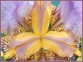
I'll start with the good stuff. Exquisite focus, just lovely depth of field. All of the flower is in tight focus and the background green is blurred. The petals protuding in the center are just as sharp as those behind and the fuzzy pollen laden stamens (or is it pistons?). Great colors, very subtle but well balanced yellows and purples. Perfect lighting! soft and again subtle, feels like early morning fresh. Nice interplay of texture and pattern. The smooth center petals contrast with the busy spots of the outer petals and the bright yellow pollen. The weight is right too, the heavier darker, busier elements of the photo are near the bottom and the lighter, airier lavendar petals are at the top.

And then the bad stuff - this is what separates a good photo from a great one. Your composition is pretty basic, a straight on shot with the object of interest in the middle of the frame. You have only one center of interest and all the leading lines point there. This shot is perhaps too symetrical to forgive the slight assymetries. Why is the top petal cut off? Would a more square format have suited the flower better than the standard rectangle? What if you rotated it ever so slightly so that the lower petals were at the same angle?

Or better yet...what if you had abandoned the symetry altogether. Have you read the tutorial on the rule of thirds. All rules are meant to be broken, but also they are meant to be mastered. Would the flower have been more dramatic and less static if it had been placed off center in the frame? taken from an angle? had a more (or less) contrasty background.

In the DPC lingo, you need something more to take this from "nice" to "WOW".

Disclaimer: remember that this is only my opinion and I an NOT an expert.
Photographer found comment helpful.
The Roar of a Fast Flowing River
06/03/2003 09:56:00 AM
The Roar of a Fast Flowing River
by CLarson557

Comment:
People like to "read" a photo from left to right. This feels backwards, even though i isn't. Try flipping it to see if it looks better.
Photographer found comment helpful.
Moonlight Sonata
06/03/2003 09:55:03 AM
Moonlight Sonata
by qachyk

Comment:
Lots of problems here - I'll just mention one - camera shake. You don't have enough light for a hand held shot here. If you had put the camera on a trii pod or even balanced it on a chir or a beanie baby the keys would have been in sharp focus and then the blurred hand would have been effective.
Photographer found comment helpful.
Not so loud
06/03/2003 09:12:32 AM
Not so loud
by Crafty Sue

Comment:
wish their faces were turned towards the camera
Photographer found comment helpful.
Sizzling Morning Campfire
06/02/2003 03:05:04 PM
Sizzling Morning Campfire
by DougPaz

Comment:
ooh - enter this one for smells too. your cmposition could be better, you didn't take advantage of the interesting patttern of lines of the grill, the pan seems to take up too much room, maybe more of the campfire could show? glowing coals?
Photographer found comment helpful.
Behind the Screen
06/02/2003 10:10:18 AM
Behind the Screen
by Paige

Comment:
100th place?? Boy was I off this week. This was CLEARLY the best photo submitted, and my second choice came in 90th. This is a stunning photo!! Hey, 100 is a nice round number - Just pretend you are in grade school when 100 meant a PERFECT score!
Photographer found comment helpful.
Z-sun
06/02/2003 10:06:57 AM
Z-sun
by justine

Comment:
90th place??? My second favorite picture is in 90th? What happened??? This was a ribbon for sure!!!!
Photographer found comment helpful.
Behind the Screen
06/01/2003 12:41:30 PM
Behind the Screen
by Paige

Comment:
10 - This is my favorite!
Photographer found comment helpful.
A Portrait from the Past
06/01/2003 12:24:05 PM
A Portrait from the Past
by Marjo

Comment:
You could have done more with this picture - the fuzzy rug underneath detracts - The crackle wall is perfect- Those shadows on the wall could have been a great part of the image.
Photographer found comment helpful.
Library Square
06/01/2003 12:21:38 PM
Library Square
by frisca

Comment:
A great photo but a muddy color - Could another color have made it as dramatic as it should be?
Photographer found comment helpful.
Pages:   ... [131] [132] [133] [134] [135] [136] [137] ... [165]
Showing 1331 - 1340 of ~1647


Home - Challenges - Community - League - Photos - Cameras - Lenses - Learn - Help - Terms of Use - Privacy - Top ^
DPChallenge, and website content and design, Copyright © 2001-2025 Challenging Technologies, LLC.
All digital photo copyrights belong to the photographers and may not be used without permission.
Current Server Time: 06/19/2025 02:10:09 PM EDT.