| Image |
Comment |
| 06/30/2004 01:46:26 PM |
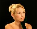
My Love...by toddheadComment: I think I would move her to the lft a little and leave an uneven amount of black. whatever she is staring at or thinking about is also part of the image and he needs some room too. The extra negative space on the right implys that there is another part to her life, but the extra negative space on the left is just extra space and doesn't contribute. try it |
 Photographer found comment helpful. Photographer found comment helpful. |
| 06/30/2004 01:43:33 PM |
Captain George Highlighted.by graphicfunkComment: Great face! great triangluar composition! Lots of wonderful leading lines, cheeks, arms, shirt folds, makes a nice flow for the viewers eyes. lighting is a bit harsh and I find the cloth under his elbows distracting. also that dip in his next commands too much attention, soften it out? |
| Photographer found comment helpful. |
| 06/30/2004 12:47:30 PM |
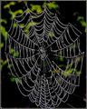
The extraordinary skill of the spiderby trainComment: Happy Halloween. The contrast between the sharply focused web and the completly out of focus background is very nice/ The over processed look works well here, even the grainy background. It is a sylized image of a spider web, you can than the spider for the wonderful repeating patterns in the lines. You can thiank yourself for mimicking the radiating pattern in the leaves of the background. I like the way the image reads from top left to lower right and the center of the web draws the eye back into the scene. |
| Photographer found comment helpful. |
| 06/30/2004 12:42:47 PM |
Natural Symmetryby ellamayComment: oh my. this is lovely. What a perfect scene. the contrast between the straight lines (square) and the curved is wonderful. the pink side of the square repeats the pink flowers, the yellow in the center anchors each halp in the middle. The muted colors work well to enhance the Zen ness of the image. So very nice. Not quite sharp enough for a ribbon, you'll have to settle for a top ten. |
| Photographer found comment helpful. |
| 06/30/2004 09:47:55 AM |
|
| Photographer found comment helpful. |
| 06/30/2004 09:34:51 AM |
The Calm After The Stormby GolferDDSComment: Although this scene probably has a hill. the tilt to the horison is disconcerting. It might work better if it were straightened. Sometimes quick viewers get the seasick sense that "something is off" without identifying it as tilt an you lose points here and there. |
| Photographer found comment helpful. |
| 06/29/2004 02:16:05 PM |
Rustyby wingyComment: once again my top picks bite the dust - Why did I give it a nine? - I wish I had given a ten. This reminds me of your train picture with the crossing sign. |
| Photographer found comment helpful. |
| 06/28/2004 11:07:44 AM |
|
| Photographer found comment helpful. |
| 06/28/2004 11:06:11 AM |
Contemplationby waterliliesComment: A tighter crop? It feels out of balance with all that stone. The colors are so nice, as is the pose and the sad expression, I think it would be stunning with a much tighter crop. |
| Photographer found comment helpful. |
| 06/28/2004 11:04:17 AM |
Bill & Kimby TooCoolComment: Sometimes you can make people slimmer by cropping them. Thia is lovely but I'd take a little more off the left. The black is heavyier than the white and so the image feels a bit unbalanced. |
| Photographer found comment helpful. |
Home -
Challenges -
Community -
League -
Photos -
Cameras -
Lenses -
Learn -
Help -
Terms of Use -
Privacy -
Top ^
DPChallenge, and website content and design, Copyright © 2001-2025 Challenging Technologies, LLC.
All digital photo copyrights belong to the photographers and may not be used without permission.
Current Server Time: 06/22/2025 05:13:25 AM EDT.