| Image |
Comment |
| 07/02/2004 07:35:55 PM |
|
 Photographer found comment helpful. Photographer found comment helpful. |
| 07/02/2004 02:42:59 PM |
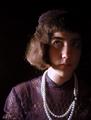
Margaretby melismaticaComment: What an odd, wonderful portrait! Make you wonder who is Margaret, she must have a story to tell. She's too old for pure dress ups, too young to really wear this get up. He strange expression adds to the mystery. The phoot itself is really well done, the lighting enhances the drama and makes her look more trapped in her odd life. Her upward glance is tentative to the point of being afraid. Great work! |
| Photographer found comment helpful. |
| 07/02/2004 02:38:47 PM |
Sheridanby gajmajComment: I am loving the high key entries into the challenge. I think this is my third favorite over all, not just of the high keys. The lighting and the color are sooo nice, her eyes are perfectly placed to draw attention, her gaze and the tilt of her head make the photo move. |
| Photographer found comment helpful. |
| 07/02/2004 02:36:08 PM |
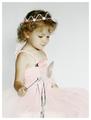
Princess by SonifoComment: Of course this is the winner! Everything is just perfect. I love the hand colored look, remember when we did it with inks? the light is lovely but that shadow along the back of her face, neck, arm is exquisite. 10 |
| Photographer found comment helpful. |
| 06/30/2004 07:15:01 PM |
Breakfast for Twoby OneSweetSinComment: Wonderful portrait. Tells a great story. reminds me of Lassie. Is the whole picture tilted slightly to the right? Would it look better straighter? I like the muted tones. Sometimes if you take the sponge tool and saturate the color only on his eyes it gives the face a bit of a focus. |
| Photographer found comment helpful. |
| 06/30/2004 07:07:14 PM |
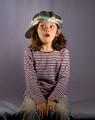
Pleasant thoughtsby awpollardComment: I think in a portrait the eyes should be a center of focus. Her eyes are nice and bright with good catch light but they are they same brightness as her finger tips, Well, it is a nice french manicure but unless she was the manicurist or particularly values her hands, I think the fingernails command too much importance. The best light falls on her hand also and the jewelry is ver interesting, That leaves her face with a secondary importance. What about cropping just below her knuckles, that looks more balanced to me and makes her lovely face stand out. I do like the way you have left more space on the left, leaving room for her gaze to be part of the picture. Maybe the white balance is too pink? |
| Photographer found comment helpful. |
| 06/30/2004 03:59:55 PM |
|
| Photographer found comment helpful. |
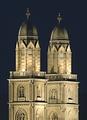
| 06/30/2004 03:56:47 PM |
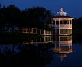
Double Spiresby BeeGeeComment: Perfect lighting, perfect composition, extraordinary duplication of design. |
| Photographer found comment helpful. |
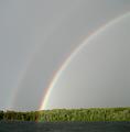
| 06/30/2004 02:00:53 PM |
A Rainbow's Endby readmeComment: The rainbow is nice but there's not much else here to make it interesting. |
| Photographer found comment helpful. |
| 06/30/2004 01:59:41 PM |
Big Mouthby boomerComment: There are some stunning leading lines in this photo. It reads easily from left to right, high to low/ The top pelican points to the greedy one (love his shirt collar). the pattern of scallops on the roof repeats in the sape of the wings. the building lines contrast with the organic forms and feathers. the mouth is perfectly positioned to be the central focus. I think I would have increased the contrast and saturated the inside of the mouth. |
| Photographer found comment helpful. |
Home -
Challenges -
Community -
League -
Photos -
Cameras -
Lenses -
Learn -
Help -
Terms of Use -
Privacy -
Top ^
DPChallenge, and website content and design, Copyright © 2001-2025 Challenging Technologies, LLC.
All digital photo copyrights belong to the photographers and may not be used without permission.
Current Server Time: 06/22/2025 05:09:57 AM EDT.