| Image |
Comment |
| 09/05/2005 12:37:20 PM |
BW film developerby birgirComment: wow, great shot great idea! beautiful only thing I would fix is the background is a little blown out. mabey come down a stop |
 Photographer found comment helpful. Photographer found comment helpful. |
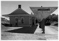
| 09/05/2005 12:36:35 PM |
Shadows and Light (A Study in Black and White)by rayg544Comment: wow, I like this shot alot
the left side behind the building kinda takes the feel of the shot away and it looks like that may be an overturned trash can or something of that sort under the awning. I love the border and the exposure and dof is perfect. I would have put a very very slight desharp mask across this image but other than that great shot. clean up the left side and this would have been a 10, but I'm going to go with a 9 here |
| Photographer found comment helpful. |
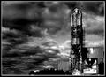
| 09/05/2005 12:34:41 PM |
Old concrete mixing plantby gisliComment: there is a ton of noise or grain in this shot. The dark in the bottom middle part of the frame areway blown out and there aren't many light points in the frame compaird to the number of dark points. Great try though, go back and fix the noise problem and your scores will improve a lot |
| Photographer found comment helpful. |
| 09/05/2005 12:31:27 PM |
Contrast Matches His Job No Gray Areaby eaglebeckComment: lol, great great shot. the comp is perfect the exposure is just right. you hit the dof perfect, there is only one major problem. there is alot alot of noise in this shot. crank down your iso and don't let the camera over heat. the noise in this shot is almost overwhelming and I think it robbed you of a top 10 finish here...8 |
| Photographer found comment helpful. |
| 09/05/2005 12:29:41 PM |
|
| Photographer found comment helpful. |
| 09/05/2005 12:28:57 PM |
Luminous Gazeby kadac00Comment: wow, I like what your trying to do here. the only problem is the exposure. the focus is wonderful but the blacks are to grey and the white are to gray. put the camera in manual and take the meter readings yourself |
| Photographer found comment helpful. |
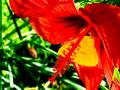
| 09/05/2005 12:03:17 PM |
Flowersby LKMoteComment: very nice shot, good use of dop and contrast. though I'm afriad that there will be 6 million flower entries and overall you may get voted down due to that. I love it though 7 |
| Photographer found comment helpful. |
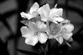
| 09/05/2005 12:02:32 PM |
there is no grayby snowdogComment: ohh very nice shot, I love what your trying to make here. There are a few problems though, the lighting just makes glare on the wooden things and the eye goes stright to that, there is a spot on the background that looks like it's been cloned and not very much time was spent on doing that. the lights are to light and the darks are to dark and it loses some sharpness in the front. Next time take a meter reading for the white and a meter reading for the black and then take the average. also to, move your lights farther back or but a diffuser of some sort on them, (tolit paper works well, the cheap kind) and mabey clean the dust from the sensor and it would be great, keep shooting! |
| Photographer found comment helpful. |
| 09/05/2005 11:57:18 AM |
Wrapped Upby dw_photoComment: very nice image, I like how it's simple yet nice to look at. Only think i would have done different is change the light angle you can see a glare on the black |
| Photographer found comment helpful. |
| 09/05/2005 11:56:26 AM |
Contrasting Colorsby trobergeComment: the quality is very lowon this image, very grainy I like the take on the color contrast side of things but the green in the frame takes it farther away from contrast and farther towards a color triangle, which is balance not contrast |
| Photographer found comment helpful. |
Home -
Challenges -
Community -
League -
Photos -
Cameras -
Lenses -
Learn -
Help -
Terms of Use -
Privacy -
Top ^
DPChallenge, and website content and design, Copyright © 2001-2025 Challenging Technologies, LLC.
All digital photo copyrights belong to the photographers and may not be used without permission.
Current Server Time: 12/21/2025 01:02:38 PM EST.