|
|
|
Showing 731 - 740 of ~3731 |
| Image |
Comment |
| 07/30/2007 07:06:44 AM | Cowboy Upby neophyteComment: Greetings from the critique club :)
Well first of all, this definately meets the challenge, no doubt. I do like the lighting, maybe a bit harsh but still pretty good. I am not sure b/w was the way to go here, I do like the b/w conversion, it´s got great tones in it and looks cool but I just get this impression that the colors in this shot would have made it pop a bit more. Most of all, the hat and overall would have looked nicer in color I am sure, but the backround was maybe too prominent in color so that´s why you chose to make it b/w? Anyway, not sure it would be better, it´s just the impression I got.
Composition is not bad but maybe a bit too centered, had you taken this a bit wider and shown more of his surroundings, keeping him in the left corner of the photo, would it have been better? Maybe showing this dude in the dunk tank would have gotten you a better score, I am not sure. Anyway, this is a pretty nice photo and I think it should have scored a bit better but maybe the reason it didn´t is cause it´s not really memorable or stands out from the rest like it could have done had you maybe shown more of the surroundings.
Kind regards from Iceland, Lárus. |  Photographer found comment helpful. Photographer found comment helpful. |
| 07/30/2007 06:38:11 AM | Baby Blue Eyesby Delta_6Comment: Greetings from the critique club :)
As a parent, I don´t often know what to say on pictures of other peoples kids so I might keep this a bit short.
I think this shot was pretty underrated in this challenge but then again I can guess on why it didn´t do better. First off, the lighting doesn´t really look natural, I personally would have given you the benefit of the doubt but it looks like you lit it with some side lighting, like a monolight or off camera flash. Like I said, I would have given you the benefit of the doubt but a lot of DPC voters are pretty anal when it comes to things like this and would certainly have voted it down for that.
Secondly, this baby is extremely cute and has a lovely smile, definately a photo to put in the family photo album for years to come. However, it´s not really something I haven´t seen or photographed before and while this is a treasure for you and the baby´s family, for other people this is simply a snapshot of a very cute baby, there are a lot of cute baby snapshot´s on DPC and I guess some people are tired of seeing them and vote down because of that. I am not fed up, far from it since I love kids and me and Henný are probably not done yet, but if you want a better score, try to make your baby photos a bit less "snapshot-ish" :)
Kind regards from Iceland, Lárus. Message edited by author 2007-07-30 07:17:43. | | Photographer found comment helpful. |
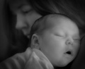
| 07/30/2007 06:25:06 AM | Somnolentby KaliComment: Greetings from the critique club :)
As a parent, I always get a little bit lost for words when I am commenting on photos of children so I am going to keep this pretty short.
First off, congratulations on your new baby! I remember those first days very vaguely, funny how our minds only remember them sleeping like this and not of them crying their lungs out, hehe :) Has got me and my wife thinking about making another one and Alexander is not even 5 years old :P
This photo definately meets the challenge, I like the shallow DOF and that you decided to make this b/w. I am not really fond of the way you did convert it to b/w though, did you use the channel mixer and a lot of the red channel and very little of the green and blue channels? I just feel like this image looks a bit too "Infra Red" to my personal taste. It´s a minor detail though but I think I would have liked it even better if you had a little less IR look to it and had used more of the green channel while b/w converting it. Perhaps I am wrong and you got this IR look some other way, by perhaps dodging/burning but in any case, I think I would have preferred the image with some other b/w look.
Lighting is nice, as is the composition and DOF like I said earlier. Both of your expressions are memorable and sincere and they always look like little angles when they are sleeping :)
Kind regards from Iceland, Lárus. | | Photographer found comment helpful. |
| 07/30/2007 06:09:05 AM | A Beat From Withinby JawnyRicoComment: Very nice dude, congrats on the new personal best. Don´t think it´s long before you ribbon if you just keep at it and do things your way, don´t wonder what other people like :) | | Photographer found comment helpful. |
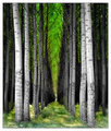
| 07/30/2007 06:02:45 AM | Archesby CitadelComment: Greetings from the critique club :)
Well I don´t have a lot to say about this image as I find it very pleasant to look at, it´s a good shot but I still think I would not have voted it higher than a 6 if I had voted, mostly cause even though it´s a pretty good image, it doesn´t really grab me either.
It´s well composed and exposed, the depth of the image is great and it meets the challenge head on. I am not sure I like the blue toning but it´s not bothering me much either, I would have to see the shot with a more neutral color cast to decide wich I would prefer, like I said, this is nothing that is bothering me much and I completely understand why you chose the blue cast.
Post processing is nice, only thing I would have done diffrently was to even out the lighting a bit, darken the areas that are the brightest and brigthen the darkest areas but not by much so the image doesn´t loose too much contrast.
I just think this image lack´s that certain something to make it really pop off the screen, maybe something extremely interesting at the end of that hall? Don´t know...
Anyway, congrats on your new personal best :) Kind regards from Iceland, Lárus. | | Photographer found comment helpful. |
| 07/30/2007 05:39:16 AM | | | Photographer found comment helpful. |
| 07/28/2007 09:13:01 AM | Natural bloomby zane1Comment: You asked for my comment so here it is :) This is not a bad shot and if this is only the 2nd time you take a real stab at portfolio photography I can´t wait to see more. However, there are a couple of things, her pose first. Having her knees like that in the frame kindof draw the attention there, I think sitting more straight and bending the knees to either side would have helped this photo. I don´t usually cut off the head like that when shooting a half body photo, sure it works sometimes but here I think I would have wanted to see her whole head and maybe what´s behind her, so also the slight looking downard at the model is not maybe the best way to go here, I don´t know what was behind her so maybe I am wrong but that´s just my impression of the photo.
The rest is pretty good, good lighting and focus/dof and all that is like I said, pretty good. | | Photographer found comment helpful. |
| 07/28/2007 09:08:06 AM | M by alexjackComment: Well you asked for my comment so here goes :) Pretty wife, pretty light and well exposed and I like the DOF. There is absolutely nothing wrong with this shot technically so my best guess is why it didn´t score better is maybe DPC is getting used to these technically good photos that you need a little more. I mean she is really pretty and has a lovely smile but it seems a bit like that´s all there is, she isn´t really portraying any deep emotion and you don´t really connect to her in the shot, who she is and that kind of stuff, she´s "just" a pretty lady with a pretty smile.
Also I guess a couple of those low votes were from anal people who think catchlights meant you didn´t use natural lighting from it so they DNMC voted it.
That´s my best guess :) | | Photographer found comment helpful. |
| 07/27/2007 10:25:59 AM | L A C K I N G by JawnyRicoComment: Greeitings from the critique club :)
Yo buddy, what´s up! I don´t have a whole lot to say about this image so I´ll keep this short. If I had voted I probably would have given this a 6, wich means above average but still not great for me. The image is well taken, well lit, good focus, DOF and sharpness, that part is all good. Bokeh maybe just a tad too busy for my taste, would have wanted it a bit smoother but nothing that is bothering me much.
I think you know why this didn´t score higher, this was done a lot in this challenge and while this is a good photo, it doesn´t really stand out from the rest like for example the red and yellow ribbon photos did that had a similar concept.
Kind regards from Iceland, Lárus. | | Photographer found comment helpful. |
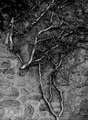
| 07/27/2007 07:25:51 AM | Between Life and Stoneby posthumousComment: Greetings from the critique club :)
First of all I just want to say Huh? I am sorry, I just don´t get this shot, or rather, I don´t get how it ties in with the challenge and thus I probably would have voted it a 4 if I had voted in this challenge, knocking off a couple of points for my own lack of vision on how it ties in with the challenge. At least I am honest :)
I guess you were going for that life (the branches) and dead objects (the stones) don´t have a link cause they are alive and dead? Best I can come up with, sorry dude... :P
Aaaaanyway I do like the shot, only gripe I have with it is the tie in with the challenge. It´s well exposed, got great b/w tones and I like the clay like texture you were able to bring out in the stones, whole shot looks like the branch and stones were covered in mud wich I like about it. I probably would have voted this shot a 6 if the challenge had simply been black and white. Composition is not what I would call good but not bad either, a little bit shot too much straight on the subject or an ordinary vantage point, maybe another angle would have appealed more to me personally but like I said, it´s not bad.
I don´t know what else to say buddy so I´ll just say kind regards from Iceland, Lárus. | | Photographer found comment helpful. |
|
Showing 731 - 740 of ~3731 |
Home -
Challenges -
Community -
League -
Photos -
Cameras -
Lenses -
Learn -
Help -
Terms of Use -
Privacy -
Top ^
DPChallenge, and website content and design, Copyright © 2001-2025 Challenging Technologies, LLC.
All digital photo copyrights belong to the photographers and may not be used without permission.
Current Server Time: 08/17/2025 04:20:48 PM EDT.
|