|
|
|
Showing 721 - 730 of ~3731 |
| Image |
Comment |
| 08/02/2007 10:26:36 AM | Con Caloreby freakin_hilariousComment: Greetings from the critique club :)
I didn´t vote in this challenge but would probably have joined the majority and voted this a 6. I really like the tonal range in the shot, think you did a great job with the b/w conversion, nice work. The composition and DOF are also very good. Frankly the only reason why I wouldn´t vote higher is that I have seen so many similar photos that photos like this don´t really visually interest me as much as they used to do but technically speaking this photo is very well done.
I also would not have gotten what this was a photo off had I been voting as I don´t recognize the subject and "Con Calore" doesn´t mean anything to me :) Don´t know if this hurt or helped your score, just thought I´d mention it.
I think one thing about the composition could be improved if you cropped out the two pegs at the bottom left half, I put my figer over that part of the screen and the photo seemed much more clean cut and simple, think that would have improved the shot, but that´s it.
Kind regards from Iceland, Lárus. |  Photographer found comment helpful. Photographer found comment helpful. |
| 08/02/2007 10:15:03 AM | Infinityby jackal9Comment: Greetings from the critique club :)
I don´t have a whole lot to say about this image so I´ll keep this short. I kindof like it but it also is just lacking something that would want to make me vote it very high.
What I like is it´s simplicity, it´s easy to look at, very easy on the eyes. Got great focus/dof and I like the bokeh. Composition is also above average but could have been better, mostly I would want to see an even steeper angle and more panoramic crop, the close to square crop is kindof "squishing" everything together, for lack of a better word. A longer crop and more area to the right with stuff out of focus is something that would have appealed more to me.
I think that most people did vote this a 5 is a tell tale sign that while it´s a pleasant photo to look at, there was pretty much nothing memorable about the photo so probably most people just threw a 4-6 rating on the shot and just moved on to the next photo. You needed something that was different about this photo, like really odd coloring on the posts or something that added interest.
One thing you probably already know, but having a blown sky or any big areas with blown highlights will always hurt your score here at DPC. Personally I don´t mind and think it goes well together with the dark posts to create contrast but there are just so many self proclaimed experts here who can easily identify blown highlights and think a photo can not work with a sky like this.
I don´t know what else to say so I´ll just say kind regards from Iceland, Lárus. | | Photographer found comment helpful. |
| 08/02/2007 09:55:31 AM | Who knew stoping to smell the flowers could taste so good!by CboydrunComment: Greetings from the critique club :)
Well I didn´t vote in this challenge, truthfully if I had, I would probably have been one of those 5 votes you got and would have moved on to the next shot without commenting. The photo is not really bad but it´s just not really appealing to me either, it is promising though so definately keep at it.
First of all, it´s too dark for my personal taste, so dark it makes me wonder if your monitor is calibrated, can you see all the grayscale underneath pictures when you vote or do some of the squares seem the same to you? Secondly, I don´t really agree with the DOF in this picture, I do like that the glass in the backround is out of focus but I would have strongly preferred it if all of the flower was in focus, or if not, the center of the flower were in focus and the petals you chose to have in focus were not.
Lighting is probably the weakest part of the photo, lighting is so much the key to everything when you take still life photographs. If I were lighting the same subject, I probably would have used three lights, one on my right side with a softbox to light the subject from the front, one on my left side behind the subject giving off some backlighting, preferrably some kind of honeycomb grid with barn doors to control the spill of the light so none of it reaches the backround and I would probably use a third light from behind/to the right of me with a snoot or some kind of very narrow lighting to light up the coctail drink since large parts of it are pretty much solid black. That is what I would do anyway if I wanted the shot to look pretty much similar and with a black backround.
To make it simpler, you might just want to use a big window as lighting, preferrably facing north so you don´t get any direct sunlight in there, well assuming you live in the northern hemisphere. That would much rather be useful if you wanted a high key/out of focus look and is commonly used when taking pictures of food for cookbooks so this image would look totally different.
The last thing I want to mention is that your concept is not weak but very average and you usually need a stronger visual concept if you want to do well in challenges here at DPC. Just look at the red ribbon winner and you´ll know what I mean. Having a flower and then glass is so ordinary and cliche (wich is not always bad) that you really need to put some twist on it to score really well, otherwise most voters will do what they did, just give it a 4-6 rating and move on to the next picture without commenting.
Again I want to say this is promising so keep at it and you´ll do fine here :)
Kind regards from Iceland, Lárus. | | Photographer found comment helpful. |
| 07/30/2007 01:05:29 PM | Daughter's Eyesby tennernieComment: Greetings from the critique club :)
I am always not sure what to say when commenting on a picture of someones child so I´ll keep this short and focused on the technical details of this photo.
First of all, your camera settings and perhaps choice of lens for this photograph. I see you used a 28-80mm lens with a small aperture but you own a 50mm 2.0 lens? Don´t know what exact focal length you used but my gut tells me the 50mm lens would have been a far better choice for this photograph. The reason I say this is because you use a 5.6 aperture when 2.0-2.8 would have been a far better choice, both to have less DOF wich is often more pleasant in portraits and also would enable you to set the ISO lower for better quality and also a higher shutterspeed so the image was better frozen, the image either apperas out of focus or more likely has some slight motion blur cause it´s not nearly as sharp as I would have preferred it.
Composition is not bad but I strongly prefer when people shots include the whole chin, cutting off the tip like you do here is not really what I find flattering, I would much have preferred it if you instead framed the shot slightly lower and include less of the forehead and all of the chin.
Other than that, I agree with most of your commenters about this lacking contrast and sharpness, when photos are b/w I personally want much more contrast than I want with color photos. Boost that and make sure the last thing you do after resizing the photo for DPC use is to sharpen it and you should be set cause all in all this is far from a bad photo, just needs a little bit more thought out settings and lens on the camera and a little bit of post processing and it would really pop much more off the screen :)
Kind regards from Iceland, Lárus. | | Photographer found comment helpful. |
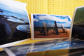
| 07/30/2007 11:34:34 AM | Recycled artby Rino63Comment: Greetings from the critique club :)
I didn´t vote in this challenge but honestly, I probably would have voted this a 5 and just moved on to the next photo in the challenge without commenting. It´s not a bad photo and the idea is not bad either but still, just not really an interesting photo as it is.
Most of that is that yellow backround, to me it just looks like you printed out a couple of photos and threw them on your couch and took a photo, uploaded to the computer and sent to this challenge. I suspect a lot of other people thougth the same and I think you know this after being here at DPC for this long but just in case someone new is reading this critique, if it looks like you went through some trouble for your entry you will score better.
I think if you had printed the same photos and then gone to another beach and put them there, it would have been so much more interesting, like if you had gone there to take newer and better photographs of the beach instead of those you printed, you know what I mean? Maybe doing a self portrait in the meantime, you being in the frame, taking pictures of the beach and be out of focus, having the focus on these same photos sticking out of the sand in the foreground?
Also I kindof agree with  surfdabbler surfdabbler, the lighting seems a bit wierd, with that big shadow there, is it in the print or was the lighting like that at the time?
Kind regards from Iceland, Lárus. | | Photographer found comment helpful. |
| 07/30/2007 11:17:48 AM | hippie flowerby dudeman13Comment: Greetings from the critique club :)
Sorry, I see this came in last place and well to be brutally honest, I am not surprised. Why?
I can´t even make out what it is in the photo but it looks like a flower and not paper. Whatever was done to this image in post processing is not even close to being to my taste and frankly, as a photograph for this particular challenge, I would have voted this a 1 for the post processing effect and the fact that I can´t make out any paper in this image.
This might definately be some people´s cup of tea though as I see quite a bit of the voters gave this a 6 or higher score, the image is very artsy and if you like this, just ignore me for I am usually one of those who don´t understand abstract art. Keep at it but do not expect high scores at DPC with images in this style :)
Kind regards from Iceland, Lárus. | | Photographer found comment helpful. |
| 07/30/2007 09:34:59 AM | The way is straight, and the path is wrought fair... by DrAchooComment: Hey on second thought, since it´s only two and a half hours away, I challenge you to make a sesonal series of this exact same shot, go there again in the fall when the fall colors are there, a winter shot then with no leaves and do anoter in april to see if you get the same colors as Charlie.
Think those three photos + this one would look great side by side, think about it dude, I know I would do it ;) | | Photographer found comment helpful. |
| 07/30/2007 09:32:25 AM | Money Hungryby JasonMooreComment: Greetings from the critique club :)
Wellcome to DPC for starters. This is a pretty nice beginning and I don´t really understand why it didn´t score better. I mean, the lighting is good and looks very natural so great job there. The DOF and focus are spot on, frankly technically this image is very well done so you obviously have the camera details down. I also like the idea and it´s pretty well executed.
However, I was thinking the same thing as some of your commenters say, that you should have shredded real (or fake) money instead of white paper. It would have been pretty easy to use a photocopier to copy money and even though they would have been b/w then you would just have colored the fake shredded money green in photoshop since this is an advanced editing challenge. It just would have made the photo MUCH stronger. That or use something other than white paper to shred, like something you would usually shred like cheeze or potatoes or stuff like that so it just looked like you were putting dressing on the main food wich was then the bills.
Anyway, great start and I think this was seriously underrated, I personally would never have given a lower rating than 6 so keep at it, you´ll fit in nicely here after the adjustment period :)
Kind regards from Iceland, Lárus. | | Photographer found comment helpful. |
| 07/30/2007 07:55:25 AM | papelby booboo_goonComment: Greetings from the critique club :)
Well I don´t really know what to say about this image so I´ll start with that I really like it. I am not big on minimalism but this one is very well done in that genre and if I had voted I probably would have given this a 7. It´s well lit, easy on the eyes, well done compositionally and of course meets the challenge very well. I do understand that people voted it low though, usually to impress the DPC voters you need something that looks like it took a lot of effort and gives off that "wow" factor that is so elusive.
I do not think you should worry what other people think as you comment after the challenge was over, if you like photos like this, just keep on entering them and think that 63 people gave it a 7 score or higher so they must have really liked it and ignore the one´s that gave a 4 or lower. There is more to photography than scoring well and winning ribbons on DPC :)
Kind regards from Iceland, Lárus. | | Photographer found comment helpful. |
| 07/30/2007 07:24:31 AM | G R E e Nby heavyjComment: Greetings from the critique club :)
First off, regards to meeting the challenge, this photo does that easily and I doubt anyone disagrees with that assessment.
My biggest gripe with it is the lack of focus on the eyes, I always think you should focus on one or both of the eyes and you don´t do that in this shot wich I am sure you did on purpouse but doing that isn´t to my taste. Also I am a fan of the big space above her but think you overdid it a bit, if you had lowered the frame just a bit so her head wouldn´t be in dead center, this picture would have looked a whole lot better compositionally.
The rest is pretty good, I like that I am looking up at her, the clothes colors vs. the backround colors work nicely, the light is good and so is the exposure, think you should have used iso 200 and 1/80th shutterspeed to eliminate any chance of camera shaking but that´s just me, the 1/40th seems to have worked this time so you must have steady hands. DOF is nice, except for that I was griping about earlier about the focus not being on her eyes, and bokeh is good.
All in all a pretty good shot and I think it ended up pretty much where it should end, almost a perfect 6.000 score and I would have voted a 6 if I had voted.
Kind regards from Iceland, Lárus. | | Photographer found comment helpful. |
|
Showing 721 - 730 of ~3731 |
Home -
Challenges -
Community -
League -
Photos -
Cameras -
Lenses -
Learn -
Help -
Terms of Use -
Privacy -
Top ^
DPChallenge, and website content and design, Copyright © 2001-2025 Challenging Technologies, LLC.
All digital photo copyrights belong to the photographers and may not be used without permission.
Current Server Time: 08/17/2025 06:03:33 PM EDT.
|